Park / [H2H8 R1] Durham, Knaresborough and Staithes
-
 16-April 18
-
 Durham, Knaresborough and Staithes
- Views 29,557
- Downloads 1,083
- Fans 3
- Comments 135
-
![Park_4075_[H2H8 R1] Durham, Knaresborough and Staithes](https://www.nedesigns.com/uploads/parks/4075/logot.png)
-
 79.50%(required: 70%)
 Gold
Gold

chorkiel 85% Cocoa 85% Steve 85% bigshootergill 80% Kumba 80% trav 80% Xeccah 80% ][ntamin22 80% CoasterCreator9 75% csw 75% G Force 75% Coasterbill 70% 79.50% -
 Description
England. The country of Shakespeare, Sherlock Holmes, Robin Hood, London, posh accents, medieval castles and knights and famous battles, timber framed townhouses, hooligans and chavs, and high tea with scones and clotted cream. The food is mostly terrible and it's always raining. This is the other England. The real England.
-
3 fans
 Fans of this park
-
 Full-Size Map
-
 Download Park
1,083
-
 Objects
477
-
 Tags
Tags
![Park_4075 [H2H8 R1] Durham, Knaresborough and Staithes](https://www.nedesigns.com/uploads/parks/4075/aerialm3813.png)
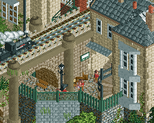
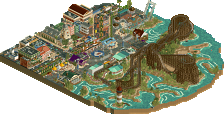
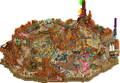
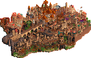
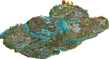
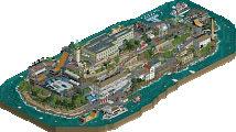
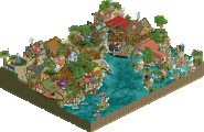
I'll put up a full review later after a second viewing of the gallery park, but two very good parks, with very different styles. Great work everybody!
I enjoyed my first look through both maps. Two great ideas executed well and a strong first impression for both teams, big props for that. This will be a tough choice.
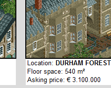
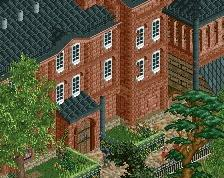
I think Liampie is right to say that his team's park is an antithesis to ours. Relying on subtlety in head to head is certainly a risk to do in Head 2 Head, but perhaps it may pay off here. If anything it's certain that this park has heart to it. The atmosphere shown here is pretty incredible and really shows a level of skill and , especially, discipline out of its creators. I think narrative wise yours told the story more effectively than the other park; the ride design especially showing this off. Everything is so picturesque. It kept myself imagining as a peep, walking through the town and landscape. Being down a a row of English seaside architecture with a dry riverbed on side is so tangible. If realism's purpose is immersion, this accomplishes it better than any stale american theme park that I've seen in recent memory. Holistically I can't see the userbase at large appreciating this as much as #diamondheights from H2H7, but I think this is equally executed to that. 80%
As an aside it saddens me a little bit that H2H has transformed into trying to catch as many eyes and attention as possible as being the "winning strategy" for miniparks. I see this as a much-needed regression from that, and hopefully we'll see more stuff like sloB's H2H parks later on in the contest.
Interesting matchups, here are my pros (+) and cons (-) for both parks, my language is pretty bad at the moment, so that must do it:
UltraRealists - Wit's End:
+ castle and railway ride around it are awesome
+ height elevation is great
+ loved the landscaping and foliage
+ entrance area and market are cool
+ stronger park layout than the other park
- missing readme, took me a while to figure out the drug theme
- drug theme seemed like an excuse to build something la reve-ish without a greater concept behind everything. Mushrooms were great, but definitely umbrellas are definitely a stronger concept than mushrooms
- architecture around the castle is still nice, but can't keep up with it
All in all definitely negative points there, but these are only small flaws, i think all in all this definitely is an amazing park and i really like it! 75%.
Heaven's Gallery - Durham, Knaresborough and Staithes:
+ Architecture and atmosphere are unbelievable!
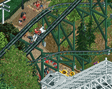
+ Lovely wooden coaster, a cool layout with some nice interaction with the surroundings
+ custom palette works really great here and it really helps the painting theme
+ Train line + bridge are cute and charming.
+ Maypole dance! Probably the detail of the matchup for me
+ Landscaping and foliage are well done, i at least think they also worked well with the painting idea
- I get the painting like shape, but the park would have really been better on a more dynamic map shape with more room to breath for the stuff on it. It also resulted in the park layout of this park being less stronger than the one of the other park.
- could have done more with the wooden coaster queue, i generally think there was some missed potential in the industrial area, some mechanies and other small details could have made this area much more interesting imo
I think looking at all aspects in my opinion this park also has his flaws, but is a little bit stronger than the UltraRealists' Park considering everything, so i think i'll vote for this one. 80%.
It doesn't make me sad, as I love high concept parks and all the ridiculously creative crazy things H2H is known for. I want to be blown away. At the same time, I totally hear you. I've been looking at all the old H2H parks a lot during the past few months, for either nostalgia, excitement for H2H8 or simply research for the List or the H2H promo video, and there were a few parks that I hadn't really paid attention to before that grabbed my attention now. Valley of the Kings is not a park that would hold up in any of the modern H2H seasons, it wouldn't even hold up in H2H3, yet there is something very appealing about it. Elegant name, no nonsense to the point castual Egyptian theme. Some sand, a pyramid, cool coaster, et voilà. Slobs parks are also like that. Götheburg doesn't have a lot to offer conceptually, but it's extremely pretty to look at and easy on the eyes. For some reason it's more memorable than a well executed content stuffed park like Terra Progressia or Neverland.
We still get parks like that every now and then, but they've become more rare. Red River Delta, Calico Canyon, Adventure Isle, The Lost Samurai, Vampyre... I guess Pridelands could fit in there too. Not all of these are great but I like how easy to digest they are. Would be nice if we saw a return to straightforward parks at some point. Just a few more of those and a few less of the high concept complicated parks.
RWE, how are umbrellas conceptually stronger than mushrooms if it's a park about psychedelics?
lol
I said my language is terrible today lol. It isn't really something your team could do something about, but you can definitely do more with umbrellas like rides etc. than with mushrooms, who are just standing there.
I feel like your just trying to find something to complain about by saying that tbh.
But we're not making a park about umbrellas????
Mr Tolkein nice books but maybe you could've made them about space things instead of hobbits and dwarves and elves there is more you can do with space things.
Wtf, no. I'm just comparing it to le reve, it didn't had enough ideas made out of the main concept for me. Am i allowed to have that opinion?
You can have that opinion but it doesn't change the way it sounds.
We're criticising criticism. We've gone fully meta.
Your right tim this is a stupid argument. sorry.
Good reflection on the criticism of that criticism! Keep it going!
Its kind of unfair for the negative comparison to another irrelevant park, shouldnt we be comparing the two parks here that are going Head to Head, not comparing them to XYZ park from the past? Just my two cents.
I and largely our team expected people didn't need to be spoonfed with a readme to understand Wit's End. Parks are meant to tell the story, and that if you need an external source to get information about a park, then the parkmaking wasn't effective. As with visual art I think rct parks should be in a lot of ways up to the viewer to extrapolate meaning out of the work.