Park / [H2H8 R1] Durham, Knaresborough and Staithes
-
 16-April 18
-
 Durham, Knaresborough and Staithes
- Views 26,389
- Downloads 956
- Fans 3
- Comments 135
-
![Park_4075_[H2H8 R1] Durham, Knaresborough and Staithes](https://www.nedesigns.com/uploads/parks/4075/logot.png)
-
 79.50%(required: 70%)
 Gold
Gold

chorkiel 85% Cocoa 85% Steve 85% bigshootergill 80% Kumba 80% trav 80% Xeccah 80% ][ntamin22 80% CoasterCreator9 75% csw 75% G Force 75% Coasterbill 70% 79.50% -
 Description
England. The country of Shakespeare, Sherlock Holmes, Robin Hood, London, posh accents, medieval castles and knights and famous battles, timber framed townhouses, hooligans and chavs, and high tea with scones and clotted cream. The food is mostly terrible and it's always raining. This is the other England. The real England.
-
3 fans
 Fans of this park
-
 Full-Size Map
-
 Download Park
956
-
 Objects
477
-
 Tags
Tags
![Park_4075 [H2H8 R1] Durham, Knaresborough and Staithes](https://www.nedesigns.com/uploads/parks/4075/aerialm3813.png)
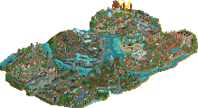
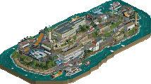
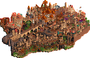
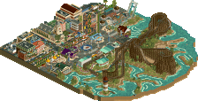
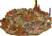
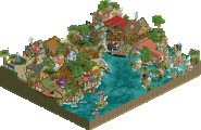
Round 1 | Match 3
--- POLL WILL OPEN FROM Tuesday April 17th 14:00 GMT TO Friday April 20th 14:00 GMT ---
Wit's End (RCT2)
VS
Durham, Knaresborough and Staithes (RCT2)
Voting Rules
- You should only vote if you have viewed both parks in game.
- Everyone but players belonging to either team in the match may vote.
- Voting will be monitored to improve fairness, and anyone found to be abusing votes in any way will be punished.
Interesting match up, and a really strong one I think. Strong because both parks are very good, and interesting because the Heaven's Gallery park seems to be the anthithesis to the UltraRealists park. Wit's End is WOW IN YOUR FACE AWESOME while the more subtle beauty of Durham, Knaresborough and Staithes will creep up on you. I can see this match go either way. I'm excited to see some good discussion and debate on this!
Also a few reminders for everyone:
- The parks are anonymous and should stay that way until after the match is over. That means that you can't play the guessing game in public. No rumors, no guessing, no deducing, no sleuthing, no implying. Just keep this about the parks for now!
- Please try to keep your reviews and discussions on the site, and not on discord where it will be quickly buried. Who doesn't love reading old match threads? By posting here, you can ensure that your children and grand children will also get to enjoy that.
Happy H2H'ing!
From First glance this is going to be a weird one. You have one park that is built more for the shock value and one built more for the overall beauty. I need to let it sink in a bit more before I give a full review of both parks, but I'm excited to see the outcome of this match.
Everytime I see papyrus I have the need to throw up somewhere
I'm counting 16 boats between the two screens.
I'll edit with a more refined review later, but for now I'll say this:
Phenomenal round 1, Ultra Realists, great stuff. I keep finding more and more little details and the quirky nature really appeals to me. The textures on the domes/spires were sometimes a bit weird, and there's a lot of brown, but to me it doesn't really detract from the overall experience. I do really hate that one yellow building though. It hurts my eyes.
The Psilocybin castle was the biggest standout for me, and the B&M's layout is absolutely fantastic. Water coaster was cool too. Well, the whole park is cool, but I guess that's the point, huh? This park was definitely built for shock value/wow factor and it worked, but there's enough going on to make it enjoyable to view in the long term. 85% for me.
As for Heaven's Gallery's release... its a mixed bag for me. The more subtle beauty overall is a lovely contrast to Wit's End, but some things just don't seem to work. The macro cohesion is a bit off putting, it does really feel like 2 or 3 separate projects that were smushed into one, whereas the micro is lovely. I appreciate the use of negative space, but though authentic, I dislike the seaside village.
I think this is one of those parks that would have greatly benefited by not being restricted in size, in order to use more negative space and expand upon the 3 major areas so they each feel like full towns more than chunks from said towns for the sake of a single framed painting. That said, there is some incredible stuff here, especially as the woody dips under the bridge, and I love the castle area too. 75% from me. Definitely a great release, but unfortunately outclassed in my mind.
I'm definitely stealing this colour palette too btw its perfect
Great park Heaven's Gallery! Being someone from the north of England, I think it captured the essence well. I'll give a review after voting.
edit: also cool to have another colour palette added to the game
Also, don't all jump on this narrative that Liam just concocted about 'shock value' vs 'subtle beauty' because it's bullshit.
Durham, Knaresborough and Staithes
I think the best thing about this park is the color palette. Other than the orange roofs, the custom colors all look amazing and make it very atmospheric. The red brick especially is really refreshing in rct, and the olive on the bridge. The atmosphere is cool and pleasant and all the little thin paths across the countryside look fun to explore. The foliage is really pretty, especially in the back of the park. I like that I'm watering flowers, thats a mood. The white cliffs look pretty bad but i appreciate the effort, and the density of the map feels kind of flat and the composition is not very interesting. Very atmospheric and strong detailing, but weak composition imo.
Wits End
This is my favorite park of round 1 and a great example of why zack is one of my favorite rct2 players. The map feels completely alien and the areas are diverse but fit together beautifully around the castle with each area offering a different view of it, and a different village full of life to explore. The mushrooms tie the map together without being overwhelming, the colors are subtle but effective, and the textures are perfect. The architecture is gorgeous even though some buildings have bad angles, the towns are interesting and immersive. The individual elements are skillfully done and the composition is incredible. What a great start to H2H!
I didn't say shock value! That implies that your park is otherwise hollow or cheap and I don't think it is. I meant that it's just more extravagant and that's a pretty objective observation I think.
Just love this unexpected park vs park in H2H... 2 parks on each scale of the spectrum battling it out! Both are lovely parks... I'll review them shortly. Hats off to UR and HG!!! Way to kick off the tourney!
EDIT: For some reason the train on Pareidolia jumps off the track after the batwing, then goes through the cork and helix disconnected from the track. Is this a glitch in my game or on purpose?
Wit's End:
At first glance I thought this looked really 'inspired'. Almost like an ode to the fantasy parks of h2h6. Not only La Reve, but also Corsair Veredian and the unfinished Reservoir Dogs park - to name a few. That did not necessarily get my interest. But then I looked at the castle with the reversed splash boats and psilocybin. They both made me laugh and the concept got more clear. Then I googled Pareidolia and the park started to click more. This was quite a clever park. I enjoyed it.
Durkham, Knaresborough and Staithes:
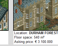
Pretty like a painting. Very cohesive piece of work. The color scheme worked well, subtle as it was. Lastly, I loved all the little details like the beachcombers and the maypole. Some of the object choices will have to grow on me. The one thing I'd say I didn't really like was the grey rockwork.
😂😂😂
Different than a realism vs fantasy match-up / debate here..
Awesome work from both teams !
I had a real crush for one of the parks.
These two parks are both very good, I think. Serious business.
Just like Julow, I had a crush for one of the parks, but I think mine is likely to be the opposite of his, haha.
Leaning towards Ultra Realists here, I think their park just reached an extra level that Gallery's park doesn't really even attempted to. And while it does feel a lot like La Reve, it's much less so than I felt at first glance and does enough other things to feel new. The color palette for Gallery's park is quite cool though and definitely pushes the theme, but I wish there was more content and memorable moments.
As for the theme, both are a little hard to gather. I think some sort of readme or explanation would have helped both parks.
Wits End definitely has something to do with Shrooms or something like that, an interesting idea. While Gallery's park just seemed like it's themed to an area in England? Interesting for sure but I don't know if it's quite enough to win a H2H match.
Would have liked to see Wits done a bit cleaner and gave a clearer theme. And I think DK&S could have benefited from a central structure and more of a focus, be it a coaster or other ride, perhaps a bit more density too.
Both strong parks, but I think both teams are capable of better.
Amazing. Such a fantastic first round of the first H2H with OpenRCT2 and multiplayer building. And it shows. There's so much crammed into each park. Some of my thoughts on each:
Ultra Realists:
-The end of the invert made be say "what," quickly followed by "YES" once I re-watched it. Ballsy, unexpected, unique, and memorable. Slick hack that I remember from the release of Portal a few years ago. Well, I think it was a few years ago at least. I've been here a while haha. Anyway it was brilliant.
-Leads me into the reverse splash boats. Again, unexpected when I saw it and catchy.
-The castle. I really liked the lift and first spiral drop of the mine train coaster. Thought the transition out of the spiral drop was awkward by hey it's opinions and there's really nothing objectively wrong with it, just not my style. Didn't know what to think of the loop either. Ballsy move, but just not nearly as effective as the other ballsy moves in this park, I thought.
-The only thing I didn't like about this park is.....while everything looks nice, I don't really know why it's there. I really love what I see but at the moment it's lacking narrative for me, at least without some explanation. I don't mind Googling things, but I'd rather be able to open the park and have an idea of what the concept is without having to do that. For me this is an area that the Heaven's Gallery's park really succeeded at compared to the Ultra Realists' park.
Heaven's Gallery:
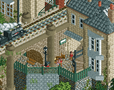
-DAT RAILROAD BRIDGE. Actually the whole train, I really liked it for some reason. But yeah the stone arch bridge was really fantastic.
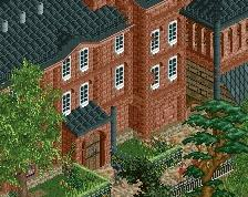
-Double layered bridge on the wooden coaster. Gah I can't remember the name of the wooden coaster, but I will say.... Wait! Locomotion. That was the name. Great name by the way, and the station was really neat. Loved the brick color, which I think has a bit of the custom palette to thank? I've been out of the game for a while. Either way I liked it.
-The fact there was actual landscape. I think this is really what makes this park so effective in achieving its goal. Valleys, buildings nestled into hillsides, the muddy river area leading out of town into the larger water body. All of these are subtle elements that give this park it's life.
-I have to say that I adore this work, but to me it lacks..... complexity, compared to the Ultra Realists' park. I guess that's not necessarily a requirement of a good park, but it comes off as a bit simple when I view the two parks in succession.
Great match, and a great start to H2H8. Also I'll echo Liampie's thoughts and encourage people to not be tempted to keep all the discussion on the discord. I've never be on the discord (or any discord), and am not involved in the contest, which gives me the perspective of what a site "guest" sees here. And let me tell you, this website is dead as all get out while the H2H teams are building. Which makes sense, but then I'd ask that you all try to infuse that life back into the "public eye" of the community when you can, such as here in the match discussions.
I definitely enjoyed both of these parks.. really contrasting styles of parks and it is difficult to say which I like better. I'll try and do some +'s and -'s for my reviews this season.
Ultra Realists:
+ Psilocybin was my favorite ride in the park. Cool layout and interaction with the castle complex. The castle itself was really well done too. I think I just liked the general area.
+ The market area at the entrance of the park was very quiant.. less funkadelic than everything else and its a nice change of pace
+ The insectorium area of the park was well done. The flying insects and then the giant toadstools were also nice.
- I know there's a non-glitchy save file, but damn. Were those black holes or something? I was really confused when I first opened the park.
- Maybe it's just me, but I don't like when waterfalls have different colors in them. Was that intentional?
- I wont vote on a park based on this, but a read-me really really would've helped.
Heaven's Gallery
+ Locomotion was great. Cool station, great layout, great interaction with the surrounding buildings and wooded area.
+ Cheese rolling? Wonderful. That's a memorable little detail.
+ The plaza for the train station was well done. Very simple, but also distinctive.
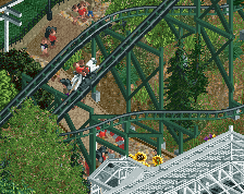
- I did not like the steeplechase at all, sorry.. just for some reason it doesn't look right to me. Station is good, concept I like, but it just looks like a tangled track on top of trees. And I wish they were synchronized..
+/- Scenic Sunday Drive would be better as an Isle of Man TT ride.. but thats not a negative. Just looks like motorcycles would work well here too.