Park / Regicide
-
 05-April 18
- Views 23,341
- Downloads 571
- Fans 0
- Comments 8
-

-
 46.50%(required: 65%)
 Design Submission

Kumba 55% Poke 55% posix 55% Camcorder22 50% CoasterCreator9 50% G Force 45% Jaguar 45% Sulakke 45% WhosLeon 45% Cocoa 40% inthemanual 35% Liampie 35% 46.50% -
 Description
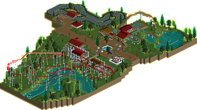
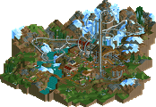
Regicide is the one coaster built within the small park of Sherwood Forest, located just outside of Sheffield, England. Management wanted to pay homage to the famed hero of Sherwood, Robin Hood, with medieval themed rides and attractions, thus giving the park a somewhat run-down appearance.
I'd like to give a special thank you to Terry Inferno, without his input this project would have turned out to be a vastly different beast.
I'd also like to thank MK98, Jappy, and everyone else who provided me with helpful feedback over the course of my time working on this. -
 No fans of this park
-
 Download Park
571
-
 Objects
1
-
 Tags
Tags
![park_3164 [MM2014 R1] Thompson's Pier](https://www.nedesigns.com/uploads/parks/3164/aerialt2724.png)
I like the choice to use a less-used coaster type. the station building was my favorite in the park, and the landscaping around the coaster wasn't bad too. some of the buildings felt a bit flat and empty, and the park as a whole felt quite stretched out and there wasn't many details to really hold my interest. but it wasn't bad all up
A nice first release Chris! The coaster was cool, and I enjoyed watching it run through its course, until that crazy trim brake right at the end. I wish you could've made the layout work without that, as it was a total mood killer. There were definitely some spots I felt that the coaster was undersupported as well, e.g. the 180 degree turnaround after the first big drop.
You certainly got the run down vibe in my mind at least. The brick on the edges of the paths was a nice touch. It works pretty well. I do think there's a bit too much flatness to the landscape around the main path, and maybe a few more trees would've helped in this regard. It is Sherwood FOREST after all. =)
The flume was nice, and the go kart track was cool too, asides from the interesting texture under the track. I think the standard tarmac with some cracks here and there would've been better.
Some other little details could've elevated this to the next level for me. Ride ops for all the flats for example, or at least having little stations where they operate the rides from.
Finally, a few park operations type suggestions. Is the coaster testing for any particular reason? Would've loved to see some peeps on it. Second, there's a broken path at the log flume exit that has trapped some peeps. Could be a reason why the park feels a bit empty.
Good first submission, looking forward to whatever you come out with next!
Congratulations on your first release Chris! It's not a bad park. The foliage has made a great progress from what I've seen earlier on this park and the log fume is also cute.
The park is a bit lacking on details. Especially the roofs of some of the buildings need a bit more details to make them look less square and uninspiring.
I think it also needs more finishing in general. Not only the coaster that's testing or the peeptrap, also using an invisible track for the rapids, removing the little drops after the lifthills on the log fume, using a better invisible track for the Go Karts (I know this is hard to cheat) and using path objects to prevent the clippings. I'm sure you can learn all these things when we do that park together.
All by all you're showing some potential with this. It can be much better, but you're listening very well to the feedback we gave you and that's great to see. I think you can make some real progression very fast so that we have a new upcoming builder for the future.
A very nice first release! And immediately using quite he unusual coaster type, I take my hat off to you sir.
Most of the important stuff has already been said it seems. The foliage is a great improvement on the first screens you showed, and the buildings could use some extra detail like trims and stuff. Also I'm not a big fan of how much empty space is between everything, it makes it look quite barren.
The Liam mesh roof on the rocky texture is something I've never seen before, that's new! It creates an interesting texture I haven't seen before.
Overall it has its shortcomings but it's a great start. You do show potential. If you keep listening to advice and continue to build I'm sure we can expect great things from you.
Cocoa keeps stealing my thoughts lately.
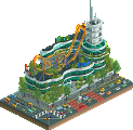
The coaster itself was probably the best part of this, with the station building being one of the best parts overall. Other than that, the park felt a little empty in places, with some of the other buildings not standing up to the level of detail of the coaster's station.
This is a really strong first submission; most of the things I was going to say have already been said, so look into things like consistent detail, foliage, and being mindful of effectively using empty space as stated above and you'll improve rapidly.
Relevant talent in this. Very enjoyable layout with a weird ending. Hoping to see more from you soon.
Thanks to everyone for providing their thoughts/feedback. As my first 'relevant' RCT2 work I uploaded this primarily to receive such feedback to help me further improve. I've been around for a bit on RCTgo (where you can find all of my work) and I'm far more proficient with the 3D titles (although RCT3 is dead so I've since moved on to Planet Coaster and Parkitect). Hopefully I'll continue to improve thanks to feedback here.
Finally gave this an accolade vote. This is a good first submission that shows a lot of talent. The coaster looks like it's a lot of fun to ride. I also quite like the station and the foliage is well done too. Biggest problem for me is the lack of interaction between rides, landscaping and paths. Everything feels very spread out and flat, which makes this quite boring. I hope you'll work on that if you're still around. You clearly have talent for the game!