Park / Big Theme Park
-
 28-February 18
- Views 2,645
- Downloads 609
- Fans 0
- Comments 8
-
 44.00%(required: 65%)
 Design Submission

Poke 60% inthemanual 55% Dr_Dude 50% Jaguar 50% Coasterbill 45% Cocoa 45% SSSammy 45% bigshootergill 40% CoasterCreator9 40% Camcorder22 35% G Force 35% Liampie 35% 44.00% -
 Description
Hello all. Regards.
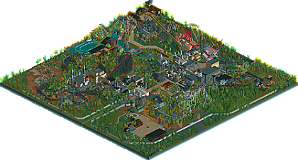
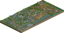
"Big Theme Park" is a park in which there are no pink balloons.
Guests are supposed to feel like in a "sensational film".
In addition to the atmosphere "not for everyone", you can find places that will allow you
for a bit of relaxation. -
 No fans of this park
-
 Download Park
609
-
 Objects
1
-
 Tags
Tags

![park_3112 [MM2014 R1] The Haunted Estate of the Fantastical Lord Fredrick Kent](https://www.nedesigns.com/uploads/parks/3112/aerialt2743.png)
Some interesting ideas, and some good aesthetic bits. Too much path in some places though.
Very nice park battle boy! I wish there were more peeps, and the architecture is a bit samey all over the park, but the coasters were fun to watch and were well done!
As G said, a bit too much path in some places, and in some other places the path patterns detracted from the park. Looking forward to your next release!
I have very high praise of this! Atmosphere and mood are unlike anything I've felt before in a park. Just so creepy and ominous and strange and surrealistic and I liked it a lot. Keep it up.
this isn't bad at all. Some of the castle bits are cool, a decent atmosphere, and the layouts are pretty well constructed on the whole. some of the path is strange- a bit wide in parts and leads to dead ends. But heaps of improvement from you.
Do you throw everything into google translate? Even then it chucks out some weird words sometimes. I'm glad there are no pink balloons though, that would ruin the atmosphere for such a big park.
Hey Cocoa. Thanks for a few words about the park. I am happy when something comes out better to me than before.
Unfortunately, but my English is of such a level that I usually have to help myself with translators.
(this grammar makes these weird things).
Greetings to you. All the best.
opening this park was a very nice surprise! youve created a nice atmosphere for a horror park and i see several distinct themed areas. the architecture is a bit samey like saxman said but in general its well built and i really enjoyed the textures you used. i think the rockwork actually works really well and the use of color in the rocks is very interesting, specifically the green by xsplashO. i like the coaster layouts, especially Castle Ride. The Centaur looks so massive and intimidating which really helps the atmosphere.
as others have said, some areas have way too much path and the textures can be distracting. the castle theming is a little overused and is boring to look at from certain angles. i dont like Plus Coaster very much, it just looks like spaghetti. i also dont understand why the train is set to shuttle mode? its odd seeing it run backwards. the foliage seems kind of messy and random a lot of the time and in most places it completely lacks underbrush. also, pink is my favorite color so ill have to dock your score for that (just kidding!)
i had a lot of fun looking through this park! im excited to see what you do next. 55%
I love this! What is it?
Cons:
Worst park name ever (and it's not that big)
Worst ride names ever
Worst objects ever (why the rave lights and lightning under the B&M?)
Worst paths ever
Pros:
... but I kind of fucking like it. lol
Seriously... it's so much fun. Also, Centuar is kind of awesome in a weird way.
I'm so confused. lol
You're getting a lot better. I'm giving this a 45% but if it gets bronze I won't even be mad.