Park / Temple of Fear
-
 05-April 18
- Views 3,009
- Downloads 700
- Fans 1
- Comments 8
-

-
 63.00%(required: 65%)
 Design Submission

Dr_Dude 70% posix 70% chorkiel 65% Cocoa 65% csw 65% Liampie 65% bigshootergill 60% Coasterbill 60% CoasterCreator9 60% Faas 60% G Force 60% ][ntamin22 60% 63.00% -
 Description
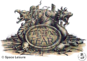
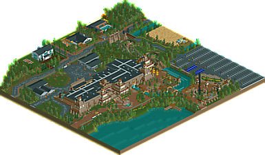
The long forgotten project from Bobbejaanland recreated in RCT2. What could have the Temple of Fear been like?
OpenRCT only -
1 fan
 Fans of this park
-
 Full-Size Map
-
 Download Park
700
-
 Objects
1
-
 Tags
Tags

This was pretty pleasant. I always love the idea of alternate reality theme park visions. The ride building was good, maybe slightly derivative of Tenochtitlan but still quite good. the actual coaster itself made sense from the perspective of the story, but didn't capture my attention so well- felt like a good supporting ride in a park with more stuff, but there wasn't much more. A good coaster would have massively elevated this design, although I understand why there isn't one. the outside stuff was pretty good too. I do wish the entrance had a bit more 'meat' to it, and wasn't just a few turnstiles then an S&S shot tower. I love a good entrance
good stuff though- refined, clean, and well designed all up. I thin it'll probably be a coin toss whether this makes design, just because its a bit empty content-wise
Ditto. Cocoa pretty much nailed it from my perspective here; the emptiness is a bit of a letdown, but what's there is refined.
This is pretty awesome dude! Very fun, very unique, and a very cool backstory. I enjoyed all the little details immensely, including Faas taking a smoke break, the dinosaur in a cage prop, and the Riverland-esque harvester.
The dark ride/coaster was neat, and I did enjoy the dark ride scenes. I also really liked how the boats stopped in front of the (hopefully animatronic) alligator after the finale splash. Really cool detail.
The rest of the map is also nice. Good surroundings, good supporting rides, and a pretty nice atmosphere. Things do seem a bit spread out, but it didn't detract from my experience.
A few things I wish could've been, but weren't:
- Running monorail, even if it was endlessly shuttling back and forth. Would've made the park feel a bit more alive.
- A real shoestringed version of Kutoa. I think it would've been fun to add this in. I'm glad you made it peepable, but it could've been even better.
- Some life in the parking lot. Just don't use those cars from TV... =P
- More life on the outskirts in general. Some moving cars on the roads, some peeps walking around the sidewalk, etc.
Waaay to atmospheric to be BJL, 0%
In all seriousness, this is great stuff. Typical Fred work.
Overall I don't have much to talk about, it just looks great! I like the dark ride section, I like all the little details you put around the park and the surroundings, I really like the colour scheme for the surroundings... I like the houses.... I also like all the little nods to theme park fans who know BJL, like the hidden cars of Looping Star in the shed, the old steam train... I don't know if it was part of an actual ride, but the dinosaur in the wooden supports is a great touch!
But there are a few things I don't like. I know Belgium has some terrible roads but sheeeeshhh.... That could've been turned down a bit. I also agree with saxman about the monoraik, that would've been a small but easy touch. Last nitpick, I really like the foliage you make, especially the underbrush, but you might want to rotate some of the trees sometimes. The ones between the coaster and the back stage are all facing the same way!
Fantastic work Fred, just wished BJL would've made this instead of that horrible sweatbox they call 'Kinderland'.
I really liked this. It's not quite design worthy but it shows a lot of skill, especially the outskirts of the park.
I can see why it wouldn't make design. The coaster is a bit underwhelming but the ride was intended that way, as it's supposed to be a mix of darkride, water ride and coaster all in one. A De Vliegende Hollander before there were even plans for that. Besides that, the watercoaster track in rct is really limited and slow
I'm glad it's liked by you all. Sadly most of you won't notice the many winks to real Bobbejaanland The dinosaur prop for example, there stood a real one for years. Koen Wauters even hide himself in there when trying to overnight in the park without getting seen. Now it's gone but it's a BJL monument.
In some ways this is again some of the best stuff you've done. It feels like a real section of a park, and a pleasant one too. The ride had some good theming and I can definitely see this in Bobbejaanland. Good job there! There's also some glaring flaws and things that just don't feel right to me. I don't think you should've included a park entrance here. This area did not look or make sense as an entrance area. Where are all the supporting buildings? Why is the parking empty? The scale of this design overall was too big. Everything should've been about 75% of what you did. Because you blew everything up it feels more empty and stretched out than it could've been. The building is huge but mostly empty. That the coaster had a ton of block brakes did not help. Overall the map feels 'slow'. Another minor flaw that stood out to me was how the entrance sign to Temple of Fear was invisible from the main angles that the peeps will approach it. Coming from any of the main paths and they will only see the back of the sign... Lastly, rotate your damn trees! Foliage mix was great but not executed well.
I'll give it a 65%. I think it's design worthy because of how complete it is, and how generally everything looks great, but the execution is too inconsistent to get a higher score than that.
Thanks for your review Liam! Hope other reviews will come in during H2H or at least after it's done.
I know the entrance can look weird, in fact it's conluded because Bobbejaanland, the real park where this should be built, has that entrance right there in the back. And since it's a backward entrance, it's small. The real entrance in Bobbejaanland is even smaller and nowadays rarely used, but years ago it was in use. I forgot to add cars at the parking lot, but I can argue that on a calm day they wouldn't use that specific parking lot and fill up the parking lots near the front and main entrance.