Park / Space Race
-
 28-February 18
- Views 1,637
- Downloads 497
- Fans 0
- Comments 5

-
 Description
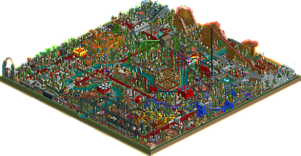
It's my 1st submitted park in 5 years. The park is colorful yet chaotic, but I guess that's just my style. The rides/staff are aptly named after space-related stuff whether it be real or fiction; I even attempted some puns and references to other stuff. The park description follows an arc of a story that will continue in future parks. One ride (hint:coaster) has a design/theming that provides a clue to my next park, though I think I made this challenge near impossible since it pretty much has no correlation (but an important letter). Enjoy your visit to "Space Race" !
-
 No fans of this park
-
 Download Park
497
-
 Objects
1
-
 Tags
Tags
![park_4085 [H2H8 R1] Motherland](https://www.nedesigns.com/uploads/parks/4085/aerialt3815.png)
![park_4233 [H2H8/8] Mount Playstack](https://www.nedesigns.com/uploads/parks/4233/aerialt4060.png)

![park_4129 [H2H8 R5] Disney's Frontierland](https://www.nedesigns.com/uploads/parks/4129/aerialt3870.png)

![park_4093 [H2H8 R2] Forgotten Mekong](https://www.nedesigns.com/uploads/parks/4093/aerialt3831.png)
I did enjoy my visit to "Space Race", but this isn't the type of park that scores well on this website. I admire it because I used to build like this before I started caring about imaginary accolades.....
Right, so I don't usually comment on stuff but I'll make an exception here, mainly because I have a sneaking suspicion that my opinion may differ a fair bit than some of the other ones here.
I found this a blast to explore and look through. Pretty much every square of this park is alive and interesting. It does have the unfortunate side effect of feeling rather busy and maybe even overwhelming in a few areas, but there are a lot of areas where I thought it was just enough to add a lot of fun texture without going overboard.
I'm also a huge fan of your coaster layouts and design in this park. I'm by no means a coaster realism expert, so I can't tell you if your designs are realistic. I feel like that may not be so important for a more fantasy oriented park like this anyway.
What I can tell you though is that they're a lot of fun. Your coasters are huge and fast, but they also feel well integrated into the park. Sometimes I see coasters that I feel are just next to the park but not really part of it, just thrown in a corner or kept in a neat little box; I think in this park you managed to avoid that and create some really interesting and fun designs that manage to have a ton of fun interaction without feeling cramped. Favorites include Shooting Star and the Black Knight; other designs like Solar Flare (too cramped) and the Martian (good, but too short) felt somewhat weaker but still enjoyable.
The two biggest criticisms I have of the park are the architecture and the paths. Most of your architecture is simple but effective for the park. Some of the taller buildings felt like solid blocks of color that were somewhat boring. Best advice for your next park I would have is trying to manage the scale of your buildings so your simple designs fit in more naturally and experiment with using fence pieces and different textures to add a bit more interest to your buildings.
The other issue I felt was the pathing. You use a lot of different path textures in this park, and while I liked some of the color switches, some I felt made the path layout difficult to see and kind of compounded with the business this park. Single tile paths are also a tool best used sparingly in my eyes; they tend to get lost in the scenery, especially if your scenery style is more busy like in this park. Best advice for this one I would have is to use single tile paths carefully and try to keep path colors consistent and contrasting with the ground texture and the surrounding scenery to better outline your paths. That would definitely help with some of the chaos problems that this park has.
I think this is a very enjoyable park that shows a lot of positive parkmaking abilities that you have, and I certainly enjoyed flying around and taking it all in. It obviously was fun to build.
So my humble advice is to review this park, try to get a grasp on areas you think are strong and areas you think you can see possible improvements to make, and in your next park, experiment with blending your interesting but chaotic scenery style with more consistent pathing and architecture. Most of all, keep building and never lose touch of what you enjoyed in making and finishing this park. It is a game, after all.
not bad for what it is. Its definitely rough and similar to so many parks from people just discovering that there is a world of rct which revolves around scenery in such an in depth way, but who still places scenery sort of in a naive, rookie-ish way. At least the atmosphere here is more interesting than usual.
things to improve on, if you're interested in building your scenery skills, like many people on NE are- but this is a stylistic choice you don't have to make. Bare in mind the audience here at NE is people who like that shit though! Firstly, I'd recommend doing something with the landscape- other than a windy river, the entire park is fully flat. On that note, try not to just 'spam' trees/bushes/scenery pieces everywhere. The final image really comes together better when pieces are placed with a lot of intentionality. Lastly, we like to craft buildings with purpose and individual style. So that means less reliance on in-game scenery items and stalls, and more emphasis on putting together the myriad construction objects in the game to build unique buildings. This also allows you to more fully explore themes that aren't just the base game ones. That's probably enough for now to get you started!
Needs more waterspouts
Thank you all for the comments/ criticism
Yes I know this isn't a very realistic looking park, but it wasn't supposed to be that way anyway. I'm glad the overall reaction is positive, though it seems like there is room for improvement and I don't disagree with that.
The park is alive, but yes there are sections with overwhelming scenery and/or additional paths that may be too much. The coaster layouts are my fav. for this park, they are laid it so well, better then my previous parks; I personally enjoy the designs of The Black Knight, Gravity, and White Dwarf. The integration of rides and such is key for me, and it looks like I did that better in certain areas. The general landscape was rather simple, so I will for sure change that for next time.
Again, thank you all for the feedback, can't wait to inc. into my next park (hint: it shares some styles with a show debuting it's second season airing soon)!
And yes, needs more waterspouts!