Park / Redlynch Heights
-
 28-February 18
-
 Redlynch Heights
- Views 6,381
- Downloads 824
- Fans 5
- Comments 29
-
-
 58.50%(required: 50%)
 Bronze

Poke 70% Cocoa 65% Fisch 65% trav 65% bigshootergill 60% G Force 60% ][ntamin22 60% Faas 55% Iron Rattler 55% CoasterCreator9 50% csw 50% SSSammy 50% 58.50% -
 Description
After one year, 18 days, and a whopping 338 saves, it's FINALLY here!!!!!!!!
I will appreciate every single comment you all give me; trust me, it has gotten me to a release! Thank you, all of you!
May this be the mark of my (hopefully) long and productive career! -
5 fans
 Fans of this park
-
 Full-Size Map
-
 Download Park
824
-
 Objects
1
-
 Tags
Tags
That’s a nice lookin’ logo you got there. Wonder who made that?
In all seriousness, I could take this park apart, and nitpick at all it's minor flaws and shortcomings, but I think instead, I'll look at it as a whole.
First off, I won't be taking percentage points off for object selection, or even for ride failures upon release. What I suggest for next time is to have somebody else review the park, and/or make the necessary changes, and then give them a small percentage of the park credit. This is why you will sometimes see parks with 99% *Builder*, and 1% *Somebody Else*. Definitely take advantage of that next time, because there are people who will cut your score for a sloppy release.
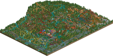
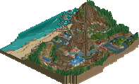
You nailed the mountainous landscaping. Tree/bush selection was a little unorthodox, but this entire release is unorthodox, so I suppose it only fits. It really felt like a park nestled in the mountains.
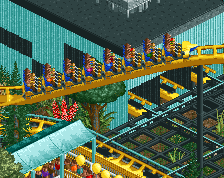
Coaster design was hit or miss. Nexus, Montanhoso, Alpendrachen, Raging Fire, and even the wild mouse and kingsnake were really interesting, some others were decent, but others just had me scratching my head.
Supporting rides were again hit or miss. The flats next to the kiddie coaster were surprisingly well done and fit nicely, as well as the double inverter ships. The log flume was subtle, but the drop stood out well. I liked the basketball court game, and I appreciate the creative object use there. There were a couple glaring examples, like the splash boats, where I think you could have developed the ride more. And I wasn't a huge fan of the rainbow playground.
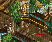
I like how clean and plain the architecture is. It ties the park together as a whole, and makes it feel continuous when scrolling around. It really lends itself well in areas like the Roto Drop's, Raging Fire's, Timberwolf's, Mountaineer's, and Montanhoso's. However, two pieces of advice for you: No flower gardens on roofs, and use less Wooden Post Fences, in the alpine section especially.
Overall, I'm going to put this right at 60%. It's a full, cohesive park with great landscaping, engaging architecture, and unorthodox ride design. A great first full-scale release. I can't wait to see how much you improve for your next release, especially after H2H.
A very nice park!
Some things i love:
+The landscaping! It looks very rugged, and i love that river and all the foliage.
+The waterwheel
+The entrance
Some things i would have done a bit differently:

-I think moving cars look a lot better
-Nexus has crashed, and Raging fire was stuck somewhere. Maybe something to check for before you submit a park. They're nice rides though!
-I always name my trackitecture. I like when you click any part of a ride you see the correct name.
I can understand you're happy to get this submitted, i cannot imagine working on the same park for over a year
Hate to be that guy, but here is a list of obvious mistakes and problems:
1. Upon loading the save, 10 rides are broken down and 1 is crashed, some are closed. Not good.
2. Your rides are either running too few trains or too many, after the adjustment you told us to do in the discord.
3. Block Brake systems. Sometimes you have them, sometimes you don't. The wild mouse is always stuck on Block Brakes and your GCI doesn't use the system despite it being easy to implement.
4. You use Eurofighter trains, but also the splash boats that make a stupid splash effect on the layout you have chosen.
5. Your rides aren't merged after the most modern method.
6. Your river starts at the top and then goes down in two directions. Did it start there? Why not just build the one corner higher except lower and have a sensible river?
I'm reluctant to rate this, because it's semi-CSO and that's not really my wheelhouse. But this submission is incredibly sloppy and kinda makes me question if you were invested at all into this park.
Since someone on discord encouraged me to rate it so here it goes:
40%. The Landscaping is solid, I don't like the rides, I don't like the architecture (especially the glitchyness) and there are some other mistakes. Due to the many issues with the release I've subtracted 5% from the score (so it would have been a 45% without the many issues related to the sloppyness of the release)
2. They're running just fine. All you need to do is turn on 'disable vehicle limits' and manually add back the trains. Sample: Nexus should have 2, Montanhoso 4-5, Mountaineer, 2-3, Raging Fire, 2, Timberwolf, 2, Hurrican, 2-3, El Grande, 2, ect, ect.
I don't know why that one coaster crashed.
3. I rarely use block brake systems as I cannot seem to figure them out. For instance, I'd use block brakes on Nexus, but I can't get the timings right so that a train isn't stuck overly long on the block brake section. The reason the mouse has one (albeit, long ones) because it is usually one of the ones I can do. If you want block brakes, add them.
4. i'm not as experienced using trackitecture, so I know, that water ride/splash animation annoyed me too. I didn't know how to fix it.
5. Modern method? No one told me about a modern method. At least they're merged and should be working.
6. i'll give you this one. It's stupid, I know, but I, now can't go back to fix it lol
Thanks for the critiques, V1, but hear my reasonings. Thanks!
Thank you all for the comments so far. I will certainly polish my next release far more, but I just grew too tired of this and released it anyways. Debut park.
I look forward to all the comments! Enjoy!
This is a very diverse release, while i enjoyed some areas really much, others felt quite odd. I really loved Montanhoso and the surrounding area, the interaction with the flume, the landscaping and the chairlift was quite good. Timberwolf is also a good and solid coaster, the surroundings and architecture feels much too rectangular in my eyes though. I also thought the RMC was quite solid. One point that bothered me a lot with your coaster compositions was that many coasters are made after the same formula: having the coaster go mostly not seen from the path and seperated from it and then have some elements over the path for interaction reasons, mostly that felt pretty forced and it made it look like you added coasters to you park and surroundings, instead of having both exist together and interact compostion-wise.
I enjoyed the look of the foliage and landscaping in some places (Montanhoso area), but in some parts it felt pretty random, almost like you used the scattering tool, i also think you used a bit too much textures and bush and tree types at all, so it was a bit confusing at some places for my eyes.
My biggest concern i have about this is your usage of CSO objects though, which makes it pretty hard for me to judge it. Everywhere where you used a CSO object, the stuff you've done could have easily been done with NCSO only, i'm not sure if i should see this as laziness or textural choice or whatever... it just left a lot of questions open for me about what you were going for overhere.
I think in the end as a panelist i would go for 55%, because all in all i think this is accolade worthy and i would love to see it getting one, but this has some problems too big to look over. All in all i think this is a solid first release for you though and i definitely look forward to see what you are going to do in the future.
Its clear you put a lot of heart into this, which in the end is all that really matters for a park like this and your first solo release. It also shows a lot of improvement from start to finish and displays a continual increase in you confidence when it comes to building, which is really important here.
There are a few things I would have liked to see cleaned up for the release, such as some of the rides being closed or broken down. Stuff like that is easy to fix but goes a long way.
As for the mix of CSO and NCSO objects, I honestly couldn't care less. Its so odd to me that mixing the two like this gives people difficulty when rating or viewing a park. A park is a park, and the objects used ultimately don't matter. It does a good enough job at what it was trying to do and that is enough for me.
Probably a 60/65 from me on this. Looking forward to seeing what you can do in H2H should you be given the chance.
Good job building such a large and immersive park, Blazing! I’ll break down my review into a few different sections.
Architecture – This was very hit or miss for me. Some parts I liked a lot, like the buildings around Alpendrachen and Nexus. Other parts didn’t do so much for me (most of the other areas). It just seems like a random collection of walls and roofs and textures and colors in some places. I’m also a bit confused by the NCSO status. Is this park describable as NCSO? I see lots of custom objects, and that begs the question, why build in an NCSO style if you’re using lots of custom objects? I’m just confused by it, and I think it comes out in your work.
Atmosphere – Again, like the archy, hit or miss. Some places are great, some places aren’t. I also will count the function of the park under this category, and on that, I’m afraid you missed a lot. A ton of the rides are broken down and repeatedly break down during viewing, and you’re greeted with warning message after warning message about it. It seems that even though you assigned mechanics, they’re not finding the rides, probably because the exits are disconnected.
Landscaping – The land itself is nice, provides a lot of depth to the park. The rivers/water flowing everywhere make things a bit confusing, but it doesn’t detract from the park too much. It’s just hard to read in some places.
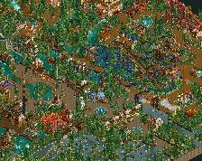
Foliage – This is one of the strong points. While it is a bit dense in places, its well done imo. I think you could’ve done without so many colored flowers everywhere; this park seems like its high in the mountains somewhere, but those make it feel tropical in some places.
Ride Design – Layouts were okay, provided a lot of interaction with themselves and paths. A lot of them I felt as though the pacing was too slow, and I was worried that trains weren’t going to make it through the whole layout. You should definitely work on this in the future. Also, use block-sectioned mode!
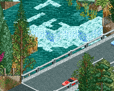
Surroundings – I really liked the interchange and the highway, but I wish you had hacked some moving cars to make it look more alive. It just feels sort of “there” right now.
Not sure how to score this one. I think its going to be a 55% for me. It’s clear that you improved greatly as you were building this, so I’m looking forward to seeing what you do next (hopefully in H2H)!
30% is a dick punch dude. It's clear there was time and effort put into this, and it does have it's nice points. I can understand you not wanting to give it an accolade, but a full 20% below the lowest bronze? That's pretty crazy.
This is a super hard part for me to rate, not because of the Semi-CSO, but because for every great aspect about this park, I find a negative one that just baffles me.
The first thing is the presentation, all the breakdowns are super distracting and detracting from viewing the park. Several of rides had reliability of zero, it takes two seconds to renew the rides in Open.
The foliage is another issue. Most of the park has great foliage, but then over by the highway there are all of those distracting colored plants. I also agree with Saxman that the stationary cars on the highway are distracting.
I did like the ride selection a lot. You had a lot of fun layouts, and you made sure to include enough interaction. The architecture varied, in parts it was very nice, in other parts it was very sloppy with distracting colors.
Overall this is hard to rate, but I think the good outweighs the bad, and I would give it a 55% and a bronze. Good job getting this finished
I can tell pretty well what came first and what came last; much like saxman noticed. As I've mentioned maaaaany times, you definitely outgrew this park as you worked on it. I need to take another look or two before I decide on an actual score, but I'm finding a lot of what's already been said to align with my opinions on this park.
+ Landscaping
+ The most recent archy
+ Ride interaction and surroundings concepts
~ Foliage; seems very dense. Good in places, not so good and distracting in others
- I know how the end of a park is; but I could tell you rushed through the last bits of this to get it released; you've got bridges missing railings, canvas roofs with no support whatsoever, and the aforementioned minor things like broken down rides that could have been fixed with a couple of cheats.
- Ride pacing; Some of the rides were very well done, others slowed to a crawl through the circuit
- Earlier architecture
- Wish those cars were moving!
Again, I need to take another look to truly decide on a final score for this park; but as it stands I'm thinking low bronze.
I really want to score this in bronze territory. But unfortunately there are just too many glaring errors in terms of park operation that gave the park a sense of sloppiness and unfinishedness. First, the best-looking coaster, Nexus, is crashed in the station...the Arrow looper with the sweet interlocking loops is stuck...guest complaints left and right...broken down rides everywhere..giant peep jam by Mountaineer....lots of unnamed rides....you get the point. I'll overlook those for the time being.
Your ride selection and sense of fun are the high points of the park. The coasters are interesting, with nice interactions, and you've got great ideas. I'm not as much a fan of some of the color choices you made, especially the pink/magenta flowers in the surroundings. Your architecture is pretty average, but I won't complain since it reminds me a lot of my first park, Snake Valley.....actually, the whole park reminds me of Snake Valley. Redlynch is perhaps a little better executed and definitely bigger though.
Overall, I'm not seeing anything more than about 45-50% work. I'll give it a bit more time, though, before I vote; I know how difficult it is to spend lots of time on something to only to not win anything. Perhaps it'll grow on me some more.
I've been waiting to see how this would turn out for quite some time, since you started teasing El Grande for Build-It! over on RCTgo. Now that it's released... well I have some mixed opinions on it.
Roller Coasters:
Probably what I'm most qualified to speak on here, we have quite a mixed bag. I'm not going to go over each but I will say that some really don't work (no pun intended with the constant breakdowns here), while others work quite well with their themed area.
I did however enjoy your creativity (as usual) with your ride selection, and I did like how you took inspiration from Busch Gardens Williamsburg, I just wish that instead of a Tempesto clone you would have done an Alpengeist clone.
Architecture:
Not bad, the only real complaint I have with it is the amount of constant clipping that appears all over the build. Mixing CSO and NCSO also doesn't bother me - use what you think is best for the build you're working on.
Landscaping:
As previously stated the river is a bit wonky, but overall I think you did a good job. There were some questionable choices with some foliage (flowers) but that's a rather minor nitpick in my mind.
I'm still not totally familiar with the accolades and how ya'll rate things around here, but I don't think the lack of polish here deems the build unworthy of a Bronze at the very least. If there were %'s between the intervals of five I'd vote it somewhere between a 58% and a 62% personally. I'll probably just round that out to a 60% on my vote.
I think the ride design in this was stellar. Especially Nexus really delivered with a great layout and some awesome interaction with the landscaping and the surroundings. Now as the name of the park says, "Redlynch Heights", it's all built on a hilly landscape. Therefore the trick with the terrain coaster elements that you have going with Nexus, is something that you did for a bunch of coasters really. It definitely makes sense, but after the 5th coaster it kind of takes away the wow effect, as they all intertwine with the landscaping in a similar fashion. Still you definitely did that very well.
The Loch Ness Monster type coaster didn't run for me, as both trains were actually stuck within the underground helix section. Not gonna alter the score or anything, just want to tell you to make sure next time that everything runs properly.
I wish you'd have put in some more water rides, a rafting ride or even just a It's a Small World - esque attraction. The coasters in this certainly stand out, but it almost feels like in return you didn't really put emphasis on the supporting attractions. You have a playground which is good and you have the car ride, but I'd generally want to see more family rides in there as well.
In regards to the foliage, the colors, and the density, I'd suggest mixing it up a bit more. As it is, it's all really one big sea of contrast and color, which is fun, but hard to read. Next time make sure it's more readable and celebrates itself more as a park with different parts than a terrain coaster showcase in a way.
Overall I really did enjoy the release, it's full of heart and love and looks like it was great fun to build. Some of the layouts and some of the layout interaction is awesomely done.
Are you interested in moving over to full cso at all?
you've got to consider how people will view your work. If i open up your park and see a big heapload of "can't be arsed" heaped all over it (rides not open/crashed etc.) how do you expect the audience to show any more interest than you have?
this is like submitting an essay for uni and it not having capital letters or paragraphs. it would have been so easy to fix, and the fact that you didn't makes it hard for me to vote highly.
this stuff is VERY important in ALL aspects of life. it might be perceived as unfair, and you may ask why we can't just look past it, but first impressions are important. you just turned up to a job interview with soup down your front.
the actual content i would place at a 60%, due to scale, and ability. like others have mentioned, there is a lot of variation in terms of quality as you move through the park. the coasters are alright, but still lack overall confidence and polish. all this comes with time though.
i am excited to see what you come out with in future, as your potential is already showing. maybe blast out a few designs before you tackle anything else large scale so you have time to refine your skills
This is a fantastic analogy, and I completely agree with the whole notion that presentation is everything in this world.
SSSammy, always dropping the knowledge bombs. =)
I do agree with V1's and Sammy's comments about presentation although I do feel people are somewhat exaggerating it a bit.
And I feel like deducting like 10% of score is a bit extreme especially cause it's only a few clicks to get things running smoothly (somewhat) but I guess people can view it out how they want.
This park is definitely solid, colours and composition are rather haphazard which can make the viewing experience not paticuarly pleasant.
Although I do appreciate the actual amount of rides and rollercoasters in this park, far more than most parks out there I would say, paticularly for its size. None of them stood out as groundbreaking but most of them were definitely solid.
I think this may score lower than what I originally imagined and part of me understands why. You've definitely got the skills and tool kit to produce very enjoyable and high quality work but you really just need that refinement to make those skills really shine.
Can we just take a moment and appreciate that almost every comment is a full review....I love this website right now. So full of activity and goodness.
Danni Offline
So I feel quite the same way as Poke does re: what you get when you open the park and all. I think people are over-exaggerating how strong the impact of those breakdowns should be on anyone's score (30% is far, *far* too low a score for this). I looked over this park last night so I may forget ride names quite a lot, sorry!
I gave 65% and I think it's bronze-worthy, here's why:
+ This park was absolutely great fun to look at and explore. You had lots of rides and lots of details to look for. For me, that is very important for a park to do, it has to suck you in and make you explore it. You got a lot of it right. Speaking of which:
+ Atmosphere was great, the amount of detail really did suck you in and make you look through the whole park.
+ Ride layouts are nice, Nexus is great and the purple invert (forgot the name, sorry!). I liked Fire Hazard too.
+ Architecture was well-done in some places, in other parts it felt a little...lacking, but I did like how it was done in the flat rides area.
+ Foliage was vibrant, energetic, and colourful. One of the stronger points of the park, in my opinion.
- The errors upon opening the park are sadly a little sloppy, but I feel it isn't so big an issue because it took a few clicks and everything was operating fine. Maybe you wanted us to interact with the park or something But you should have cleaned up a bit before you submitted.
- Some architecture was a little too simple in some places
- Some of the interaction does feel a little forced, but the double loop on the corkscrew coaster bugs me the most. I'm not usually big on interlocking elements, unfortunately.
- A lot of variety in the foliage may have held you back sometimes, especially in the most dense areas of the park.
Overall, for your first release, you nailed it. It's got some flaws, but it's a very strong release that I had rightly anticipated. Definitely worthy of a bronze. I do hope you go CSO at some point, you seem fairly confident putting some CSO into your (semi-)NCSO work.