Park / Arid Heights
-
 17-February 18
- Views 2,628
- Downloads 512
- Fans 0
- Comments 7
-
-
 43.50%(required: 50%)
 Spotlight Submission

robbie92 50% chorkiel 45% Cocoa 45% Jaguar 45% Ling 45% RWE 45% saxman1089 45% Scoop 45% CoasterCreator9 40% G Force 40% Liampie 40% Xeccah 35% 43.50% -
 Description
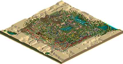
My personal love letter to the letter K.
Do me a favor and turn off plant aging if you're using Open. Lots of flowers in this one.
Thanks! -
 No fans of this park
-
 Full-Size Map
-
 Download Park
512
-
 Objects
1
-
 Tags
Tags
![park_4087 [H2H8 R1] All Coasters Go To Heaven](https://www.nedesigns.com/uploads/parks/4087/aerialt3818.png)
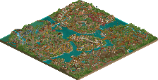
The logo may be the worst on the site, but in that regard it has a lot of added value. I enjoy it!
I agree with Liam in that the arrow was the highlight of the park to me. There were some other fun parts like the navajo area, which I thought was some unique NCSO. I didn't like how many trees there were though, it led to the park feeling cluttered in parts. Still, an early contender for Logo of the Year 2018
I'm heartbroken you feel that way about the logo. I pained over every pixel of it and quite frankly it's difficult to accept your criticism.
Being serious now, thanks for your feedback and the (very) quick release. As a hilarious example of my poor taste in these things, Outlaw was (well, maybe still is) my least favorite coaster in the park. I was pretty close to scrapping it, so I'm glad I didn't. Kanawa Kountry was also kind of an afterthought, the last little bit that I did pretty quickly because I was running out of inspiration. Maybe from now on I should just keep the things I don't like and scrap the ones I do.
I'd be much obliged if you kind downloaders could take a second and leave a rating (or even better, a comment) on this park, I'm very curious as to what the larger group opinion around here is.
Be as negative as you please. I can take it.
Except if it's about the logo.
This is a neat little park; it's cute and enjoyable. The coasters are unique and fun to watch, and a lot of the architecture, though simple, is charming. The foliage is a bit messy in general, creating a bit of a disorganized and cluttered feeling to the park.
Overall, it's nice!
i think the architecture is a little flat, its nice but not particularly interesting
other than that its very cute and it was fun to explore. the foliage is odd but works well with your coaster layouts. i especially the landscaping beneath high noon, its pleasing to look at
nice work!
PS the logo is genuinely the most gorgeous park logo ive seen in my life
I thought this had a fun vibe and an interesting atmosphere. Its certaingly rough and maybe 'naive' would be the right word, in terms of rct-maturity and refinement. But there are nice bits, like the jumping fountain area near the purple buildings which comes together well. keep it up!
While some of this was pretty good and definitely nice to watch, i think all in all it's not quite up to what i would call accolade worthy. As others pointed out it also has a very unrefined feeling to it and some pretty messy and weird bits. But you're definitely having a unique style and i would love to see some more of it, i'm sure with some practise you can improve and your next submission will cross the accolade border! 45%.