Park / Bates Motel
-
 14-February 18
- Views 1,936
- Downloads 612
- Fans 1
- Comments 8
-
-
 Description
Disclaimer :
- You need WW/TT to open this park.
- If you have OpenRCT2, block the weather to "storm".
- Please, for whatever reasons, never stop at the Bates Motel.
*********************************
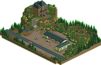
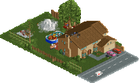
This was a quick project I built in some hours, I don't expect anything huge from it but it was really fun to build. I really enjoyed watching the show and I needed to translate it into RCT. Hope you will like it ! -
1 fan
 Fans of this park
-
 Download Park
612
-
 Objects
1
-
 Tags
Tags
![park_3112 [MM2014 R1] The Haunted Estate of the Fantastical Lord Fredrick Kent](https://www.nedesigns.com/uploads/parks/3112/aerialt2743.png)
Nice job with this. I haven't seen the show, so I don't really know what I'm looking at. That being said, I think the horror theme is done well, and I like the little gory details here and there.
And now for the elephant in the room: why back to single angle? I can understand if you were going for it looking like a painting (which is a cool concept), but the why moving car ruins that notion a bit. I'm not gonna harp on this too much, because I enjoyed the project a lot, but I think I would've enjoyed it even more if I could see the other angles and explore a bit more.
i mean great job n all but just make a fucking gif
It does seem weird that Julow stopped making single angle releases then went back to it. I would have really liked being able to at least see the rest of it when I rotated the camera, even if it was undetailed from other angles. Having my view blocked by a wall of black tiles is just annoying.
As for what I could see, I enjoyed it. I think the motel is further away from the road in the movie, but it is otherwise a nice recreation and the atmosphere was good.
Probably the best screenshot on the site.
The accuracy is quite cool; the ground textures were done exceptionally well. Nice atmosphere, just wish I could have seen the car crash scene from another perspective.
I haven't seen the show either, but I loved this without needing to, which was good. I'd like to see little ideas like these executed on a larger map, with some more stuff to find and look at. Maybe an entire map with just scenes or sets from shows/films you like? I'm sure to go back to this one once in a while just to see how well this works as some kind of sprite-art/moving painting. Please do more.
I can't help ignore the one-angle thing, though, because as shnupz says, you did all four angles for Cannibal, and it certainly helped. Initially, I tried removing the black tiles and walls but then gave up after 5 minutes due to how tedious it was. Mammoth was easier to clean than this. I hope you try a more efficient method next time
Thanks for the feedback, here are some answers :
- I didn't make the 4 angles because I didn't want to spend too much time on this project. I don't think what's here is very interesting for the people who don't know the show, so it was just a "quickie" for me and maybe some other people.
- The french project, Batman the ride and Cinecitta World are being build in all 4 angles, don't worry !
Great to see that some people enjoyed it !