Park / Volare
-
 14-February 18
- Views 3,380
- Downloads 504
- Fans 0
- Comments 19
-

-
 64.50%(required: 65%)
 Design Submission

trav 75% Liampie 70% posix 70% Steve 70% bigshootergill 65% Coasterbill 65% csw 65% ][ntamin22 65% CoasterCreator9 60% SSSammy 60% G Force 55% Xeccah 55% 64.50% -
 Description
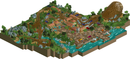
I'm happy to be able to present you 'Volare', my newest design creation! It's a woodie!
You all know i'm not the men of long readmes/introductions, so i wish you much fun looking at it, and make sure to leave a comment! -
 No fans of this park
-
 Full-Size Map
-
 Download Park
504
-
 Objects
1
-
 Tags
Tags
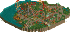
![park_4712 [NEDC5 - 05/10] Fireball](https://www.nedesigns.com/uploads/parks/4712/aerialt4594.png)
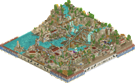
Architecture, theming and atmosphere was the strong point here. Good texturing on the buildings and tasteful use of the odd-coloured roof tiles. For the paths you would've been better off sticking with 1 texture.
For me the layout was a bit awkward. The diagonal straight-helix-straight ending in particular looked ugly. The overall footprint was quite nice however.
The composition in general was nice actually.
Sorry it's a short comment but there also wasn't much to spend time with here. Decent quality stuff but I hope you make some more substantial releases.
Things I liked:
* some colour choices; the red and a blue of the twister was a great design choice.
* atmosphere.
* textures of the architecture but also the underwater texture was a nice touch.
* the patches of brown shrubbery were done nicely.
* i liked how visible a lot of the coaster was for peeps.
Criticism
* the pathing was a mess, one texture would have been much cleaner.
* the shrubbey was overdone.
* the boats were executed a tad mediocre.
* i feel like grey rockwork wasn't the most atmospheric choice, brown surely would have suited the theme more imo.
* every single roof was peach which was a bit overbearing.
im sitting on 65% will have to think more about it
Good job.
Theming was prob best u ever built but man that lay out, composition and even map shape is just a blatant rip off.
+archy was very good. again a bit cocoa inspired but it separates itself enough to not be seen as a copy. the station especially was great. good choice to make the roof colors the same, even if not having a more bold color would have contrasted well with the equally dull path choice.
+- clusters of trees were alright, the random underbrush all over the place was bad. it led to clutter and no clean "negative space" on the map
+- queue was well integrated but felt a bit blocky in places (not to fredd levels though)
-bascially the same layout as nightingale, but not as good or not as flowing. this in it of itself in my eyes bars this from being a design.
-pathing detracted from the whole viewing of the plaza. the bridge especially shouldn't have had the
-the landscaping relied too much on the fake-looking lotr rocks and felt randomly placed where it should have been trees or just plain grass in its place. using a lot of ruins/lotr rocks/quartertile blocks is overrated anyway.
I really like the architecture here, it's great (even the pathway that a lot of people don't seem to be a fan of). It's warm, fun, atmospheric and technically impressive. Everything but the coaster is awesome.
Unfortunately, the coaster itself is a little lacking. Everything is from the station to the tunnel, but everything from the tunnel to the brakes is awkward and doesn't flow well. It looks pretty good from 2 angles, but sloppy from the others.
This is a tough call. I love it aside from the coaster, but the coaster should be the highlight of any design. I'm giving it a 65% exactly. I'm on the fence, I'd be at peace with this either way.
Wow. The archy in this was by far your best. Great step up from Parenzo. Also great interation with the queue. As everyone has already said I do see major cocoa vibes with not only the layout but also the archy (not a bad thing). The path looks 10x better with all dirt. Same feeling about the foliage and landscaping as others. Overall great little release. Stuck between 60 and 65.
Short comment from me, since what I'm going to say will echo everyone else. Archy was good, interaction was good, details were good (poor Ziscor), paths were bad, coaster was eh, the underbrush was not so good. The last thing was probably what kept this at about a 60% from me. In places, it just wasn't very cohesive.
Overall, a fun little park that I enjoyed looking at.
I love the archy, really well done and full of excellent details. The layout just feels really weak after the first half, and the rockwork feels random and sporadic, it doesn't really fit in well. I also agree with saxman on the underbrush and paths. There was a complete lack of negative space, I think there was only a couple tiles I counted with just grass and it could have done with more to break it up, but this isn't a huge criticism for me.
Since the main ride is the focus of a design and I have issues with the layout, I've given it 60%, which would have been 65 or 70 with a better flow. The excellence of the archy is not the be understated though, and you're definitely improving and I love it.
This was a bit of a shame for me. The archi and the details were great. the atmosphere was also on point, excellent work there. very considered and well executed.
then why does it feel to me that the coaster was your first draft? the most telling part for me is in the last helix, there is a straight piece between the small turn and the diagonal turn. this feels more like you were more concerned about fulfilling what was in your head rather than getting something that felt flowy and inevitable.
like many have said, up until the coaster goes underground, its really good! great interaction, i'd love to be in the queue when it goes thundering past and overhead, but then, ironically, it feels like your vision ran out and you tried to get it to the station with some arbitrary flapping about.
I'd love to see the same level of intent and consideration that you put into the atmosphere of your work applied to your ride design. i want to see you steadily refine a ride. this process may take a few days! you sometimes need to come back with fresh eyes, or go off and look at park asterix or stuff by RRP and louis and robbie or any other great ridemaker.
this isnt a design for me, because the (beautiful) archi and theming feels pretty perfunctory despite its competence, the actual content is thin on the ground and in a very narrow sliver of a small map. The landscaping and foliage also needs the same level of commitment you show your archi. the appliance of quartertile grass felt too patchy and could do with more focus to prevent it feeling spammy.
Honestly, I'm in pretty much 100% agreement with what Sammy said above. Especially with regards to the coaster itself and the foliage. The architecture was fun and obviously one of your strong suits. I'm waffling a little bit between 60 and 65%.
I thought this was pretty good, more so than I was expecting to be honest!
The coaster might be a bit samey, but I think it's solid enough. The architecture is nice for the most part. A couple of buildings fall into the typical 'RWE Style' trap, where the deco on the building becomes a bit nonsensical, but it's definitely an improvement overall.
The main thing I was missing from this was interesting details. Parenzo was great for this, where you put little details in to make it feel alive; sadly I couldn't find much here apart from the staff naming, so I didn't end up spending too long looking at the map overall.
Still, very solid work and I'm torn somewhere between 70 - 75.
Someone asked me on discord why I submitted it as an accolade submission when it was a fun build. The answer is that pre release many people called it design worthy, seeing that now a lot of people are agreeing to this also kind of shows that it might was the right step. I hope that makes things a bit clearer now.
I thought this was nice. Good to have fun and build with a free mind. Translated into great aesthetic unison and design flow. Also translated into pretty bare minimum substance, but not everything must be fully conceptually fleshed out. I think a project like this actually can work wonders for your follow up creations because you develop your stylistic routines of the moment, and that can mean great building speed gains. So well done in these regards.
Next time, I would advise you to lose some of the little water objects, some of the rocks, some of the little clutter you have here and there that just seems to overdetail something that should be done in a simpler and thus more elegant way. Right now it looks like you had moments of aesthetic insecurity and decided to fill to distract from them.
I didn't like the layout much either. Any comment why it looks so similar to Nightingale?
The archi is, as always with you, very amazing.
I didn't have a problem with the roller coaster, I usually don't really care that much about pacing, for me the most important is the aesthetic of the layout (I'm not saying pacing doesn't matter lol, it's just not very important for me if it isn't perfect).
Saying that, I didn't think it was particularly great neither. It was okay.
I think you need to be a bit crazier in some of your next ideas, your work feels sometimes a bit too polite.
I think I can't rate more than 60% because of the foliage and the grey LOTR rocks.
Still it's good for something you made in some hours !
Dang, that's rough.
I'm glad you took the casual approach to this. I think that probably helped you to relax and resulted in some really good archy.
Your main fault here is definitely the layout. Extended diagonal sections, the odd helix, and some jerky transitions made it feel off to me.
The path is also a bit distracting, but that's mostly my taste.
Overall, I think it's a toss up. In my eyes, if you improve, even marginally, you literally cannot miss Design next time.
Looking forward to your next project! (that hopefully takes longer than 14 hours)
Shame, I thought this was lovely.
Oh I only now realize I didn't give it a proper review yet...
You were always great with archy and the archy is for sure the best stuff on the map. You've managed to create a vibrant atmosphere. The path is a bit messy, should've sticked with one path type or placed it at least less random. I like the foliage and landscaping, they all contribute to a great atmosphere.
I don't really have a problem with the lay-out, it's solid but nothing more. You could have done more, for me it's a bit too short. Pacing is alright for me.
A bit of a shame you just missed out on design... Nonetheless a lovely piece of rct.
Ouch, tough break.