Park / Error - Park name not fou
-
 04-February 18
- Views 2,785
- Downloads 628
- Fans 2
- Comments 12
-
 39.50%(required: 50%)
 Spotlight Submission

posix 55% Ling 50% saxman1089 50% Xeccah 50% chorkiel 40% CoasterCreator9 40% Cocoa 35% Jaguar 35% Liampie 35% G Force 30% RWE 30% Scoop 30% 39.50% -
 Description
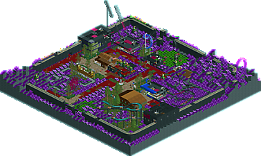
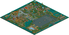
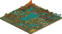
A rather... unique park, with some surprises that can only be seen by playing it.
----
original release: https://openrct2.org/forums/topic/2810-error-park-name-not-fou/ -
2 fans
 Fans of this park
-
 Full-Size Map
-
 Download Park
628
-
 Objects
91
-
 Tags
Tags

The pop-ups and intentionally corrupted things were a neat touch. You seem to have a knack for parks with unique concepts - if you can refine this into a larger release it could be very interesting indeed.
Same like the other park, i like the concept, but it could definitely be refined a lot in my opinion.
cool concept and execution
Thanks for everyone who took the time to take a look at the park. Creating this park was one of the most fun things I have done in OpenRCT2 so far.
Looking back on it, I could have probably done a better job on the station building of the log flume, but creating nice buildings is an area I still am improving in with every park that I create. Corrupting some of the buildings was a nice way to hide my current lack of skill in that area (wink).
I agree with RWE, it's a good idea but it's not pushed to the max and feels rushed. The squareness of the map doesn't help in my opinion.
Still, it's cool to see some people trying things like that !
Keep building
weird. I was scared to click on anything for fear of error trappers. funny idea though- I would love to see it pushed to some real potential similar to ivo's work, but maybe with a bit more 'plot' and 'world'. that would be very cool
You really went all-out on the train hacking for this one. The ride names are all hilarious, especially the extra ones. The -1 train length and the river rapids trains were also really good. With how much effort was put into the park it was kinda sad that all the employees had default names, it kinda broke the immersion a little.
Solid gimmick release!
I agree with RWE here. Mind making a more "updated" and refined version of it? I still really enjoy the park overall, even though I think it could be refined closer to its potential.
I think purple even combined with the name ERROR
I loved the effect of the train, very crazy
Congratulations by imagination
Sorry not to see this win Bronze, as the conceptual effort here is significant and original. Deurklink, thank you for the diversity.
As original as this was, it was lacking several different things on scenery such as archy and posts imho.