Park / Space base (on an unnamed planet..)
-
 17-February 18
- Views 2,758
- Downloads 699
- Fans 2
- Comments 8
-
 46.50%(required: 50%)
 Spotlight Submission

robbie92 60% Jaguar 55% Ling 55% bigshootergill 50% saxman1089 50% ][ntamin22 50% RWE 45% Cocoa 40% G Force 40% Liampie 40% Scoop 40% Xeccah 40% 46.50% -
 Description
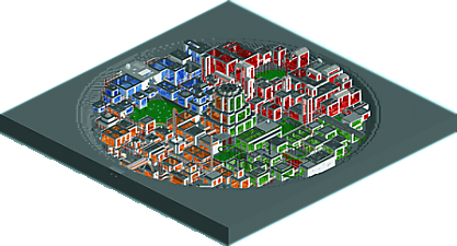
This park is made to look like a base on an extraterrestrial planet. As a restriction to myself, i wanted to have all areas where peeps could walk to be inside. I ended up covering most of the rides as well. It has many vehicles flying around high above the base, and is covered in high-rise buildings.
This park was not originally intended for posting on NE but some people convinced me to do it anyway because they told me it looks very unique. It has some objects and car types from the expansion packs. But hey, rct2 + expansion packs is only $10 now on steam :wink: Not expecting to win any accolades here, but hey, who knows.
A build log of the park can be found on the openrct2-org forums.
----
original release: https://openrct2.org/forums/topic/2715-space-base-on-an-unnamed-planet/?page=2&tab=comments#comment-17965 -
2 fans
 Fans of this park
-
 Download Park
699
-
 Objects
120
-
 Tags
Tags
![park_3411 [H2H7 Finals] DisneyPunk](https://www.nedesigns.com/uploads/parks/3411/aerialt3046.png)
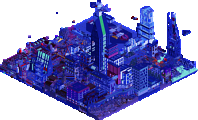
I think the overview doesn't do justice to the size of this thing, its impressively huge. Although the shapes of the buildings was a bit repetitive and simple, they were crammed full of fun rides and ideas. The way you layered the rides, particularly the monorails was really nice. I'm enjoying these fun fantasy parks you're uploading recently. It's clearly what you enjoy building, and they're always unique.
I agree with iron rattler. Other than Postapocalyptica which I gave 50% your parks haven't in my mind been accolade worthy yet. Chronologically you've been improving with every park, and they have all been fun and interesting to see with lots of interesting details. I'm very eager to see how you improve from here
its a really interesting concept. i appreciate the effort that went into making the architecture less repetitive but it wasnt enough for me. i started to get bored exploring the park and looking at white walls and colored glass everywhere
im super into most of the ride layouts and ideas. the ultra twister was fun to watch through the curves and centrifuge is a pretty layout
not bad! the archy is definitely a bit samey and all the rides feel a bit like they're just in boxes with not a whole lot more purpose than that. to take it to the next level, I'd suggest having the theme be a bit more pervasive than just a architectural style/ color scheme. A coaster or ride should be meaningful to the theme- for example, you could have a coaster themed to the rocket pads which involves scenery relating to launches/rockets or a ride relating to power generation or mining which relates to the infrastructure meaningful to those bits of themes. Of course there's infinite possibilities, which is what makes parkmaking so amazing and creative, and not just an exercise in building the same structure over and over again (with different colored windows )
)
Hope that helps give you a idea where to take things next, I think you definitely can be a bit more intentional with your themes and create some awesome stuff.
While this again showed some potential in terms of ideas and concepts, it still lacked the technical skill and the micro management i would expect from a accolade worthy submission. I can definitely see that you're improving though, you're next step should be focus a bit more on the little thing, try to put more effort and thought into every single object you're placing both in terms of a macro and micro composition, and i'm sure you'll create some amazing parks. You've got all the potential you need, it just needs to be shaped now. 45%.
I figure I should leave a comment on this since I'm voting on it. I tend to agree with RWE's comments. The concept is cool for sure... some of those rides were pretty neat. It's clearly evident you have a creative streak in you, it'll be interesting to see how you develop it. You need a little more finish to hit bronze I think, but you're close. I always recommend building something on the smaller scale for one's first attempt at accolade worthy submissions, either a small scale park (even smaller than an H2H size park) or a design. Keep building!
I gave it a 50%... borderline bronze for me.
Fantastic simply loved it.
Impressive, the imagination of the players.
The rockets looking like they are flying and landing were super nice.
The effect they are taking off has been incredible.
Great job, I liked thema, in the future I will try to do something similar to this park, I like space theme.
This is ridiculous, I kind of love it. Layouts are solid. Structures are super repetitive but that's basically my only complaint.