Park / Zitterwald Park
-
 08-February 18
- Views 3,520
- Downloads 675
- Fans 1
- Comments 18

-
 57.50%(required: 50%)
 Bronze

Poke 75% Coasterbill 65% csw 65% CoasterCreator9 60% Cocoa 60% G Force 60% SSSammy 60% bigshootergill 55% Liampie 55% trav 50% Louis! 45% nin 45% 57.50% -
1 fan
 Fans of this park
-
 Download Park
675
-
 Objects
466
-
 Tags
Tags

![park_4252 [H2H8/8] Toreador](https://www.nedesigns.com/uploads/parks/4252/aerialt4038.png)

![park_4161 [H2H8 Semifinals] Disney's Fairytale Kingdom](https://www.nedesigns.com/uploads/parks/4161/aerialt3928.png)
![park_4087 [H2H8 R1] All Coasters Go To Heaven](https://www.nedesigns.com/uploads/parks/4087/aerialt3818.png)
![park_4234 [H2H8/8] Blizzard Bay](https://www.nedesigns.com/uploads/parks/4234/aerialt4061.png)
Wow! Where did this come from?
I absolutely love this. I often compliment parks for having an old throwback style, but that's often code for "This is a lot of fun, but technically unimpressive".
That's not the case here though. It IS a ton of fun, but it also showcases a ton of skill.
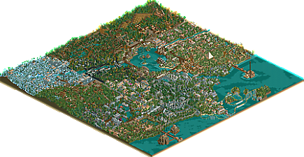
First of all, it's very pleasing to look at on a macro scale. While the park isn't much for hyper-detailing, it doesn't have to be. It's incredibly pleasing to look at, and it's clear that a lot of thought went into the placement of things.
Things like Reise durchs Mittelalter, the main gate area and Alice in Wonderland are amazingly charming. Seriously, this is some of the better macro RCT2 work I've seen. The park actually almost has a Loopy Landscapes vibe to it.
In addition, your layouts are quite good. Sure, they're not Jagganath, but they flow nicely, the pacing is good and they're fun to watch. Seth was probably my favorite, but the larger, more unorthodox ones like Spitzen Racer and the wood racing coasters were a ton of fun too. Honestly, there isn't a bad one in the bunch (though I don't quite get the 4 mph brake run before the helix on Jungle Express, otherwise I like that coaster a lot though).
Sure, the park's not perfect. The layouts can always be improved, and your foliage has a lot of room for improvement too, but this is the most exciting, totally out-of-the-blue release by a brand new player in recent memory.
I hope you stick around and become a part of our community for years to come. I love your style, and you should be very proud of this park. You'll win an accolade for sure.
its clear you spent a lot of time on this and you enjoyed yourself making this. your ride design is definitely good, and i think playing consciously will get the rest of your parkmaking skills up to shape.
The layouts were a strong point for me; the interaction between the rides and other park elements was great fun. Bill pretty much nailed it with the strengths being the macro scale and overall appearance being pleasant to look at without requiring many little details. The size in and of itself was rather remarkable with the themes separate but blended just enough to minimize jarring transitions. Pretty exciting to see such scale from a new player, and looking forward to more from you.
I agree with all above. Wasn't sure what to comment when I saw this park because I was blown away by it. Bill summed things up nicely, can't wait to see what you come up with next!
I also agree with the rest. You seem to have a good eye for macro, composition and ride design. It has this old school vibe to it that fits just so well with parks of this type.
BTW, to any of the old RCT-Guide people.... Am I the only one who was reminded of Coalinghe's Forlindon while watching this?
Definetely a great park. Reminds me heavily on old school rct-world NCSO style. It was incredible fun to look over this park. The ride-scenery-path interaction is pretty good as well as the atmosphere. Overall a nice and unexpected release.
holy crap this was bigger than I expected. a lot of good details and little scenes in here! I probably missed a bunch too...
my favorite areas were definitely the space area (wow), the entrance, and the area with Oasis and those islands. they felt the least 'generic rct2 area' also. you clearly have a lot of skill and are just on the verge of putting it all together. I'd love to see some themes that branch out from these a bit more. theres a lot to like here, and its a bit overwhelming. definitely unrefined and undetailed also- on the whole it reminds me a bit of butterfinger's euroscape or the really early rct2 parks. a really solid first park though by any means. would love to see areas separated a bit more and with more meaningful differences than wall/roof colors in the actual construction of buildings. good stuff here though, I'd say solid silver probably. hard to guess on these though.
I really like this, very old school and fun to watch. There was just so much going on I could keep watching and there was always something new to discover. Really nice work!
I would have been less surprised to learn that Jimmy Hendrix is still alive, then to see anything rct related from you ever again. First of all, you and doomsday were big reasons why I got hooked with rct back in the day and the stupid youtube-channel we started together is the sole reason why I still am.
That said, I loved this park. Threw me back in time like nothing I´ve seen in years. As has been said, I like the interaction between the rides and everything else. The layouts, wich I always thought one of your "weak points" were solid here (except the vekoma inverter) and the theming and park layout is sooooooo Jonas. Forgot how much I liked that about your work back in the day.
The best parts were the space area and for me personally the jungle area. Just really liked the feel and the atmosphere in it. I have no idea where this will rank at the end of the day, but you should be proud to have released such a big park, after such a long hiatus at this quality.
if I´ll ever find the time, I may put together a video for this park on our channel, let me know if you´d be down for a recording session. Would be my pleasure.
I really hope this wont be a one-off.
Liebe Grüße
MCI
Thank you a lot for all your comments, your compliments and critic for the Park. I'm really happy that so many enjoyed the park.
To be honest, I'm not completly new in the RCT2-scene, some people may know me as Jonas from rct-world but its definitly the first very big Park i completed and i wasn't playing active for severeal years, so some kind of a New. Thats maybe why the old school Style can be found in the Park also.
@coasterbill: Thank you very much! Well, don't aks me about the 4mph break run, i really can't explain why its there... But the foliage, your'e right, is always a big problem for me. I really love that thick overdone foliage and its hard to come away from it.
@cocoa: Thank you a lot. I'll will have a closer look on different architektures of the buidlings next time.
@MCI: Thank you for your comment. Over the years of Inactivity, I've seen many Roller Coasters in real or in youtube-Videos, so that might be the reason for the better Layout design, knowing, that they can be improved though. And for sure, if we can find the time, let's start a recording session.
@all: Thank you a lot for the compliments. I'm very pleased you all like the park and i really wasnt expecting such a good rating.
And sry for my english, it isn't the best really but I try my very best.
So glad to see you here! I also really like the park, it feels really nostalgic and reminds me of the old days on rct-world! Will we see more from you again in the future?
@RWE: Yes, i really hope so. There will be more in the future from me. At the moment, I'm working on a smaller Park, so something is in work already.
Quite the split in terms of voting!
The fact that this received some votes below 50% is a travesty......
Congrats on the accolade!
Thanks for the congratulations I'm happy to get an accolade for the first upload. I hope i can even improve myself next time, i know my weaknesses and what to work on
I might be late to the party, but I love the old-school feel to this! I'd give this a 70%.