Park / Terra Ventura
-
 28-January 18
-
 TerraVentura
- Views 5,775
- Downloads 754
- Fans 2
- Comments 21
-

-
 69.00%(required: 60%)
 Silver

Kumba 80% Poke 80% trav 75% Fisch 70% G Force 70% SSSammy 70% Coasterbill 65% CoasterCreator9 65% Faas 65% Liampie 65% nin 65% Xeccah 60% 69.00% -
 Description
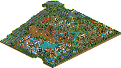
What if the makers of Port Aventura opened up a new park from scratch?! That was more or less the idea while starting up this park. Port Aventura has his influences on Terra Ventura, my second solo park.
Terra Ventura contains 5 coasters which all offer unique experiences to its riders. All this in a heavily immersive theming.
OpenRCT2 only. -
2 fans
 Fans of this park
-
 Full-Size Map
-
 Download Park
754
-
 Objects
97
-
 Tags
Tags


+decent theming
+size
+-architecture was fine in most places but it still is a little too large scale-wise. some of your structure forms are awkward and dont help the flow of the path at all. the best looking thing in the park was definitely that church in havana.
-awkward path layout which forces peeps to double back through half of it. also some of the hard corners (where you squared off the path instead of curving it) felt weird and hurt the composition.
-ride design was weak. rmc, eurofighter had no flow. hyper and lsm coaster were fine but nothing memorable.
-your queues really need work. they're usually just squared off and hardly any love or effort put into them to make them look good or feel organic.
-foliage was also really weak and the colors chosen were really distasteful and distracted from the viewing of the park.
60%
Woo, TV is here!
I took a decent-sized chunk of time to look at the park. Most things were well done, and it kept me immersed for a while. I followed from the park entrance, through Greece, the Outback, Cuba, and then finished in Bali. The rest of the things are going to sound super negative, but I promise you I did enjoy the park! I just want to give you the things I disliked, so you can maybe improve on them in the future.
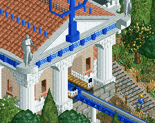
The Greek theme seemed a little cliche with all the blue and white, but it didn't detract from the viewing of the park for me. Poseidon was a fun ride, although I thought it was a bit too long. The dark ride in Greece was neat, I enjoyed the cutaways immensely.
Moving on to the Outback. I thought this was probably the weakest area of the park. The RMC was okay, but not great. The train choice was a bit weird, given that we now have great custom RMC trains. The layout also was a bit odd. I didn't mind the weird inversions, but it lacked the proper speed in a lot of places, and didnt give me the "out of control" vibe an RMC should. As for the outback theming, I would've liked to see more normal sand as opposed to the red sand, and some different foliage/more brush that really matches the types seen in the outback. It just feels a bit too bare now. Finally, at the plaza for Bunyip, I come to one of the major detractors in this park, the peepability. I personally think peeps are extremely important in the grand scheme of things. They make the park feel alive! This peep jam at this plaza could've been easily fixed by adding an invisible underground pathway to the Greek hotel (EDIT, I found the path you made, but it was disconnected... I don't know if I did this or not). I know you're not a fan of peeps, but I think you need to consider peepability from the beginning of a park if you plan to make it peepable.
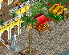
Now, for Cuba, which was the strongest part of the park for me architecturally. I loved the buildings, and that church is great. I didn't like the Eurofighter that much, tbh. Why u no use eurofighter trains?! In addition to that, it takes some inversions way too fast, like Donald's nose and the cork over the queue line. The double down on the way to the cork is also really weird looking.
Finally, we come to Bali, which I think is the best part of the park. The archy was nice, the interaction and layout was nice, and the coaster is good. Could be a little slower over the airtime hills, and it needs a predrop, but I'm just nitpicking.
Overall a nice park, and I'm imagining it as a solid silver, but we shall see what the panel says.
As a new member to the site mainly involved in the discord, and an exclusively NCSO player so far without any real portfolio to show, I know that my critique here does not hold much merit. I'll do my best to be objective in this and I'd be interested to see how my perception of this release differs from more experienced members.
With that out of the way, I'll start, going area-by-area.
Greece was a real mixed bag for me. The architecture was great, the foliage was comfy, the boats were cute. I loved the surroundings and it was amazing, except for a few things which really let it down for me. The way the path dead-ends at the swinging ship feels unnatural, really breaking the flow of the park layout. I strongly believe that connecting it to Australia by going under the second drop of Bunyip would have made a huge difference, and honestly that drop and the double-up next to it look perfectly suited to some interaction anyway, it was a hugely missed opportunity imo. Poseidon suffered with a janky layout. It felt stretched out and was badly paced. It went well up until the turnaround surrounding the first waterfall, but afterwards it all went to shit, hitting the mcbr really hard and feels a lot like you built the architecture and theming first (which was good) then tried to fit a layout to interact with all of it. I really did enjoy the cutaways on the dark ride as well, although i was a bit sad to see the interior empty when looking with the cutaway view.
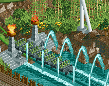
Australia felt much the same to me. The theming and architecture was interesting and unique, and I loved the flat rides (especially the RFD one!). I'm not a fan of the texture work and overuse of corrugated steel, but that's me being an Australian and getting nitpicky about the authenticity of the theming. The landscaping and foliage was well done, but I did feel like there was way too much completely empty ground, some extra rocks and shrubs to fill in the negative space (but not overfill it) would have been lovely. The big issue is in the layouts. I won't lie, Bunyip absolutely sucked. Great station and a solid opening, and I loved the rotundas in the queue (I agree with shogo on most of the queues not feeling organic, and the same applies here. The rotundas were cool though). It just felt so bulky and flowed badly, and that wasn't just because of your choice to use wooden track over a custom supported steel track (a minor annoyance, but I understand how aggravating that can be to build) and that car type, An actual RMC train would have been much nicer (you can edit the train friction in-game in orct so that shouldn't be an issue). The layout just had so many bizzare element choices between the Dive/turnaround thing (which was fine, I think) and the final turnaround. The second inversion being a direct copy of the one into the dive loop felt uninspired and the pacing was bad too. The double up was ugly and that weird twisty thing afterwards was just... why? The log flume's final drop could have done with a smoother roll-out and a longer splash zone, but I otherwise loved the ride. The massive peep trap at the merry-go-round cannot be understated, it really lets down the entire park to see that.
Bali was nice yet also had its downsides. I loved the rice fields, the show on the island, the landscaping and most of the architecture. That red tree object is hideous, and I feel like the bamboo was overused. What was there could have been sunken into the ground for varying heights to make it seem less samey too. Though I liked the archy (felt like there was too much brown though) it all felt much more small in scale than the other areas and was and as such seemed off. The hyper has the best layout in the park imo. It did hit some elements a bit fast, but it looked really imposing and fun to ride. I disliked Yami Yami's pond dive turnaround. The splash boats were really well done, so cute! Lovely layout, station and first drop. The bridge was cute too and some good interaction. The whole area was nice other than some off-scale buildings, but the red tree objects stands out so badly.
Cuba was the strongest imo, the architecture was consistently well done and I don't have anything negative to say about it. The church was a highlight for me, and I loved the cute little tank and the drop tower. The Eurofighter on the other hand felt like a huge letdown. The first element just looks painful. I'm not sure if it is something that can be seen on a ride somewhere irl, but train races through it way too fast and I felt like aesthetically it didn't appeal to me either. The train also went through the second half of the layout way too fast, and the whole thing felt extremely short. The interaction was lovely, but overall I really disliked it and felt like it should have been either a longer or smaller in scale to begin with. The theming for it looked dirty more than I think you intended. I get the war theme, but it looked unkempt and abandoned more than intentionally gritty.
The car park and park surrounds were good, don't know how to judge this as I really just haven't been to enough parks irl, the car objects were terrible though. It wasn't the clashing art style, I get wanting to have actual cars over finding something that matches the game better, but they weren't actually made in an isometric perspective from what I can tell, which is extremely weird to see and looks like it came out of the disaster bench.
Overall I gave it 65%, it was certainly enjoyable to open up and view and for the most part was excellently themed and pretty to see, but with some glaring issues preventing me from rating higher. I definitely preferred FUCK, but I hope you don't take the criticism this park receives in a discouraging light but rather a constructive one, because it was actually a good park.
Regarding the horde of guests that looks like some kind of holy pilgrimage to the carousel, they can be flushed out by altering the connectivity of two paths.
On the subjects of both connectivity and flushing, the guests who get stuck are the ones looking for the restrooms. They can't find them because they aren't connected to the paths. Only in Cuba are they provided with accessible accommodations.
I connected the commodes to the main paths, and it eliminated the jamming in the Outback. There's still a swarm in Bali, but those who can actually find the toilet are now at least able to use it rather than having to pee off the bridge into the splash boats like before.
Terry Inferno, on 29 Jan 2018 - 04:13 AM, said:
I actually loled at this.
Thanks for anyone who gave feedback. To me, this is clearly a step up from FUCK but I know it has its flaws too and I still have a lot to learn, so I'm gonna take Shogo's advice and do some more smaller projects in the coming future.
Let me explain some things:
- Why the Eurofighter didn't have the EF trains: it had them, but on one day they were suddenly gone and replaced by some glitching weird shit. So I replaced them back to the trains they have today so not have to deal with that issue ever again.
- Why the RMC did have a weird train choice: I started building the lay-out with beemertrack. It was good, it tested all good. Until I put the RMC trains on, they didn't ride as good and nearly or didn't make the track at all. I tried to change the friction settings but I didn't got the result I wanted so I used these trains as a more fitting train than the beemer trains.
- Guys, believe me that I tried several times to get rid of that peep jam in Australia! I redid the path several times, with zero clearances off. But they kept jamming there and I came to a point I didn't really care anymore... Apparently the solution was right in front of my face and I didn't see it. Should ask someone to look at it. (I didn't notice the peep jam in Bali...)
- I'll never again place the peep facilities after I've built the park. I promise.
I agree with most of the stuff Shogo said.
+ I liked the church and the train station in Havana
+ There were some pretty atmospheric parts, like the train crossing next to the playground in the Polynesian (?) area? and the water ride drop in the cliff next to the rice paddies.
+ I liked the log flume supports.
- I didn't like two of the layouts. The quirky elements on the Eurofighter and the RMC were awful if you ask me.
- The path layout and architecture was terribly blocky and chunky. Try to free yourself from the RCT-grid.
- Let's not talk about the peep issues.
Some small things:
- Why does the entrance say "Greek shop"
- Isn't it La Revolución, not El Revolución?
- The cars on the parking lot look hideous. Why did you use those objects?
- Some tree choices really stood out in a bad way, distracting the viewer.
- The log flume splash section is way too short, that corner would kill people.
Especially some of these small things could have easily be fixed if you spent ten minutes more just checking everything or letting other people check the park. Why did you send in an almost unfinished park?
Mid-silver for me. 65%
I agree with just about everything said above. It's a neat park with a pretty cool aerial. I enjoyed it.
An absolutely incredible release, Fred. Loved everything about it.
the things that this released suffered most from is failure to redraft rides enough and failure of planning the paths. it had a tonne of atmosphere and i really admire the scale and scope of it. sadly i need more from the rides to give the score this really could have got.
I totally enjoyed the park. The overall atmosphere is quite amazing as well as the theming.
My favorite area was definetely greece. The architecture was fantastic and the Poseidon coaster also.
The weak point was for me the outback area, i thought the theming was a bit dull, also the RMC layout was not my cup of tea.
Also the huge peep jams were a bit annoying, hopefully you can improve you path layout a bit to avoid this.
All in all this is a solid gold for me.
While in places perhaps not a definite Gold for me, it was great to see a park with character and individuality. The use of bold colours and a devotion to the originality of main rides was something I'd been missing for quite some time. Thank you FredD.
Nice.
Pros:
+ Unique coaster layouts - Perhaps not the most fitting where exactly they were placed (looking at you, RMC) it was fun none the less to see some more unique ideas put into play along the lines of roller coaster elements and design.
+ Atmosphere - Specifically the Asian section; really gave it the feel of a nice theme park that I enjoyed.
Cons:
- I'm going to echo what Faas and Shogo said as far as this goes; they basically touched on everything I would have said. Primarily the reliance on RCT's grid in a path and architecture sense as well as a bit of a generally awkward park layout as a whole.
Minor things:
> Those car objects.
> Bit of an oddly trimmed map shape, specifically around the main roadway.
Overall, an enjoyable release that shows a lot of potential. I think I would have voted 67-68% if possible; so I think the score is right on.
I finally found my time to review this. As said on discord it's a 70-75 for me, so the voting is a bit low in my opinion. Still something to be really proud of definitely!

Pros:
+ Cuba: amazing area with some cool details and architecture that is really great to look at.
+ Intamin: might still be one of my favorite coasters from you. The layout and the theming are really beautiful, i love this area.
+ Swinging ship: might not be everyone's favorite, but i loved it.
+ Hotel: we should see those more often again in parks. It also shows of your focus on macro, which is something i generally like about this park.
+ Bali: Do i spot some map racks overthere?
+ LOD-sign! Everyone's hyped for that park, not wondering myself you put it in here!
Cons:
- car object
- open spaces in the australian area didn't really worked at the end for me.
- RMC layout, i'm not good at layouts myself, but that one didn't really worked in my Opinion.
- some of the foliage isn't my cup of tee, i still do like the rice fields, but especially the foliage in the middle of the park feels pretty random and a bit rushed. Maybe you should care more about that in future projects!
All in all a very nice solid release! Can't wait to see what you'll show us in the future!
Lots of things were done really well, a lot of it was great work, but a lot of it also felt unrefined.
I think its a shame you just missed out on gold, but I can see why.
I don't think this is as good as FUCK, but it's nice all the same, I wonder whether you rushed it, the surroundings were a bit pointless and sloppy.
The Asian area was great, the Med area not too bad, Cuba could have been better but was pretty decent, but the Outback area just was lacking and brought the whole park down.
Nice layouts too, well except for the Gerstlauer, that needs burning down and scrapping
Good job, I'm interested to see what you do next, I'd like to see a couple of designs where you really polish your work up and go that extra mile to create a fantastic piece of RCT, you can do it, I just think you need to do it on a smaller scale first.
Nice park. Good job. I liked the spacious areas the most. So Asia and the mine/western part that wasn't a big block of wooden coaster. The colors in your entrence area weren't my cup of tea but I really liked the composition and atmosphere. The objects in your car park where my biggest gripe with a second place going to the oddly colored trees near the woody.
Also; why are some parking spots covered and others not?
I really liked this. While it was a bit rough around the edges, your work always features a ton of originality and uniqueness in a community that can be starved for both of those things at times.
This actually reminds me a lot of Stotsky's old work. The scale is all over the place and the quality varies wildly throughout the park but it's so much fun to look at that it's hard to really care.
Highlights for me include the hyper layout (aside from the odd curved first drop), the custom flats and basically everything in Havana.
The biggest cons are probably the things I mentioned earlier plus the area near the flume. The flume itself was weird (though the supports are cool), and the surroundings were really bare.
Overall though, there's a lot to love here and your unique style continues to be a breath of fresh air.
It was a really fun park to explore.
It's cool to see some craziness with the layouts, like for example the eurofighter which was kind of interesting to look at.
It was clearly unrefined in some places, I don't think the object choice for the cars was a good idea lol and foliage wasn't very well done for me... but it was made with a lot of love and that's very powerful.