Park / Euclid Beach Park
-
 21-January 18
-
 Euclid Beach Park
- Views 6,005
- Downloads 844
- Fans 3
- Comments 22
-
-
 62.00%(required: 60%)
 Silver

Coasterbill 70% SSSammy 70% bigshootergill 65% nin 65% posix 65% Sulakke 65% CoasterCreator9 60% pierrot 60% trav 60% Liampie 55% Xeccah 55% Poke 50% 62.00% -
 Description
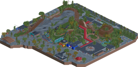
A semi-recreation of a once proud East Cleveland staple.
Euclid Beach Park operated from Spring 1895 to September 28th, 1969. -
3 fans
 Fans of this park
-
 Full-Size Map
-
 Download Park
844
-
 Objects
1
-
 Tags
Tags
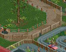
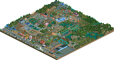
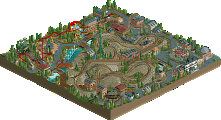
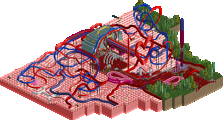
This is insane.
I actually had a really weird range of opinions while viewing this. When I first opened it I really didn't like it at all but it REALLY sucks you in after awhile and I'm at the point now where I absolutely love it.
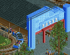
The pavement is so well done, Over the Falls is awesome and the station really sucks you in with a "Knoebels Boats" vibe, the Racer station is perfect (as is the structure on the turnaround) and the "deliberate ugliness" is really cool.
I expect a wide range of votes here. Objectively, a lot of these buildings are very blocky and technically basic but they feel real. 70% from me. I feel like that's probably a bit high, and I feel like it's realistically too small for gold but I can't justify giving this anything lower. It's great.
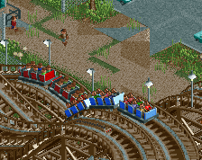
I really like the look of this. The paths are a bit overdone perhaps, and glitchy too. But other than that this is as distinct as it gets for bare bones American realistic stuff. Entrance gates, the long path awning, the rotor and maze ride, all pretty cool. I also liked Racer's station setup, but the trains weren't synced.
I also think that you cannot cut a park in half and still submit it for spotlight. Since the map is centred around one ride/a combination of two inseparable rides this would've made for an excellent design submission. Why you went with spotlight is a mystery to me. I'd say this is a design, but it's not a silver.
Wait, this isn't a design submission?
It just doesn't feel like a park, feels more like Liam's Python design.
Idk, I feel like this is sort of like a H2H park, and most today those are spotlight submissions and not designs. Regardless, I always built it with the intention of a spotlight submission and not a design, had I done that it would have been different.
I agree, this doesn't look like a design submission to me.
Anyway, I enjoyed this park a bunch. You definitely captured the old, run-down feeling very well, and your architecture matches the theme very well. The buildings were simplistic, yet interesting (something I fail at consistently). I also liked the PTC layout, felt super classic and old school. Also, did you use a different color palette? It feels muted in a good way.
Some cons: Those busses. Yuck, but matched the theme. The miniature train model you chose is a bit too new for being built in 1920, I think a steam train would've worked better. I wish you opened up the roof of the Colonnade a bit more, it would've been nice to see what else is in there. Finally, I just wish there was a bit more of it to look at.
The color pallet is actually the "hipster" pallet from #diamondheights, works really well with this park I think to give that more vintage look.
As for the train, the track was built in the 20's however the train itself was updated sometime in the 50s with the more modern look. The CTR spacek made almost looks exactly like the real thing. Maybe I should have explained that a bit more in game. As for the Colonnade, yea initially I wanted to do a bit more with it, but it ended up being the last thing built and for the most part any inspiration to do more had left me. Its not the most exciting thing but I did want to include a little bit of a cutaway regardless.
As for the parks size, yea its not huge, and probably only about 40% of the real parks total size, but honesty outside of one or two elements the rest of the park just isn't that interesting to me and there really isn't much source material or references available. Probably over 80% of the media you can find on the park is basically from this section, which is where most of the rides were obviously located.
Thanks Bill! I'm really happy with how both the Racer and Splash Boat ride turned out, the archy isn't perfect but its probably the best I could get it without differing too much from the source material.
The real Racing Coaster wasn't actually synced either, almost all the clips I can find show one train going over the first drop well before the other. I wanted to try to go for layout accuracy and fitting it into the correct space more than anything, so sacrificing a bit of timing was alright with me.
Overall I'm fine with people not thinking that high of it accolade wise, it was more of an experiment style wise and I really only built the parts of the park I wanted to build. It's not perfect but I'm happy with the end product.
I stand corrected, that train is almost definitely an Allan Herschell G-16, literally the same train that they run in Knoebels and what spacek based the ride on. I'm glad it ended up getting some use outside of Knoebels.
I thought this was quite fun and certainly earns some points for accuracy from me. I was a little disappointed that more wasn't included such as the beach and pier.
Very well-executed, and i think this may have been a silver if it was done fully, or at least showed some of the aformentioned beach. Right now it's oddly cropped.
I feel the same as Coasterbill. The park doesn't blow me away when opening first but it kept my attention for longer and I kept viewing around. I think you nailed the style you were going for. It all feels so very old yet familiar.
The flume is pretty cute. Thriller would be in today's standards still a pretty fun coaster to ride imo. I also think you went crazy with the paths, you could easily lost the road lines there without effecting the atmosphere at all, and it would look a lot cleaner yet still having that dirty look you wanted.
Overall pretty good submission. I don't mind it's oddly cropped... but what is it?! I'd say this is design all over it, since it is a part of a park you cropped out. It doesn't really feel like a whole park so for me, so I don't get the choice for spotlight accolades either.
grats on the silver!!!
yeah, i think this got around the score it deserved. i was aware i would be in the higher end of things with my vote. i liked certain parts of how dreary and depressing it was.
however, it did suffer from greyness and overall lack of meaningful content. the context of a lot of the components was really dull, so it makes me wonder why you would bother emulating this, but clearly you are a fan of the real place and i can understand that.
I think this is great, I think you accomplished your goal well. I hope you keep with this use of some of the harsher/grainier textures in your future parks, even if it's not necessarily with the rundown look. Something I try to incorporate myself.
As mentioned, the path was a bit too beat up compared to the rest. Perhaps basing it on larger concrete blocks could have been interesting. Like 2x2 or even 2x2 in diagonal.
Anyways, it's inspiring and makes me want to build myself, and I can't say there's all that many releases that offer that.
Take this with a grain of salt because I've only looked at the overview: The cracks, planters, and a lot of the roofwork is all very distracting, to the point that it takes away from the project rather than adding to it.
Overall a really cool idea though, and similar to what I've wanted to do with Natatorium Park in Spokane (but never will). Definitely a fan of this period-type work.
I like this park really much. The overall atmosphere is great and the different color palette is a really good choice overhere. I also really liked both woodie layouts and that little ride with the horses.
Other than that, this really suffers from the greyness, as SSSammy pointed out. I also had some weird feelings about these roadlines, they looked great on screens, but looking at the park in the game, they felt overdone and unnecessary. Same goes for the mowed grass, i don't know why every second 1/4-tile needs to have something on it, i would definitely prefered some more interesting details instead.
All in all quite a solid release though and congrats on the silver. I think voting is kind of right for me.
65%.
Amazing release, I really liked the foliage here and particularly the (new?) custom trees.
I think the path was a bit too grey but I guess it's difficult to have the perfect option for this.
As always, very tasteful and effective.