Park / Chione
-
 19-January 18
- Views 4,339
- Downloads 699
- Fans 2
- Comments 11
-
 67.00%(required: 65%)
 Design

Liampie 80% Coasterbill 70% CoasterCreator9 70% csw 70% Iron Rattler 70% nin 70% G Force 65% Kumba 65% pierrot 65% posix 65% chorkiel 60% ][ntamin22 60% 67.00% -
2 fans
 Fans of this park
-
 Full-Size Map
-
 Download Park
699
-
 Tags
Tags
![park_4120 [H2H8 R4] Ruigrijk](https://www.nedesigns.com/uploads/parks/4120/aerialt3860.png)
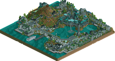
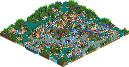
This release really is an epitome of your style.
Minimalist without being bare, cartoonish without being unrealistic, repititive without being boring. Sterile but still fun. Old-fashioned yet groundbreaking. Wide paths, dense foliage, varied terrain, a solid but somewhat forgettable coaster, little semblance of codex usage, flat rides seemingly placed just so the coaster isn't alone.
Some of these things I don't like, but most of them, I do. I'm not really expecting new releases from you that push the envelope, but that's okay, since I like your style just fine as it is. You have figured out your RCT niche, which is something most people can't say.
All that nonsense being said, I really like this piece of RCT. It feels very refreshing and is probably close to your best work. Keep up the good work!
Woa this really isn't what I was expecting from the screen you posted. It's way more chaotic and weird and all the better for it. I particularly like the layered theming around the flume/back of the hill. A crazy mixture of textures which appears somehow warm and mediterranean and icey at the same time. I disagree with csw that you're not 'pushing the envelope' - this is way less classic than most of your work.
Beautiful landscaping and path work in places. Sadly feeling underinspired still. Like you're trying to use certain shapes and combinations just so as to be different. That can't be fun?
If I was to psychoanalyse you from this piece of RCT, I'd say you need more clarity in your life to be able to reach more depth in your creative outlet.
Fair?
I really liked this. I don't know that I would describe it as "Chaotic". While it's not as clean as a lot of LL work, it's not exactly "Thoughts" either.
I actually like it a lot. It's a unique color palatte which is rare in LL. It's a nice break from the typical grey and brown stone walls and roofing tiles which I liked. It's also nice to see the introduction of snow and ice textures that DON'T look like shit. lol
As for the coaster, it was very nice. The beginning was akward and "Great Bear-ish" but it worked since you built it into the terrain and then it flowed beautifully into the helix.
I wasn't a fan of the half loop into the midcourse but you brought it all back in the second half with a nice finish (which was a cool break from the typical double corkscrew invert finales).
Glacial Falls was a nice compliment also and the monorail thing was confusing but sort of cool.
Overall I like this a lot. 70% from me.
I'm viewing this in openrct with the new LL wall textures, so I wont end up voting on it. The backside of the hill area is really good with the flume & Colosseum curves. I think it could of used more of these elements without resorting to 1x1 or 2x2's for the rest of that area.
I liked the coaster, i had trouble figuring out the end run section as it was underground. I thought the minimal use of custom supports was unnecessary compared to something like "X".
Overall I enjoyed the early spring / late winter type atmosphere. Strong Mediterranean vibe. I find your style on this to be very dense and micro oriented, the only breathing room I could find was the paths and the rivers. This is just preference as I tend to enjoy more open areas with easy readability when looking at LL parks.
This was fun to look at. Most of what I think has really already been said so I'll mention what I said on Discord; few things have made me want to sit down and experiment with new things in RCT like this did - excellent work.
a couple more votes guys !! )
)
I definitely think the heavy use of the ice walls gave a really unique style to this design. I thought the coaster was a fairly standard layout, though I felt it was a bit weaker on the back half. I think its big strength was how well the layout was integrated into your map and buildings.
I'll agree with Alex that the best area on the map is the back half of the coaster by the log flume and Colosseum. I wasn't as big a fan of the wide open path area. It looked out of place compared to the dense area in the middle. Overall I think the atmosphere is fresh and creative enough to easily score a design.
Congrats on design! I've enjoyed your burst of productivity, Poke.
wow this is awesome. vibey, large, aesthetic LL. and a unique sort of construction too, with the icey/lush green vibe. solid work. I really enjoyed everything- full of cool details and great composure. the log flume and its surrounding archy real stuck out to me also. its also all a great example of how to integrate the centerpiece ride into the park as a whole. awesome. I would have given it 80%