Park / Veteris Shores
-
 25-December 17
- Views 9,698
- Downloads 1,068
- Fans 13
- Comments 43
-

-
 84.38%(required: 80%)
 Spotlight

Cocoa 90% yes trav 90% yes CoasterCreator9 85% yes csw 85% yes Fisch 85% yes G Force 85% no posix 85% no Kumba 80% yes Xeccah 80% yes ][ntamin22 80% no 84.38% 70.00% -
 Description
Happy birthday!
-
13 fans
 Fans of this park
-
 Full-Size Map
-
 Download Park
1,068
-
 Objects
419
-
 Tags
Tags
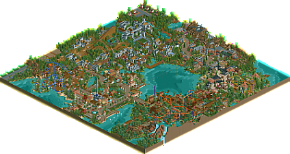
![park_4217 [H2H8/8] MS Office Suite 2003 Resort](https://www.nedesigns.com/uploads/parks/4217/aerialt3972.png)
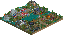
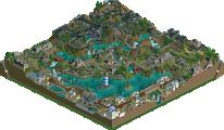
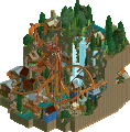
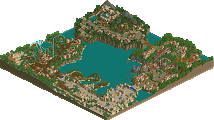
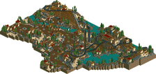
Congratulations on the spotlight win. To me, this is the park of the year. Perfect area composition, excellent layouts, wonderful architecture, and a refreshing mix of old and new objects and techniques.
Just a few of the things I loved about this park: the Cider Gulch architecture, the foliage (especially around areas with water), the QUEUE LINES, and the perfect balance you achieved between buildings, rides, and scenery. I just love the way you construct your queue lines; it's a really simple thing that a lot of builders neglect, but with care, you can turn the queue itself into a sort of adventure ride, which is exactly what you've done here.
I voted 85% due to a few park layout flaws and the (relative) small size of the park, and some small details in the medieval and asian areas, but to me, the park is a no-brainer on the spotlight vote. Add in the fact that a large chunk was built on mobile, which blows me away, and you've got a legendary park. I was hoping you'd top the 85% total score mark to get you to the next parkmaker tier, but I suppose a spotlight of any score is still very commendable.
This is how I want every park of mine to look like: a thoughtful combination of fun, color, and theming, with razor-sharp attention to detail, but not so much that it's overpowering. Which is exactly what you achieved with Veteris Shores. I will definitely be coming back to this park for inspiration or ideas in the future, even if I'm not building with custom objects. Congratulations again, you and this park deserve it.
Congrats on the spotlight Steve !
To be honest, this is not really my style of RCT2 so it didn't do much to me but it was built with a lot of good taste, for sure !
Probably a 80% for me, can't wait to see your new project (if there's one soon ) !
) !
when is the full scale overview coming? i dont have rct for another week
Lot’s of people already went into all the details of this park, I’ll just go over it one more time and note all the things that I’ll notice.
I like how every zone has it’s own separate identity. Architecture, path, atmosphere… It’s all great. They may not be the most original themes apart from the industrial area. The Asian area especially is great. This is how I wish JWAK’s Asian area looked like…
Coasters are very well integrated. Not much to say on those. I especially like how most of them fly through the landscape and buildings.
One thing that I didn’t really like were the houses and the attempt to make outskirts. This is a park that really didn’t need this as I consider this to be more semi-realism instead of realism. It didn’t hurt the park but I found it unnecessary.
I wish I could build like this. It’s so laissez-faire and laid back in it’s approach but not sacrificing detail and style for it. I hope you’ll continue building because this is awesome. More of this please!
Congrats on the Spotlight, Steve!
Well done mate, you really deserve this!
Lovely park, loved it.
Congrats on the Spotlight!
I absolutely adore this approach and concept. Unusually this is a park where I'm completely in love with the scenery, architecture, and atmosphere. It just feels like the classic "NE Style" park down to the tiniest details.
Juniper Island:
The Juniper Island Canal Boats caught my eye almost immediately. The foliage throughout the whole park is rich and stunning and adds so much, and that is especially true here. "Steve" as a waving Panda in the tower. That the stairs wrapping around the buildings actually lead up to doors and roof accesses. All the individual shops. The old-school ticket booths leading through to a fountain. The "summer" music selection along with the colors and textures for the flowers and buildings... Absolutely wonderful.
I'll dig in more before commenting further. I'm very happy that you took the time and this is absolutely worthy of spotlight in my book. For the atmosphere and attention to detail.
Well done Steve. I'll hopefully write a review before too long. I loved this park.. equally as much as Riverland actually. Highlight for me was your compositional skills and how flowing and natural everything looked.
Awesome park! Sorry it took me so long to get to this one, but it was worth the wait.
I wrote this while viewing it, so I basically just divided it into some pros and cons. Believe me though, the pros far outweigh any cons...
Pros:
- For some reason, I love the use of the standard RCT style queue and non-custom supports. It's a cool, old-school style, but the park still feels modern. Overall it has a really cool vibe.
- The canal boats were a great touch. They added a lot of atmosphere.
- Thresher is a ton of fun. Fun layout, great colors, great surroundings, A+
- Nezha... wow. Great queue, great colors, the whole ride area is fucking fantastic. This almost feels like a combination of old school Faas and modern day Robbie.
- The Skyway is adorable.
- Your Asian architecture across the board is fucking gorgeous. All of the architecture is great, but that's on another level.
Cons:
- Cider Gulch awkwardly block stops for like 30 seconds every cycle on the lift hill because the dispatches aren't timed. It seems like such an easy fix too. It's minor, but one of those small details you can't help but notice. It creates a cool dueling element, but there are other ways to do that.
- I'm really not a fan of Kingfisher. The layout is awkward and doesn't flow at all. It has the same problem as Cider Gulch where it awkwardly stops on the lift on every cycle and the layout feels off. I like the section after it comes out of the cave and before the mid course, but everything before and after those areas feels odd.
... and actually that's it. Lots of pros, very few cons. Overall this park is phenomenal. Congrats on your Spotlight. You've earned it.
Ow didn't give a review on this one yet? Sorry, guess I was still drooling on Ghoul, I think you understand that Steve.
When opening this park it made me feel like I was thrown back in time for 10 years or so. Wat the fuck did you do Steve? Get me back to my own time! But since I'm in a theme park anyway I'll enjoy it anyway. There are worse places to be stuck at... imagine to be stuck in a Battle Boy park he Steve.
The entrance zone feels quite welcoming and relaxing with all those pastel colors. However I felt disappointed when I found out you didn't make them entirely from quarter tile blocks. How will you ever hit the object data limit and be a cool rct2'er Steve?! You know you are only cool if you hit that.
I like you did a maze. We don't see that kind of rides too often and you've implemented really well. Or is it just a trap to catch me Steve? Is it?! Like put Freddy in the maze, he'll never come out, let's have a good laugh hahaha.
Off to Ka Hallu which could easily be the name of a school over here. Lucky for me, it appears it isn't a school but just another theme zone. First of all I want to ride that big blue coaster. Tresher, seems really close to Trisha which is a tramp female singer out here. You really know how to chose the names of your rides Steve.
Tresher is a cool ride, great pacing and flowing. And great environment you've created around it. I like the volcano. You know what could have made the coaster even better Steve? Stand-up trains! Nothing better than a wild ride on a stand-up coaster.
Off to the medieval area because I really want to ride that woodie #nohomo Oathkeeper is the name, which is very close to goalkeeper. Maybe you should have tried a soccer theme here?! Just spreading some ideas out... It's a cool ride, has everything I'm looking for in a woodie: long ride, fast and a great ending #nohomo I feel it's a bit of a shame the first drop is turn away from the publics view. But also, you could have built the worlds first wooden stand-up coaster! I feel like you missed out on a great opportunity here. Who doesn't want a woodie to stand-up? #nohomo
There seems to be another coaster in this area. But it's the same one from Walibi Belgium so I don't mind riding it. Done it so many times before. And it isn't stand-up either. But I do want to ride those log flumes, from which you have a great view on the woodie. I don't only like to ride woodies, I also enjoy looking at them #nohomo
Off to the industrial area which looks way nicer than the industry zone around my city. Steve, please come to Ghent and redesign our industry zone so it can look as pretty as this please. I don't know if I can ride the cider mine train since I don't drink alcohol. But ok, since I'm here anyway why not. It's a cool mine train ride that does give a seven dwarfs mine train feeling. But I wouldn't know that for sure since I haven't ridden that coaster. Nor have I done a dwarf. Again, you missed out on building the worlds first stand-up mine train coaster! It would make it more realistic too because I almost always have to stand up at train rides.
Off to the Asian zone of the park which you named Yau Qu. If you pronounce that it sounds like Joke, which is a female friend of mine. Do you know her as well Steve? Is this area built for her? Because Joke isn't Asian I can tell you.
And there we have the obligate old arrow/vekoma looper coaster. You know Steve, most parks are renewing this kind of coasters... by placing stand-up trains on it for example. The coaster is implemented well in a great landscape with the queue flowing trough it. Would love to queue here. Not to ride the coaster actually, I'll skip that. Love the pink trees!
On to the tikal zone which I first thought was African. Oops. I love the colors of the inverted coaster. Great choice. The lay-out is fantastic, love that mini first drop on the hill followed by a loop and dive loop diving into the mountain. Great! Still however... Imagine the people if they would see the worlds first inverted stand-up coaster! This could have been huge Steve!
I also love the splash boats, I always enjoy those. Especially when there's a big splash at the end #nohomo You've built a pyramid in a sober but refreshing way. I like that. I think I've seen the whole park now. Time to get out and get back to 2018.
So all foolery on a stick. You managed to build a park in a style we were used to years ago but with a modern touch to it. It does feel like a park that could have been built ten years ago but one that would feel like it would came from the future if it were released ten years ago. The park is very atmospheric, there's a great vibe going on. It are all fun coasters to look at, I think custom supporting would make them look even better. Congrats with the spotlight, well deserved. I hope it won't be another 12 years to see another Steve solo park.
Here is a video review of the park:
https://www.youtube....h?v=Q-AMqD9Tya0
not bad
a bit shit
shit. now that you've bumped it I see above I said I would review it :/
@alex do it
good start
josh why do you bump this like once a year lol
Still waiting on that Alex review tbh
Seeing a park like this makes me so envious of your natural style.
I tell myself "oh it's just a four corners park" "oh there's plain exposed landtiles with blocky shapes" "oh the buildings are just 2-3 layers of wall with rectangular rooves" "oh it uses actual path instead of many-angled path blocks" but I can't figure out how you make such simple, classic design decisions look so good. Every area has its own unique feel with distinct color schemes that all work well together. It's hard for me to even describe what you do well because it sounds so simple, but your ability to compose scenes with just path, buildings, plants, and rides is just so on point. If I had to try, I think it's your ability to layer and make every perspective interesting combined with an extremely clean style and a great sense for color and cohesion.
Some guys (like me) are only good at this game because other people make great objects that enable us to layer tiny details 6 times over until we compose something believable. Others (like Steve) are great because they don't need fancy tricks or objects, they were great 20 years ago before any of that was possible.