Park / Knoebels Amusement Resort
-
 25-December 17
-
 Knoebels Amusement Resort Recreation
- Views 13,529
- Downloads 1,280
- Fans 7
- Comments 24
-
-
 68.75%(required: 60%)
 Silver

Fisch 75% G Force 75% Xeccah 75% Cocoa 70% nin 70% CoasterCreator9 65% Liampie 65% Poke 65% trav 65% posix 60% 68.75% -
 Description
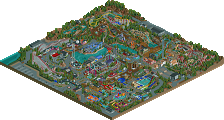
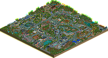
Welcome to Knoebels Amusement Resort in Elysburg, Pennsylvania, America’s largest free-admission amusement park. Make new memories the old-fashioned way with classic rollercoasters, kid-friendly rides, swimming, camping, and attractions for the whole family!
OpenRCT2 Only -
7 fans
 Fans of this park
-
 Full-Size Map
-
 Download Park
1,280
-
 Objects
1
-
 Tags
Tags
![park_2369 [H2H6] revoLLutionists - Cars Land](https://www.nedesigns.com/uploads/parks/2369/aerialt2121.png)
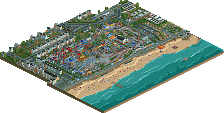
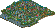
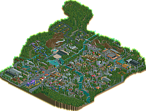
America must have its grid structure everywhere and I feel like this is the city grid of the NE parks. But that's by no means negative, as despite this grid, and despite the grey colors that are so connected to generic American parks, I felt like this had a lot of authenticity and genuineness about it.
Now obviously it's a recreation, so the park layout is mostly something you implemented into rct from the existing park. Still it shows that the park means a lot to you as you tried to recreate even the less important aspects with a lot of detail and liveliness. I enjoyed the fact that the park was so full of peeps and that you and your helpers added all these different flatrides that Knoebels has. The new trains and boats are another great feature.
There was a lot of ingenuity in the design of the different rides. Twister was my favorite coaster of the park I'd say. I wish you'd have made that little custom carousel swing with the umbrella seats work though.
The shows, the Haunted Mansion, the diagonal chairlift, the blacksmith, the custom playground, and the roll-o-plane were some of my other favorite details.
To give you some points on what to improve I'd generally want to mention the color scheme though. As has been mentioned before, it's all very grey and contrastless. There needs to be more contrast for readability and for general aesthetics. Additionally the amount of absolutely samey rooves without further roof details is kind of bothering. I didn't check to see if it's exactly like this in real life but it's certainly a bit plain and repetitive for modern rct. Try to include more flowers to break up the green foliage as well and give them a strong color that adds more life and vibrancy. At least that's my taste.
Overall a great job and a very genuine approach as I said to what could've been come an overly lifeless park in its rct translation. I feel though, that despite the grey, you did very well to make it feel lifely and worthy of further exploration and then had enough cool details to back it up.
Congrats on the accolade!
Hey Sax, congrats on the silver. A very solid and strong debut park. I think silver is just about right. As much as I loved the quirkiness and the overall atmosphere, the park lacked that cutting edge, that usually defines a gold. But with this park as your first, I’m sure you’ll have a very bright future in RCT.
This creation of yours, is rather interesting. Because normally, this kind of park wouldn’t do anything for me. There are almost no elevations. There is an absurd amount of grey. There are grey paths and grey roofs everywhere. The foliage is extremely repetitive. BUT, somehow you made me like it. It’s like your love for Knoebels shines through. The park has something that is hard to define. It has heart if that makes sense.
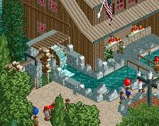
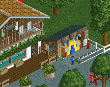
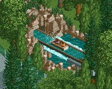
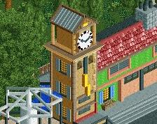
It’s actually a very pleasant and likeable park that you’ve built. The little stage with the band, the little drum set are really cute. The dark ride with the cut away is cute aswell. The little building with stonewalls, near RotoJets is really charming. The log flume is wonderful and the diagonal chairlift is really, really good.
Yeah, there is something very charming about this park, regardless of the cons. Good job.
Take your time with your next project. Experiment with different objects and different textures. Don’t be afraid to add more colour. Looking forward to your next release.
Another round of responses!
@spacek: As I said in the readme, your work on this park was amazing. From all the CTRs to the subtle VB hacks, you made the park better than I thought was possible. I am glad that after your research on the park, you can see all the effort put in to make this park as much like the real park as possible.
@Jappy: I know you were the one who originally suggested the off-white path, and I'm sorry I didn't use it in the end. As I stated earlier, I felt it was more important to get the gravel texture right, and the color matches what is in the park IRL. It was a ballsy choice going in, and I knew I would get shit for all the grey. In hindsight, I maybe should've made a new object with the correct texture and an off-white color. As for the archy, I probably also could've taken more liberty with the roofs and some of the plainer walls. Again, this was a choice to be truer to the park than to RCT, and it came out in the voting. I'm glad you saw at least some charm in it, and I knew of course that you would enjoy the trains. =)
@savoytruffle: I'm glad I was able to take you back to your memories with this park! In all honesty, that's what I was going for when I started this project, albeit for myself and not others. I'm glad that others can enjoy it in the same way, and I'm honored that my park is now one of your favorites.
@disneylanddude: Glad you liked the park and the flats. I meant to fix the slide issues before the park was uploaded, but I honestly forgot about them. Every time the rafts return to the top (hidden in the trees), they get stuck if the ride breaks down.
@FredD: I won't say much about the paths as I've said it all before. I can assure you the trees aren't randomly spammed on the paths, I spent a lot of time reviewing and redoing where they were placed. In the real park, the trees grow right through the gravel path, because Knoebels tried to minimize the number of trees cut down when building the park. I tried to achieve the same vibe, which may have been better achieved with some of the larger trees as others have mentioned. The archy is also a little bland because its that way in the real park. I should've embellished a bit more. I'm glad you liked the custom flats and the campground.
@Fisch: Thanks for your review. I'm glad that even though you've never been to the park, you were still able to appreciate some of the little details I put in. The blacksmith and woodshop area was one of my favorites to design and build. I agree about the problems you mentioned, and I just want to say that they resulted from being a little more true to the actual park then I should have been. Finding that balance for recreations is hard, especially when you're trying to recreate a park like Knoebels, that has a ton of charm that's "just there" and isn't really due to one thing or another.
@Lagom: Thanks for taking the time to review the park! I'm so happy that you were able to see past the grey and see the charm and effort that went into this park. I hope what you are feeling is the innate charm of Knoebels, which is really hard to describe in words. My next project will bring much more of myself rather than trying to recreate things, and of course will bring some different objects and colors.
Found this cool video of a drone flight at the real park, made me happy to see similarities between my park and the real one from the proper point of view. =)
https://www.youtube....h?v=biVqTQOylKA
Here's a video review of this park! Really nice work at faithfully recreating the real thing with some fun details.
https://youtu.be/yXsk5mGG-k4