Park / Knoebels Amusement Resort
-
 25-December 17
-
 Knoebels Amusement Resort Recreation
- Views 12,250
- Downloads 1,153
- Fans 7
- Comments 24
-
-
 68.75%(required: 60%)
 Silver

Fisch 75% G Force 75% Xeccah 75% Cocoa 70% nin 70% CoasterCreator9 65% Liampie 65% Poke 65% trav 65% posix 60% 68.75% -
 Description
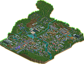
Welcome to Knoebels Amusement Resort in Elysburg, Pennsylvania, America’s largest free-admission amusement park. Make new memories the old-fashioned way with classic rollercoasters, kid-friendly rides, swimming, camping, and attractions for the whole family!
OpenRCT2 Only -
7 fans
 Fans of this park
-
 Full-Size Map
-
 Download Park
1,153
-
 Objects
1
-
 Tags
Tags
![park_2369 [H2H6] revoLLutionists - Cars Land](https://www.nedesigns.com/uploads/parks/2369/aerialt2121.png)
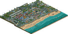
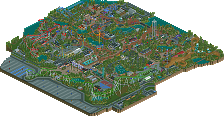
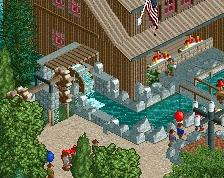
Its been super awesome seeing this park progress in screens up until now. You've ended up with a great park, and you should definitely be proud of it. I don't know the park and the quality of the recreation, but there's some good stuff here. Some bits are a bit more unrefined (and "squashed" feeling) in terms of detailing, but I think its obvious how much you grew throughout the process. There are some really great moments, some of which you've shown screens of, like the restaurant with the waterwheel and the haunted mansion. Some bits, like a few midway games and big pavillions, felt a little underdone. But on the whole it does come together.
One thing is that while I really appreciate the overgrown tree vibe (I truly understand how important that is to the vibe of the park), I think you could have pulled it off a lot more effectively with liam and other's bigger, multi-tile trees. they would feel "fuller" and more covering where it feels a bit eclectic and distracting at the moment. something to keep in mind for the future at least!
great work on the park though, and looking forward to more from you. Its not a spotlight from me, but I'm not sure you're expecting one. I imagine it'll easily fall into gold, but you never know these days
Thanks again for letting me build on this. It was a blast watching this park grow, and watching you grow as a player as you built it.
You really nailed the Knoebels vibe. Hopefully that's not lost on people who haen't been there, but either way this park stands on it's own.
Great job!
I haven't really reviewed too many parks since I stopped doing videos. In general, I find it easier to just talk about what I think about the park. Alas, one of my new year's resolutions is to review more parks on NE, since that might help me find my place in all of this. I intended to wait until New Year's but since this is a big release, and since you are such a helpful and pleasent presence on the discord, I think this and you deserves to be an exception. As with my old videos I will put my review into the form of a trip report with a summary at the end.
A Day At Knoebels
It is a beautiful Saturday morning. I arrives at Knoebels yesterday and pitched my tent in the local campground. It was a special and great feeling to camp in full view of a pretty majestic wooden coaster. I'm not so sure about the pathing used in the campground but I guess aesthetics isn't the most important part here, anyway. The tents and RVs that share the ground with me are definitely good looking and add to the atmosphere. The small playground is very cute and looks fun. Knoebels has several things that make me excited to be here: Exciting flat rides, a great reputation and of course, the main source of my excitement: Phoenix. It's not really a surprise that this world-class woody would be the first thing I will do on this day. Before I can do that, though, I have to get to the park. I cross a bridge over the tracks of the local miniature train. Even though a miniature train obviously isn't as tall as a regular train, the bridge seems a bit too low to allow the train to properly run under it. Since Phoenix is my first goal, I ignore the convenient park entrance to my right, but take a small detour past some buildings. The buildings are quite nice, but nothing to write home about. The trading post however, is really to my liking. I cross the creek and are already in the park and right next to the main attraction.
Before I ride Phoenix however, I pass by some well build flat rides and a nice little house. There are two really good looking buildings that flank the “entrance” to the area in front of Phoenix. On the right stands a quite beautiful german-style building containing a vendor and on the left stands the nice looking station of Gasoline Alley, a car ride running along Phoenix. The station of the woody itself is somewhat underwhelming and seems underdeveloped. The entrance also wasn't as highlighted as I thought it would be. The ride itself is exactly what I expected it to be: Full of airtime. Upon exiting, I notice the building of the food court for the first time. While the roof over the seating area looks quite nice, the building containing the actual vendors looks quite bleak and boring. My great ride on Gasoline Alley makes more than up for it, though. It really is a good looking and well built car ride. I look at the map and decide to continue with the next woody. I walk past the german-style building and walk alongside Flying Turns taking the opportunity to make some photos in the cool viewing area built inside the ride. The area between the creek and Flying Turns is quite nice in itself. I cross the bridge over the creek and Twister comes into view. The coaster itself is probably the best looking thing, since the buildings aren't exceptional (but still decent). The layout feels somehow forced, especially the huge helix around the station, but there was probably no other way to do it. Sadly, I also had to wait on the top of the hill on my ride. The ride ops really should have more attention to the timing of the dispatch. Right next to the coaster is the water park, which I ignore. It looks really nice, but I'm not into water parks enough to make a judgment.
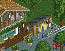
I walk back across the bridge and head towards Flying Turns. On my way I discover a unique and really good looking ride, that has vehicles with sails on them. I pass by a really good looking stone house before finally entering the queue of Flying Turns. The ride is about what I expected, so I can't complain. I will complain however, about the overuse of Grey roofs in the area. One of the buildings with the Grey roof also has too many colors for my taste. After all these coaster rides I decide to calm down a bit and play mini golf on the nearby course. The course is definitely nicely done and lovely. I decide I wanted to ride the Giant Flume next and ride all the flat rides on my way. I really have to say that I like the busy atmosphere the park has. The Giant Flume itself is nice, but I am a bit confused over the wide basing it uses in parts. Seems like a weird choice for this type of ride. The ride-op sitting at the start of the final drop is a nice touch, though. After getting soaked, I enter my least favorite part of the park: this area is dominated by a huge black building containing Black Diamond, an old Wild Mouse coaster. I don't mind the ride, but the building really is an eyesore. It doesn't help that right next to it is a huge brown building that also looks kinda bleak. The small house and the animal exhibit in the corner of the park look great, though. Before getting into the next big area I walk past a beautiful looking stage, that I immediately love. I reach the Haunted Mansion, a dark ride with a nice facade and a cool ride. Definitely one of the highlights of the park. It is right next to another eating area with pavilions (which I don't like too much) and a “western-esque” building for the vendors (which I really like). This side of the creek also contains a lovely looking area with several kids rides, like another car ride.
After I cross the river I have mixed feeling. Handcars is somewhat of an odd ride and doesn't look to great, but the custom made slide in the corner of the park more than makes up for it. I pass by another good looking stage and reach my next credit: Kozmo's Kurves, a kiddy coaster. While you can't make too much with those, the interaction with the nearby water ride is quite nice. The nearby area has several good looking building, the Alamo being my favorite, but there are also some that are pretty bleak. I do all the flat rides offered in this area and move on to Impulse, my last credit of the day. I like the bold choice of colors and the layout. I do some more fun flatrides and the super splash. To finish of my day, I ride the long and scenic miniature railroad running through the local woods. All in all, my day at Knoebels was great and I'm looking forward to coming here again.
Summary
I always find it hard to rate recreations, since often parks build less aesthetically pleasing than we do. If this was a park only inspired by Knoebels I would probably give it 65%, but considering that it is indeed a recreation I will bump up my score to 70%. I actually don't know if I want this to win gold or silver. On the one hand, it is big, has some really strong content and apparently is close to the real thing. On the other hand a lot of the content seems more like Silver level to me. I'm glad I'm not the one to make that decision in this case.
"I always find it hard to rate recreations, since often parks build less aesthetically pleasing than we do."
As an aside, I don't think you can blame anyone for a rec looking different than what we consider conventional or in any meta. I see this as a criticism of NE's realism tastes that recreations- the one thing that if done right is objectively the most realistic- has a lower space on the stylistic totem pole than non-recs of the same caliber.
I would be elated if at least part of the community took the Phatage route and sacrificed some of what we consider aesthetically better to 1:1 recreationalism.
This is definitely a breakthrough park for saxman. It's evident that you still have some awkwardness with how you build, and some odd design decisions, but it's clear to the viewer in what order you've built things in because your skill has blossomed while you were learning the ropes of RCT. As aformentioned, some of the design choices were weird- but you shouldn't just capitulate to anyones' demands about trying to conform to playing RCT differently; it's evident that you are skilled.
Knoebels has induced much of the same recreationalist charm that either of Lagom's parks. Although in areas the architecture- in particular the layering and detailing- left a lot to be desired, What matters more is that you've got the overall feel down, which for a park of this scope is the most important thing to get right.
To me, looking at precedent it is obviously *not* a silver, and it's somewhat insulting to say that this doesn't even scrape 70. This park is a lot like G Force's Avdentureland to me, because both parks stood as a testament to the authenticity of the builder's style, without any needless conforming to bullshit realism conventions. There are so many clever "little things" here that I loved. I'm going to go and give this an 80, as while this park is as good and unique as one can ask for from a debut park, you have still some ways to go in terms of cleaning up your overall aesthetic (which is why both Liseberg and Adventureland are an 85 to me). However, unlike Adventureland, this does have the spotlight-winning scope and size. I'll have to think about the yes/no vote more in detail; I'm about 50-50 on that decision.
(And, BTW, when I say cleaning up your overall aesthetic, I don't mean for you to be more in-line for what NE considers conventional realism. This reminds me of something Louis once said "Half-listen to criticism", meaning to use it when you agree with them to further your own style.)
This is an interesting park for me to review, because I have zero knowledge of Knoebels whatsoever. That makes me unsure of whether or not several of my critiques are directed to you or Knoebels. Several of the textures are rather unpleasant to look at for me. I also think that many of the finer details of the park went unnoticed by me, because of my inability to recognize them. The rides were definitely the highlight for me, I loved Impulse and the Flying Turns. I think foliage and architecture let this park down somewhat, the roofs of the buildings especially were rather boring to look at. Overall its a great debut, and I would put it at a mid to low silver, though I expect it to score much higher than that.
Sorry to say that this park had close to nothing of what I look for in RCT: beauty, organicness, finesse, heart.
I understand you wanted to build a recreation, and that accuracy is very important to you. It just isn't to me. Thus in my vote, I have valued what I saw as care given to your design choices, mainly materialising in your dedication to translate real life to RCT. But since I consider other aspects of parkmaking to be much more skillful, this park is considerably further away from the higher accolade categories in my opinion.
I remember going to Knoebels when I was very young, at least younger than 5. I've always called splash boats sklooshes since then. I also remember trying to ride the handcars and falling off. I remembered trying to ride a handcar before, but I just couldn't put my finger on where.
I love the new CTRs too! I see Spacek's been hard at work again, sneaking the tower speed coaster and the flying turns under our noses.
I almost feel like if you haven't been to Knoebles you won't be able to fully appreciate this park. This has that amazing charm that Knoebles has. A charm you can't really explain why it has it, it just does. I'm with Bill on this, I hope that it isn't lost on people, but this is a clear Spotlight in my mind. Regardless of how people are going to look at/ vote on this as a work of RCT, take pride in the fact that you were true to Knoebles. Which is much more important in my eyes.
Congrats on finishing, and amazing job.
I owe you a review. Will write one...when i have time!
What an interesting park to judge for the panel overhere. You're definitely a good rival for me in terms of getting the Award for the 'most controversial accolade voting' of the year haha
At first congrats on finishing it! You can definitely be proud of what you've done overhere. I don't know the real park, but i can definitely imagine that it's pretty accurate for a rct park. I must disagree with the people that are not seeing any Kind of heart and beauty in this. Some parts of the park like the kids area, which is definitely my favorite area of the park, showed some nice detailing choices made by you, and they are definitely showing that you're a player with huge potential.
For improving your next look should definitely be on texturing in my opinion, cause that is what is bothering me most about that park. Some texture choices you made sadly felt random and out of place. I also think you should definitely try to improve your foliage and planter work! Try to make it less repetitive and boring, so it doesn't feel like it's just a gap filler.
For me all in all this is 65%-70%, which would be a pretty good result, you can definitely be proud of! With a better texture and object choice and some more improving on your general skills, you'll definitely have a great future in rct! I definitely look forward to see what you're doing in the future.
Can't wait to see the votes for this park !
Let me come straight to the point : I had a crush on this park.
As said before, there's a lot of weird aesthetic choices, lot of inconcistency in the archy, not very elegant forms overall... but it worked. I don't know Knoebels at all but I felt something different than usual in your park. A very unique atmosphere.
For me it's clear you improved a lot meanwhile you were building this and I'm glat to see that, I can't wait to see what you're going to build next !
I would give it 68% to be precise, but will rate 70% instead.
Well, I really wanted this park to win gold, but the score is in line with what I was expecting, and I'm excited to win my first accolade here!
@cocoa: thanks for the compliments and critiques. There are definitely good bits and underdone bits, I completely agree. I probably could (or rather should) have gone back through and tried to clean up some of the underdone bits, but I was feeling like it was time to move on to something a little less recreational and a little more me.
@coasterbill: I am so glad that I nailed the Knoebels vibe, as that was what I was setting out to do. It honestly means more to me than the accolade score, as I knew from the beginning that the Knoebels details I put into this park would be overlooked by those who have never been there. I was happy to let you build on the park, the old chairlift sucked compared with what you came up with.
@Version1: Thanks for your very detailed review, and I'm glad you enjoyed your trip through the park. Many of the items you mentioned are actual quirkiness with the park (like the low train tunnels or the station to the Phoenix) while others are my own doing. In any case, the critiques are helpful, and I'm grateful for them.
@shotguns: I agree with mostly everything you said. The archy is not detailed very much in some places mostly because that's how it is IRL. It is super difficult to balance looking good in-game vs. being true to the park, and even more so for this park since Knoebels is certainly not known for its architecture. There are however things I could and should have done a bit better. I also feel honored to be compared to G Force and Lagom, as I would say they are two of my main influences. And in the end, I won't be sacrificing my individuality to conform to anything. I want someone to know when work is mine when they look at it, and I feel like always making all the changes someone asks you to make reaches the opposite of that goal.
@Iron Rattler: I'm glad you liked the rides, Flying Turns especially. I'm still not sure I like the way I recreated it, but it seems to be a hit! I think (as I have said above for others) that if we were to sit down and go through your particular critiques of archy and blandness, some of them would be directed towards me, and some towards Knoebels. The foliage is something I struggled with, making sure that the trees growing through the path had the right feel. I'm glad you thought it was a good debut; I'm pretty happy with it, and the final score makes sense even if it didn't achieve the result I wanted.
@posix: I do understand your viewpoint, but I can assure you that this park had finesse and heart. Unfortunately, it was in recreating small details of the park (I can name a bunch) that not many people would know if they haven't been to the park. This, I think, is a downfall of the park I've chosen to reproduce, and I was expecting it to come out in the scoring. I hope I can impress you a bit more with future projects.
@gustav goblin: I'm glad the park took you back to your days at Knoebels. That's honestly what I wanted it to do. And I'm really glad you appreciated Spacek's rides. He was amazing in offering to make these CTRs for the park, and I can't thank him enough.
@Maverix: As I've said above, I'm really glad you think I nailed the Knoebels vibe. That's exactly what I set out to do. Knoebels certainly has an indescribable charm that you can only feel when you're there, and if you felt the same way looking at this park, I did something right.
@Jappy: I look forward to it!
@RWE: All good points, and I'm glad you saw some beauty in it that others may have missed. Texturing is something I have massively improved on since starting this park, and maybe something I could have revised later on before submitting. However, as I said above, I wanted to move on to something where I could be a little more creative and less recreational.
@Julow: I'm hoping what you were feeling was the Knoebels charm that the real park has. I'm glad you were able to see it in my recreation, and I'm glad you had a crush on the park! =)
Having supplied the custom vehicles and hacks to the Pioneer Train and other rides, I am surprised there were no comments to that effect. Was there nobody who noticed that all three trains running on Pioneer Train were different?
That aside, Knoebels Grove and this recreation very much embodies the saying, "flying under her own wings." It is not a traditional park by any means; there is no front entrance, many rides at the park are old/classic or new-build, several of the rides were developed and built by Knoebels itself, and of all the things, you can just waltz right on anywhere there isn't a fence and start enjoying the rides: Knoebels is pay-per-ride and has no admission fee.
I have never been to Knoebels before, so there will probably be some things lost on be, but nevertheless I enjoyed seeing a number of little details, like the pavilion being used for a birthday party, or the the people posing in front of the static locomotive, or the remote control boats, or the barbecuing, both skilled and unskilled. I really enjoyed the static flat rides. Knoebels has some truly unique rides and I think they are lost on people who haven't looked them up - Handcars and Satellite come to mind.
The research I did into Knoebels helps me appreciate Knoebels and the recreation a lot more than I would have if I had not done such. It introduced me to the charm of Knoebels. What other park would spend seven years resurrecting a long-lost roller coaster type? What other parks would offer viewing of scale models of their roller coasters? What other parks develop their own wooden roller coasters, ones that have a double lift that uses the same length of chain? What other parks keep and maintain historic buildings on the grounds? What other parks operate real fairground organs daily? Knoebels is truly something else, and I think the recreation captured it well.
It was a pleasure working with you on Knoebels and I am pleased with how it turned out.
As far as the train tunnel thing, that's got to be a record for length of reach. Is this the first time someone has complained about vehicles looking like they won't fit inside standard RCT2 tunnels, or is there a history? Not to mention vehicles that are smaller than the usual vehicles that use the same size tunnel.
Congrats on the Silver, Saxman! You have a bright future in RCT.
I intend to write a review whenever I have more time on my hands.
Good job, and good luck with your next park.
I’m sorry saxman. I really, really wanted to like this. The screens showed real promise! But in the end, the path killed It for me. Why all the grey mulch? Surely the Kumba off-white would’ve been better? The entire park is so grey now!
Right, I said it, time to focus on the rest of it. I’m glad you put planters under the trees. I know from Google Maps and all pictures you showed that the trees went right through the path but this just looks better. It’s just a detail but good job!
My, my, what a strange park. The layout doesn’t really make sense and the rides just seem to have been dropped randomly. But since it’s a recreation, I’m not complaining.
Architecture: seeing how this is a recreation, there isn’t that much you can do on a creative level but I think you could’ve done more. Quite a few buildings show great skill and have nice features and details to make them interesting but there are also a couple of plain, flat roofed buildings. That might also be Knoebels fault but just adding a few airvents could’ve helped with this. Maybe a sign or a trim extra could’ve helped as well even if it isn’t prototypical. I am curious to see how you’ll be when you’re not working off a prototype and you’re just working off your own creativity.
Despite this, the park does have a certain atmosphere. I love the camp site and all the trains sprawling around the park. I also like the dense forest feel of the park but I do agree with the others Liam’s big trees would’ve improved this.
The silver is well deserved methinks. You can be proud on finishing this. I know it sounded I’m not a fan of this in the review but I do see the charm of this. I wish you didn’t make the path so grey as I think this might have improved this immensely. I look forward to se you doing another project!
Never been more excited to open and view a park. I grew up in the area and visited Knoebels several times a year as a kid, so it's incredible to see it come alive in RCT2.
I won't try to speak for the "objective" quality of this park (I don't consider myself accomplished or experienced enough) but what I can tell you is that this park blew me away. I wasn't sure the strange atmosphere of Knoebels would translate well to RCT2, but you absolutely nailed it here in my opinion.
The layouts, the texture choices, the foliage, all of it really took me back. I haven't been to the park in a few years now so I don't recognize some of the newest additions, but everything else felt exactly like its real life counterpart. Just looking over this, I was picturing all the areas of the real park in all their weird and horribly planned glory. I found myself panning all around the park and reliving a lot of fond memories, so thank you for that.
I could go on and on about how each and every nook of this recreation feels dead on to the original, but I'll spare you the gushing. Suffice it to say that this park has very easily become my favorite, and while that's admittedly for very obvious personal reasons, I think it also speaks to the excellence of this recreation. Bravo.
Nice looking recreation...always wanted to see one of this park. Just a observation...the slides are stuck just before the loading area on the water slide...anyway of fixing this...not sure how open rct works for this...Everything else looks great though some nice flat ride work going on.
I still own you feedback. First of all, congrats on finishing this. A solo park is a huge task to finish, so kudos. And recreations aren't simple to pull off. I've never been to Knoebels so I can't compare but I assume you did a good job on that.
I'm afraid I'm with Posix. As a rct-viewer I don't like going trough the park. The grayness kills it. Why so much gray paths?! And on top of that gray roofs too... I would have taken creative liberty here to put some less gray in.
What's also a mood killer imo are the many trees that seems randomly spammed on the paths. Their placement seems improvident and it doesn't compliment the rest of the park. I also found the archy quite a bit boring with most buildings being way too blocky or have massive roofs.
Don't get me wrong, I don't want to break down your park. It has his good points too. I really liked the custom flat rides you've put in. The tents and campers on the parking are also a very nice touch. Overall I think you have skills in you to create something great but a recreation is always dangerous because you have to balance between creating the real park and keeping the RCT esthetics in order.
Silver seems the right accolade for this park.