Park / The Real Drachen Fire
-
 18-December 17
-
 The Real Drachen Fire (finished)
- Views 6,963
- Downloads 783
- Fans 0
- Comments 26
-

-
 63.75%(required: 65%)
 Design Submission

Coasterbill 70% nin 70% trav 70% bigshootergill 65% Liampie 65% Steve 65% G Force 60% SSSammy 60% csw 55% Poke 50% 63.75% -
 Description
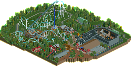
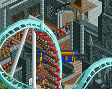
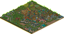
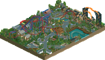
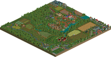
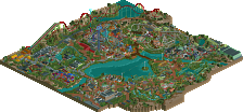
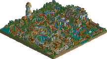
Drachen Fire was a roller coaster that used to reside behind the Fest Haus at Busch Gardens Williamsburg. It was one of the final coasters built by arrow dynamics before the company was sold off. Did you know, however, that it wasn't supposed to be built by arrow? The ride was originally supposed to be built by b&m to parallel Kumba which was built around the same time. This depicts a prediction of what the ride layout and the area as a whole would look like if the ride was built as intended. I hope you enjoy!!!
-
 No fans of this park
-
 Full-Size Map
-
 Download Park
783
-
 Objects
1
-
 Tags
Tags
![park_4087 [H2H8 R1] All Coasters Go To Heaven](https://www.nedesigns.com/uploads/parks/4087/aerialt3818.png)
I really loved this wonderful work. A great recreation.
I think you could make similar criticisms of this as you could my design Wildfire. The coaster just feels a bit separate from the rest of the map and as a whole the elements on the map don't build up the main coaster. It feels like more of a park then it does a design, and when its borderline like this that can be the difference. If the coaster surroundings were a bit more interesting and added more to the ride itself I think you could of gotten a 65% out of this. However, it just was a 60% for me. The layout was acceptable but the rest of the map didn't enhance the submission enough to quite break that barrier like you did with Wraith.
I also think if you want to keep improving you should try to break out of your comfort zone a bit, maybe take some different approaches to the game, simplify some things and focus more on planning. One problem I've often had with your realistic work is that you dont seem to space things out and often get some awkward composition as a result, in combination if a habit of over detailing (especially those queue covers). If you can make an effort to streamline those aspects and focus a bit more on planning and the macro side of things, I think you work will improve greatly.
lovely work, although I sort of see why it got the score it did. I think in some sense there just wasn't enough there. I really love the concept though- you almost pulled it off too, although the ending feels a bit weak compared to kumba's underground-helix combo. it just doesn't flow as smoothly. overall the quality of archy and recreation is pretty high, but also the composure on the whole feels a bit off. I'd love to see more of bad wolf though, the bit there looks really awesome.
Oh damn this is sad. This release really suffers from what many barely designs had also suffered in the past. The layout was pretty cool and the architecture is also not bad, but i'm really missing the excitement of this release. Might be, because lately we had a lot awesome releases but i can't see something fresh or new in this. It just feels like the stuff we're used to see everyday, which is sad, because in the end i'm not sure if it really is that, since this stuff has been 80%+-stuff lately. I also agree with G that the composition or the planning could definitely had been better in some places.
In the end for me this barely is a design, so i would go for 65%. Please don't be too disappointed about this thing not getting design. You're definitely a skilled player with a lot of potential, and i believe that your next stuff will get some great accolades! Just keep it up and try to keep the greater picture more in mind while building!
What a pitty you missed out on design Scoop. I'll give you my two cents.
I like the coaster lay-out, it does feel like something B&M would pull off their selves. Would it be among the best beemers out there? No, but that doesn't make it bad. I think the pacing is good and the flow too.
The main thing that bothers me here is how the entrance, the entrance plaza for the coaster is tucked away after all the dense foliage. It would be less of a problem in real life but viewing this in rct it just bothers me. It separates the entrance from the rest.
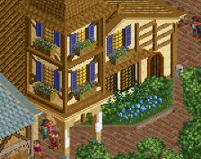
The interior of the dark ride was cool. Overall archy wasn't really great. Especially the train station was kinda weak. I think you should have spent more time on the park and coaster itself then you did on the backstages, which actually didn't contribute that much in my opinion.
Sorry Scoop. I would have voted 65%. You're a good builder and we know you can do better than this. Hence the low score I guess. Looking out for more new work from you.