Park / The Real Drachen Fire
-
 18-December 17
-
 The Real Drachen Fire (finished)
- Views 6,191
- Downloads 681
- Fans 0
- Comments 26
-

-
 63.75%(required: 65%)
 Design Submission

Coasterbill 70% nin 70% trav 70% bigshootergill 65% Liampie 65% Steve 65% G Force 60% SSSammy 60% csw 55% Poke 50% 63.75% -
 Description
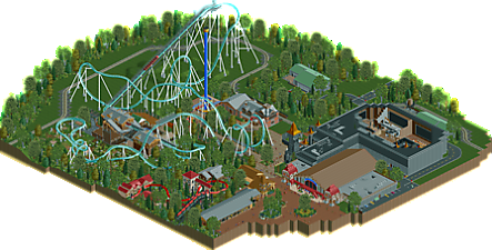
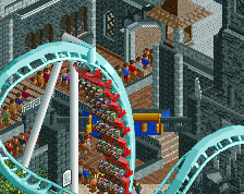
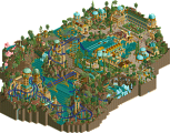
Drachen Fire was a roller coaster that used to reside behind the Fest Haus at Busch Gardens Williamsburg. It was one of the final coasters built by arrow dynamics before the company was sold off. Did you know, however, that it wasn't supposed to be built by arrow? The ride was originally supposed to be built by b&m to parallel Kumba which was built around the same time. This depicts a prediction of what the ride layout and the area as a whole would look like if the ride was built as intended. I hope you enjoy!!!
-
 No fans of this park
-
 Full-Size Map
-
 Download Park
681
-
 Objects
1
-
 Tags
Tags

![park_4102 [H2H8 R3] Castles-n-Coasters](https://www.nedesigns.com/uploads/parks/4102/aerialt3848.png)
Scoop please change that logo.
I will if you make it for me.
lol whats wrong with the logo
Very nice!
My favorite area of the park was probably the Big Bad Wolf area (I'm not sure if that's a good thing or a bad thing for a design), but the Drachen Fire layout was really nice and I enjoyed that a lot as well.
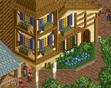
Cool idea to move Mach Tower and Dark Kastle, but I think it works. Along with the Festhaus they add a lot to this map also. It was an odd choice to align the tower with the hill up into the barrel roll like that, but now I'm nit picking.
Overall this was really nice. You definitely got the BGW feel here, the layout is nothing earth shattering but that's probably appropriate for a B&M and it's still very nice.
Overall I enjoyed this a lot. It all came together well.
the logo could be transparent. If you want, I can do it.
This was very wonderful. I loved that fact that you made the train and Big Bad Wolf functional, even if they were half off the map.
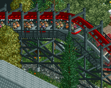
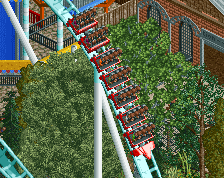
Layout was a pretty standard B&M, which is pretty standard for B&M. I would've liked to see a more signature element (to mirror the loop around the lift hill in Kumba) as I think if the coaster were designed by B&M, they would've wanted some kind of similar element.
Also, your poor peeps. Are you trying to give them all UTIs?! Put some bathrooms in! lol
Overall, a solid design and very well done. 75% from me.
So this is a fake design that was supposed to be true instead of imaginary. Wait, what. Yeah, that’s right. Anyway. I have a few bones to lick with you, Scoop. I mean, pick. Actually, either one. Why not?
I open the park and I’m greeted with utter and total chaos. There are coasters in complete darkness and trains are crashing left and right. The peeps are stranded in empty shells of buildings just begging for sweet relief of their bladders. There are buildings that are too short and their heads are literally banging around as they trudge their disfigured masses towards no first aid stalls. Dark rides are left roofless. They are also filled with portals to the void of black where boring suspended coasters call home. Coaster queue lines are tiny and no average American could dream of fitting their fat ass through the switchbacks. There is no end in sight. It’s harrowing, and yet, beautiful in its sheer derangement.
What are you trying pull, Scoop? I know I’ve pulled something. Several muscles within my noggin’ to be precise. Why am I looking at this. Why am I subjecting myself to what appears to be an exercise in brutality? Have you no moral compass, Scoop? Why is your name Scoop. Why am I calling you this. I know your name. It’s Jon. Why did you decide to be called Scoop. Do you like ice cream? Do you like the Spider Man dark ride vehicles? Do you enjoy just giving people the scoop on certain things? Did someone once say “man I really wish I knew more about what Busch Gardens woulda did if Arrow never existed” and did you just jump through a window and say “boy do I have a scoop for you.” That’s what I hope you did anyway. Did you guys know Scoop likes frisbee golf? Consider this before voting.
Anyway, good job.
this showed skill, but im not really interested or excited by it. the ride just kinda sits there, with the only interaction seeming pretty perfunctory. the best parts of it were the parts that seemed like a recreation rather than new ideas. Its a shame because i know you are a very skilled creative player. over all it suffered from "ive seen it a million times before"-itis.
also everything immediately broke down upon opening which is strange, i wonder if its a bug. when i used the cheat to fix everything, it all immediately broke down again.
The coaster layout was pretty nice, a little fast-paced, but nice. Everything else though.....left something to be desired. It seemed sloppy and rushed, especially in the details (rides breaking down, not naming things, crowds of peeps, etc).
I agree with everything Sammy said as well.
Naming is an issue? Now your just looking for problems that don't even exist. Also what looks sloppy or unfinished about it? I have a hard time grasping that one.
Did someone spam a 0% vote on this? It's score dropped really abruptly.
WHATT!!!!!!!
sorry I appologize for the comment that used to be here.
I missed out on voting, but I would have voted 60%. It's not quite design standard for me.
I just want to know how someone thinks it's 50.
Welcome to the salt mine
From screens I'd agree that it just makes design, so it's understandable how the flaws in it are enough to justify a 50% vote. It's not about if it's correct (or even good "realism) to most people, it's whether it's good RCT. To be fair this is about as good as Louis's and Maverix's low-bar designs and about half of those I wouldn't have voted to be a design.
^Thats what I mean, it had the same feeling as my barely made designs, where I gave up with them once I thought they were design worthy. Instead of making them even greater and reaching their full potential like Goliath. Thats how this felt.