Park / Spacetopia
-
 30-November 17
-
 Spacetopia
- Views 7,095
- Downloads 750
- Fans 3
- Comments 32
-

-
 76.88%(required: 70%)
 Gold
Gold

Kumba 90% Louis! 85% trav 85% Coasterbill 75% CoasterCreator9 75% csw 75% Fisch 75% SSSammy 75% nin 70% Xeccah 70% 76.88% -
 Description
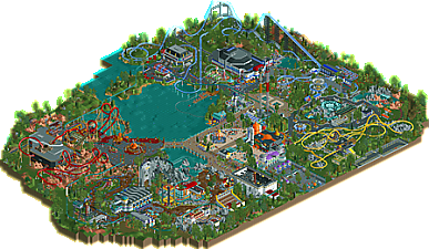
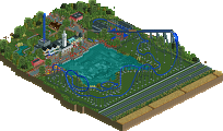
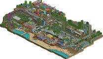
A park with a space theme. Have fun!
-
3 fans
 Fans of this park
-
 Full-Size Map
-
 Download Park
750
-
 Objects
1
-
 Tags
Tags
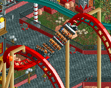
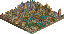
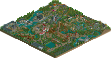
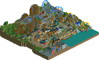
![park_3376 [H2H7 R5] Area 52](https://www.nedesigns.com/uploads/parks/3376/aerialt3839.png)
Pretty puzzled by the "low" score this got... The quality is spotlight-level, easily. I love how you've managed to take such a cliché theme as Space and make it so fresh and fun! I think the wonderful use of colour is key to the success, combined of course with an imaginative architectural style. Landscaping and foliage is beautiful.
It's not spotlight-level mintliqueur, but thanks for you kind words .
.
Alright, so I'm finally home,
I have mixed opinions on this park. There are some really nice moments and then some not so nice. I think a good word for me to describe this park is underwhelming. All of the coasters are good, but there is just too much open air in my opinion. Because of this, it feels to spread apart. The b&m is the best part of the park imo. It shows some really nice composition. There are also some really great ideas, like the cutout of the dark ride in the same area, and the entrance is also really well done. I'm a fan of your more cartoony style as well. I might be wrong in saying this but I think that you built the left half of the park first. I say this because the right half doesn't look as finished as the left half. The areas are more defined and detailed as where the intamin wing coaster is just a coaster in a field with themeing elements mixed in. It's just odd that there is a tonal shift like that in a park with such potential. This doesn't mean I don't like the park. I think it's a great park with plenty of cool content and great ideas, but I don't think it's worthy of a gold sadly. I would end up giving this park a 65%. With more polish, I would say this would have been a mid-tier gold for sure though. Can't wait to see what you have next up your sleeve.
The good news is that I’m in charge, really, and this is a nifty little park. I mean, am I mad that the park is called Spacetopia and it rests literally on the fields of an Earth-ridden valley and not ACTUALLY in space? Absolutely. Am I going to lie awake at night for the next several months thinking about it and how it enrages me and literally sends pieces of my soul to the depths of hell I mean Ohio? Probably. At least Rusty is friendly enough. He’s a little weird though. Anyway.
I like the park. It’s got rides, it’s got rollercoasters, and it’s got space puns. I’m sold. I mean, why is this just a gold? We could sit here all day talking about how we have a thousand golds and Spotlights blah blah blah but come on. There’s a truck riding over dead aliens. With an American flag in close proximity if I remember right (which I don’t, but I mean, clearly Fabian is a Trump supporter). Great touches. Did I vote on this? Should’ve be Spotlight. I mean, did you see Shogo’s park? They’re fucking GIVING AWAY these things, man. Whatever. It’s not my place to judge these things. It’s Version1’s.
Anyway, nice job. I look forward to the next adorable park you have to offer with all the cute details and cute inside jokes of what you’re really saying by running over aliens in an American Space Program-themed ride because there’s no subtext there at all really I mean what could that possiblly mean Fabian I mean come on.
Idea for the NE Awards 2017: best review
Idea for the NE Awards 2017: most drugged-out review
Well it's about time I provided you with a review Faas. I didn't get in on the voting in time, I would have given you in the 75-80% range, but I guess we'll never know! I would love to see you hit the 80+ mark one day, you definitely are legendary on NE and are deserving of a parkmaker title.
With Spacetopia you showcase your Faas-nicity once again, giving the community something original and special. There seemed to be a handful of comments criticizing this park not being actually set in space. While I do agree that some improvements could have been done to the landscape and supporting foliage, I actually quite like the setting itself. Plunked in this lightly forested area is a quaint little themed-to-the-nines space park, the contrast is fun!
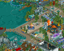
Your creativity oozes from every nook and cranny of this park, it really pays off to take your time and add little details as you went along, it created a very immersive space setting. For instance, at the entrance having the array of planets, the observation style entrance building, the space shuttle theatre, using the glass tiles as flooring with foliage beneath, the ring around the Swings... it's just a welcoming step into the park. Maybe those ideas flooded into your mind as you built this area, but if you're anything like me, ideas continue to develop over the course of building a park.
I have to be honest, I'm not really a huge fan of the glass objects, like the wavey glass roof, or the glass 1/4 circle etc. I know we used them in Asteroid Fields, which was a decent use of them, but they're simply a tough object to use well. But in Spacetopia you utilized them to perfection, they blend in so well and add a important subtle touch to almost every aspect of the park.
Anyway, I'll highlight some of may favorite portions:
+ Black Hole Rapids - Excellent ride layout and design, your development of the theme by means of water was very cool! Something about this rapids ride really struck me as being a different take, never seen like this before.
+ The "Asteroid Redirect Mission" building impresses me. I'm not usually a huge fan of larger buildings in rct, they tend translate into eye garbage, but this building is really cool, a combination of the front facade, variations on the roof and the inset spiral slide (which was simple, but pretty, pretty cool IMO).
+Somehow I missed this previously, but the Rover Racing is fantastic. With a very small portion of land and an insanely tiny go-kart track and you made something fun.
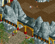
+ The interaction and themeing of Lift Off and Moon Dust Falls was great. Excellent use of trackitecture, those LOTR mountains, vibrant colors - so good! I'm not known for great coasters in my parks, but I like them to have the quirk factor, making them realistic is beyond my skill set. I found your lineup of coasters had quirk and nailed the purpose you set out for them. Kudos!
+ More of a general comment... you've taken another step forward into hacking and it payed off handsomely, you have a mitt full of custom designed rides that compliment this park so well. This was lacking in previous parks by you, I guess OpenRCT was a factor in this development of your game...
So that's my little park review snippet. I didn't touch on everything, but that's bunch of highlights I appreciated. Hopefully we'll see you join an H2H team this time around, not only would you build something memorable, but your brain would be immensely useful just to punch out tons of fun ideas for the rest of your team's parks. A creative mind is invaluable in that team contest.
What will Faas release next?!?!?!?
she's og
this park is crazy fun, love it
The fact that scoop asked who Buckeye Becky is is ridiculous.
shhh
Certainly your best park yet, especially coaster wise. Endevour and Olympus were both fantastic, with Comet also being pretty solid. Lots of the archy was nice too, with the curves and larger structures making this feel like a very high end themepark.
I think at this point adjusting your approach a bit will do great things for your building, viewing things from a more macro point of view and not just worrying about the details and small little ideas. If you're able to build on a macro level like you have on the micro level, you'll improve tremendously.
70% from me
I'm sorry for the late review, Faas. I wanted to write it earlier but I've been quite busy lately.
Anyhow, congrats on the gold. Well deserved.
I've always loved your style. It's cute, vibrant and easy on the eye. Your parks have this fun and lovely atmosphere in them. It makes them a whole lot more enjoyable.
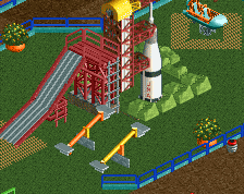
Even if Vitaminland is still my favourite Faas park, Spacetopia had a lot of charm to it. I really enjoyed all the little details everywhere (Mars Rover, Sputnik scale model, the park plans, the game stalls, the space themed playground, etc etc)
I also enjoyed the interaction between the log flume and the roller coaster. The way you themed that area is just brilliant.
As mentioned before by others, the Black Hole Rapids is really something. It's simply great. Very fun to watch.
I was also very intrigued by Olympus Mons. I like the layout and how it interacts with the building, the water, and the paths. Excellent execution if you ask me.
All in all this is a brilliant park. It's very well made, and something to be proud of. With a little bit more refinement your work would really stand out. Keep being you and don't change your style. It's uniqe and lovely.