Park / Spacetopia
-
 30-November 17
-
 Spacetopia
- Views 7,095
- Downloads 750
- Fans 3
- Comments 32
-

-
 76.88%(required: 70%)
 Gold
Gold

Kumba 90% Louis! 85% trav 85% Coasterbill 75% CoasterCreator9 75% csw 75% Fisch 75% SSSammy 75% nin 70% Xeccah 70% 76.88% -
 Description
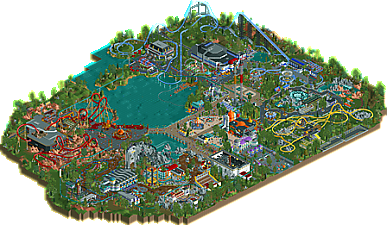
A park with a space theme. Have fun!
-
3 fans
 Fans of this park
-
 Full-Size Map
-
 Download Park
750
-
 Objects
1
-
 Tags
Tags
![park_3376 [H2H7 R5] Area 52](https://www.nedesigns.com/uploads/parks/3376/aerialt3839.png)
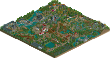
I'll give my full review when I get home.
Awesome!
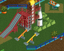
I love all the details, but the whole park also comes together as a whole. Highlights for me are the interaction between Lift Off and Moon Dust Falls, Lift Off's station, Black Hole Rapids' whirlpool, the entrance building, and of course, the custom-made rocket. I also like the clever use of NCSO objects and trackitecture, foliage, and landscaping (seriously, I've never seen such an effective use of LOTR rocks). The layouts for Olympus Mons and Comet are a little weird for me, but that's about where the weak points end.
Definitely a gold IMO, 75%.
This is wonderful. It's a really fun mix of whimsical science fiction and more realistic depictions of space exploration. From alien encounters to actual exhibits - it's very convincing. Plenty of science-y stuff with that little bit of fantasy thrown in to keep the masses entertained; I honestly love that feel that the park gives. The SCAD tower was a real highlight for me, as I don't think I can recall seeing many of those done in RCT - really well done. The themes are fun and there are plenty of interesting little details here and there - I love the murals around the entrance. If I had to pick something I wasn't keen on; Phobos and Deimos had pretty large gaps messing with the custom flat ride aesthetic. Overall, the park is a really nice balance of larger rides, shows, and smaller rides - all set in exciting themes that I enjoyed greatly. Well done.
i just wish this was bigger
Great park, will give a full review later, but I voted 75% and this is a definite gold for me. Great moments throughout and I loved looking at this park!
This is the most fun and interesting park released this year.
I voted 85% and Yes on spotlight.
Wonderful little park. 90/Yes from me. I didn't really think it was a clear NE Spotlight due to it being a mini-park, but a 76%? I honestly think this was close to Logos, an 86%... idk, whatever
Mars was awesome, loved Olympus Mons and the rovers race. The college lecture hall was a brilliant detail. Loved the diagonal launch on the Lift Off! Awesome work on the Space Raiders and the Flying Saucer Derby building. I will say that I was not too impressed with Comet and Endeavor. They lacked the creativity of the other two coasters.
Looking back the 90 might have been a little high, but it was such a fun park. That's a real skill you have, clever fun parks (mainly Turtle Rescue, one of my all-time favorite micro parks). Your best stuff nears a 5Dave level, really good.
Finally, a new Faas park! But the wait has been worth it, this doesn’t disappoint.
My god man this park is fun. I wish I had your creativity, this is great stuff. It’s like CC9 said: a great combination of the silly and the serious. It feels like a park you could go to, and at the same time have a good laugh with all the alien/sci-fi rides and actually learn something about the wonders of our universe. That’s not an easy combination but you managed to pull it off.
You certainly have your own aesthetic that some people have branded ‘cute’. I don’t know if I’d call it that but it does feel very ‘Faas’. I think it’s the combination of objects, a slightly smaller scale than most people use and the charming simplicity of it all that typifies your work. For some reason, the standard colours in your park also look more bright. I’ve no idea how you do it, but it’s something I find noticeable.
I try to balance out my reviews so now I have to pinpoint the bad stuff about this park. But honestly, I’m finding it hard to look for something I don’t like. If there has to be something, then it must be the empty patches of grass. Not a fan of those. Also some of the picnic areas seem a bit of an afterthought. Those bother me but they’re overshadowed of course by all the good stuff this park has to offer.
A great new release after all filled with fun details that I’ll be happy to discover each time I’ll open it. By the way, if you want to have a chuckle, take a look at the names of the stalls… You really stretched yourself with puns, didn’t you?
Congratulations on the gold! Spotlight next time?
faas you should be super proud of this. its a fantastic park. it was full of creativity and fun which is what this shit is all about
The amount of detail in this park is truly astounding. Sammy is right.
This park screams fun all over it. Great work Boss. It's great to see this theme done in a complete other way I'm used to. Little disappointing to see the Russians aren't represented in any way...
There are many fun little details in it. The crashed UFO is my favorite, awesome. Coasters are fun too, I really like that big-small inversion on Olympus.
Congrats on the gold, I think you got a good score.
It already got scored? Sick.
Congrats on the gold.
Love the park.
Hope to give you a full review this weekend.
Congrats on the gold !
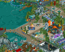
For me the entrance plaza was spotlight quality : the paths, the archy with the giant rocket, the fantastic colors. Full of life and so satisfying to see.
Then there is the other areas around with a lot of grey, too much LOTR rockwork, very cold color combinations but still a lot of creativity.
In my opinion the blue and black mega coaster + the yellow custom megalite didn't add much to the park.
And then you arrive on that Mars corner which is great.
For me the rockwork works here, the colors are more appealing than in the other areas, the coaster has a cool layout, some sweet foliage all around..
Overall I would say :
+ Great and memorable details, my favorites : toboggan inlaid in the building, the visible part of the helicopter dark ride with the shining stars (loved that), mini golf stairs for the monorail.
+ As others said, full of fun, even the areas I didn't liked that much were fun to explore, for example the river rapids with the astronauts.
- Foliage+landscaping+land textures are borderline ok in some places, not bad but could have definitely been better.
- Too much black-grey-blue combo, I understand they are "spacey" colors but it didn't worked great in my opinion on the right side of the park.
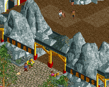
- LOTR rocks : I think they work great in the Mars area but otherwise, and mostly personally, I'm starting to be allergic to them. But I understand some ppl like them (and I used to).
I can totally understand the 85% ratings because of the creativity and the little details that really makes this park stand out of the mass, but for me on a whole it felt more like 70-75%.
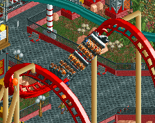
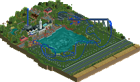
My favorite angle and part of the park.
I really liked this park. One of the most fun parks to look through in a while. Let's of really cool details throughout. This is the kind of park that makes me want to open up the game and play because it looks like you had a blast building it.
I wish you ran the coasters with block sectioning, but the variety was really nice and I enjoyed the amount of dark rides that were mixed in.
I do wish it could have been bigger only for the sake of you getting a spotlight, but honestly the whole thing felt about right. I hope to see you turn out some more parks with this level of quality and fun.
It says I'm missing METRSPDR
I think someone was missing that on Discord as well.
downloads: 199
great stuff- I enjoyed this more than I expected to actually. from screens its always felt like a bit of "usual faas work, but with spacey colors and some random details" but I actually think it came together better than that. there were a couple buildings that felt that way, but on the whole the structures seemed well composed, themed, and sensible. the rides were vibrant and nice, and everything was quite pretty. there were a few great spots- the rapids, lunar rovers, the satellite dish, the indoor coaster building and the mars bikes stood out to me. in these little bits you really created some amazing atmospheres that i wish carried out more throughout- it seems you conceded them to be more realistic. I respect the approach to make this park more 'real' but still can't help but feel that the very green foliage (while good) did suck some of the atmosphere out of the areas that otherwise could have been even stronger. I especially felt this way in the mars area, which has this awesome jules-vernes-y vibe going on but sort of fades out around the edges.
that said, there is a lot to like and some cool details. a very solid gold and I appreciate breaking out a bit from more 'standard' european style and really crafting some unique parks. awesome stuff all around.
Thanks for the great reception guys. Glad to have this finished.
 . I originally planned a Russian area on the far side of the lake, but decided to get rid of it since I lacked inspiration to make the area unique.
 .
.
@Scoop: I hope you're doing okay man, long time till you're finally home.
@Gamma: Thanks for the kind words. What do you think is weird about the layouts? Especially comet is based on a pretty standard Mack layout actually.
@CC9: Thank you, that was exactly the kind of vibe I wanted to achieve. I agree with you about the custom flat rides, didn't want to spend so much time fixing the holes so I just let them be.
@saxman: Thanks, fair score if you ask me.
@trav: Wow, surprise you loved it THAT much, but thanks!
@Kumba: Thanks, I put in frozen staff just for you, thanks for the very high score. And comparing me to 5Dave is a big compliment.
@Jappy: Thanks for the review. I don't think I have the discipline and patience for a Spotlight, but who knows. The only accolade that's missing apart from Spotlight is design, so I might try a design the next time.
@ SSSammy & Poke: Thank you!
@ Fred: Thank you. I was afraid you wouldn't like it since you kept pushing for me to only use grey and black
@Lagom: Thanks, are you building on anything at the moment?
@Julow: Thanks for the fair review, what do you mean with "toboggan inlaid in the building"?
@CP6: Thanks for the review, good to hear from you. Good to hear it makes you want to open up the game and play, please do!
@posix: Thanks. Great to read a review from you without the word 'macro' in it
@Buckeye: I hope you figured it out with trav's help. Do you use openrct2?
@Cocoa: Thanks man. I tried to make the park's setting realistic because I like to imagine being able to walk around there, but I get where you're coming from.
Keep the replies coming!