Park / Merlin's bay Themeland
-
 28-November 17
-
 Merlins bay
- Views 4,001
- Downloads 851
- Fans 1
- Comments 16
-

-
 61.88%(required: 60%)
 Silver

bigshootergill 65% Cocoa 65% Fisch 65% G Force 65% ][ntamin22 65% CoasterCreator9 60% Poke 60% Xeccah 60% Louis! 55% nin 55% 61.88% -
 Description
Hi guys, after 5 months of building me and my friend Charjallz finished our collaboration project we held on youtube!
The plan was to create a castle themed island with a magical backstory regarding the exploration of Merlin's secret island..
My goal with this park was to focus on foliage, creating a medival/mystical atmosphere and detailed interaction's between rides and landscape!
Thank you all in advance for any responses! :-D
If you are interested there is more information about the little backstory and more footage in my cinematic showcase wich is available here: https://www.youtube.com/watch?v=JcTx1PWT968 -
1 fan
 Fans of this park
-
 Full-Size Map
-
 Download Park
851
-
 Objects
1
-
 Tags
Tags
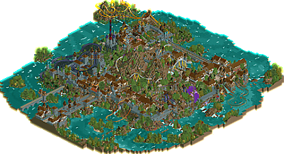
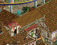
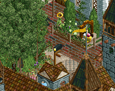
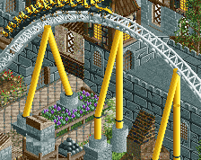
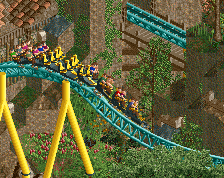
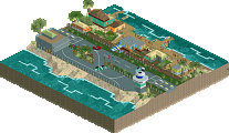
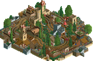
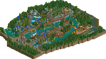
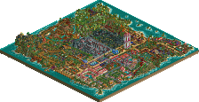
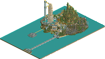
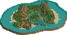
This is a very nice park i live the way the rides interact with the surroundings. I think you nailed the theme.
Share illustrated
Attached Thumbnails
really nice work. I still think that stone texture is awful but you overall set up a really nice atmosphere. very lively, lush, mysterious, etc. I think my favorite ride was probably the splash boats surprisingly, that whole area felt very well composed and layed out, along with the area containing the white coaster's station. the coasters themselves were a bit forgettable and difficult to follow. the invert was particularly not good, although I liked how it crossed to its own little island. I think in general there was a clear quality divide across the border you posted- ruyatax's side is generally cleaner, more detailed, and the composure feels tighter and more well-thought-out. that said, it doesn't detract too much from the overall quality and enjoyment of the park- really nice job you guys. i think i see some sneaky draft picks in the future- could end up contributing a lot in a competition!
Awesome stuff, I had been looking forward to this for a while! I would say it's overall very creative, which is great, and exactly what I exptected from the screens. On the other hand it does need more refinement in terms of rct and just finishing touches though. For example leaving 50% of the rides unnamed is just something that makes it feel a bit less immersive, and a bit sloppy. So I'm hovering over the rides with my mouse, to understand the themes, and the ideas by seeing the ride names. I find rides named after medieval sounding things, but every second one is suddenly "Steeplechase 1" or "Launched Freefall 1". When you work on something that's intended to be as immersive or as creative as this, go the full way with it. Ever noticed how fantasy books always have cool, theme specific names for all their characters? It's because every single detail matters for making it immersive. Either way, back to the rct: I liked the interaction, and the bold concept for this. I really enjoyed the entrance bridge and all the beautiful scenery. Some parts were a bit rough around the edges, but made up for it in terms of originality. For example I'm not sure if I like the look of the purple water, but the idea was cool. Overall great stuff, now get the technical part of this on the level of the conceptual part, and you'll make huge improvements with your next project. Keep up the great work!
File Updated
Love your landscaping and foliage man, great stuff. Overall pretty solid map, coasters were a bit awkward, but I didn't think it was a huge issue. Very atmospheric overall.
Thank you G Force, you saved me
Very interesting and whimsical park. As Cocoa said, I could also tell where the line is between builders. They're similar styles, but some subtle differences are noticeable. The unique object choice in combination with the landscaping and foliage really makes this park. As others have pointed out, the coasters are a bit hit or miss.
I'm going to have to look through the park a few more times to decide how I'm going to be rating it. Parts of it are brilliant, and parts of it are a little busy and hard to read. A joy to look at overall, and I'm certain this will get you another accolade of some kind.
This park is indeed atmospheric and of course, I love the unconventional textures but my main gripe is that it is far too dense and claustrophobic which can make it rather difficult to view.
And yeah, the layouts weren't particularly aesthetically pleasing and it also became rather a repetitive after a while as there was little variance in the architecture.
You have great skill in creating atmosphere but I feel to really allow your work to become top notch, I hope you tighten up your other park making skills, in terms of ride design, colour choices and composition etc.
I looked at this last night, I thought it was a very interesting and unique park for sure, and it was enjoyable to explore. How in the heck did you build all this in only 87 in-game years?!?
Pros for me: The objects used were selected and combined well, and made it almost look like a different game entirely. The foliage is done extremely well, and really created the right atmosphere for the theme. The theme was obviously well thought out, and there were tons of little things here and there I enjoyed looking at.
Cons: As others have said, some places were very hard to read and enjoy, and I had to use cut-off view to view some of the plazas, which is a definite detriment. Next time, try to open up these areas so they're more easily viewable.
The biggest con for me was the coasters. The white coaster looked fine for the parts above ground, but then it was random helixes everywhere underground, where its not visible. It would've been nice to see more of it above ground, and less undergound helixes. The schwarzkopf had terrible pacing, where it was almost not making it through the loops, and that let me down a lot for that particular ride. The woody wasn't bad, and the inverted had some good parts and some really awkward parts.
Overall, a really nice park with a really nice atmosphere. 65% from me.
This has to be close to a panelist decision. come on guys.
Wouldn't surprise me if we were a few votes short still, that's the result of using the expansion packs. A lot of panelists can't open parks built with them.
The score has actually come in quick for a WW/TT park. Just chill out a bit scoop.
Congrats on the silver guys! Well deserved!
Thanks for silver guys!