Park / Giari Palms Theme Park
-
 21-November 17
-
 Giari Palms Theme Park
- Views 8,773
- Downloads 1,021
- Fans 5
- Comments 40
-
-
 82.50%(required: 80%)
 Spotlight

Xeccah 90% yes bigshootergill 85% yes Cocoa 85% yes Louis! 85% yes Poke 85% yes ][ntamin22 85% yes CoasterCreator9 80% yes trav 80% no csw 75% no G Force 70% no 82.50% 70.00% -
 Description
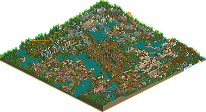
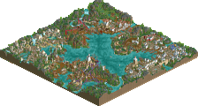
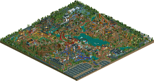
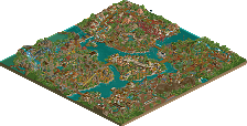
Welcome to Giari Palms Theme Park! Giari Palms Theme Park has been in the making since 2011, but will take you back way further than that, both in time and across the globe: from the tropical paradise of Sulawesi to the mysterious island Avalon, from the ancient city of Capua to the timeless charm of India, and from the wealth and extravagance of Monaco to the simple but welcoming atmosphere of the title port town. A love letter to days gone by.
-
5 fans
 Fans of this park
-
 Full-Size Map
-
 Download Park
1,021
-
 Tags
Tags
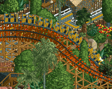
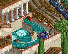
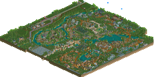
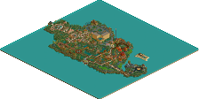
Aww! in a vacuum I would be okay with this being gold, but I wanted this to win spotlight more than anything since Legacies in 2010. This was the first serious candidate anyway... If Escapist won it would've been an accolade. So that's a pity. Still, it feels great to have four full scale parks on my resume, all gold too. That's awesome I think. It feels great to add a heavy park like this to your profile anyway.
I'd been stalking all the panelists to hear what they voted, as the votes were slowly coming in. I think I misunderstood one of them, as I interpreted their response as a 'yes', which apparantly was a 'no' here. I really hope it's a mistake like how I accidentally voted no on Discovery Bay.
Speaking of alex, he did the teapot ride...
I definitely don't think it's low quality. But, the main thing I look for in LL is atmosphere, and I don't think this had nearly the same level as atmosphere as Escapist.
The weakest area of Escapist imo was Tenochtitlan, which is still stronger as an area than India, Monaco and Indonesia in Giari. Monaco was stylistically pretty similar to the entrance area of Escapist, but not as good. The race track itself is cool, and the petrol station is neat, but apart from that, there's nothing in this area that makes me go 'wow'.
The Roman area is good, but just doesn't live up to, say the Babylon area of Escapist. The coaster is very similar to the wooden coaster in Escapist, I couldn't say one or the other is better, but the area feels very...basic other than the log flume. It's very generic LL with again, not much to say 'wow' at, other than it just looks very pleasant.
The medieval area is one of my favourites...but again it doesn't 'wow' me as much as the medieval area of Escapist. The building forms and structures, and even the overall composition of the two areas seems very similar to me, but I think King Autumn's Court definitely wins out purely because of the colours and the strong autumnal atmosphere.
I'm gonna compare the jungle area of Escapist with Indonesia/India, because they're all the 'earthier' areas I guess, and again for me, the jungle area easily beats out both of India and Indonesia. India for me is the worst area in either of the parks. For me, there really is just not a lot to this area. The water coaster is alright, and the train is okay, but they're both already outshined in their own park by the Roman log flume and the Monaco go karts.
Indonesia would be good as an area if I understood it. To me it's just a weird Chinese theme with rusty walls mixed in. When I think of Indonesia, I think of architecture like the Enchanted Tiki Tiki room at Disney, with the huge pagoda type things - a weird mix of Polynesian and Oriental, so I'd have like to have seen some more of that. I also felt like the composition of Indonesia was a little odd. I don't like how it just melts into the Indian area. Until I looked at the map/spoke to Liam, I didn't realise that they were two separate areas, I thought it was just one big Indian area.
However, the one thing overall in the park that I felt let it down was how it seems Liam went against his own advice when it comes to building an area. I normally love how Liam composes his areas to have the main attractions of each area interact with the paths and other features of the area...here it just didn't. The only coaster that kinda does it is the Intamin in Monaco. The rest might have a 'viewing platform' or just be bordered by path, but it's not the same.
In Escapist you have the wooden coaster which dives under the path and interacts with the maze, you have the hyper coaster which creates an awesome skyline as you enter the park and again dives under the path, you have the suspended coaster which would have an awesome view up the lift hill as you enter that area, and then even the splash boats in Tenochtitlan does it better than the water coaster in Giari, where you can see the ride from like 90% of the area because it works like a canal system.
This kind of interaction is what Liam does best in the whole community, and this park was just lacking in that for me unfortunately. All the coasters were segregated in their little sections on the edge of the map, bordering whatever area they were a part of. Combining that with the lack of a 'wow' factor, that's what stopped me giving it spotlight.
Hope that doesn't seem too negative. I think it's a beautiful park, but seeing as people are calling out the lower votes here, I feel I need to justify why I 'only' gave it 80%.
^Only giving it an 80 is not a reason to feel like you are being called out lol I was between 80 and 85.
(also I was on mobile responding before so I couldn't see who had voted what)
You make valid points, it's nice to hear what people think makes a park a spotlight or not, differing opinions is what keeps us all here.
Gah! Painful vote. Sorry I have not got LL installed yet, been busy with Thanksgiving week. Looking forward to viewing it in-game. I know your pain, I thought I would win spotlight a few times and came up short (BP, IWV and Sonoma).
I used this analogy earlier to dismay but it feels like the areas of your past work were flattened with an iron and chopped up, then glued back together in a random way to fill the space you had. For me to give this anything higher than a 73, which Fibritius was, I had to feel at least some improvement over that park, or at least equal peaks, unfortunately neither was done for me here, hence the 70%.
LOOK AGAIN!
An accidental no vote has been corrected. It's actually a spotlight. Took me seven fucking years to get another, but I got it at last. In LL, on my terms, that is in a codex-light, classical style. An NE dream coming true for me! Thanks for the great votes, low votes included. I like a little bit of controversy and discussion, and 70% is definitely not the lowest vote a park of this caliber has received.
While I feel this is undeniably very good, I'm quite thorn on whether it's great. Parts of it are definitely spotlight both on macro level (Monaco & Sulawesi) and a micro level (the tigers as lava for best idea 2017?), other parts felt both uninspired and uninspiring (Giari Palms & Capua). Still feel this is 75% and a no, but congratulations on the spotlight nonetheless!
I was wondering why bigshootergill was an 85%/no! Congrats Liam! I did have a chance to look at this in LL, and I think its certainly deserving of the honor!
Congrats with the spotlight Liam!
Butterfinger in 2003
Corkscrewed in 2004
Liampie in 2017
That's a very short list of Parkmakers to win NE Spotlight in both games. Liam you did it kinda backwards as the first to win with RCT2 and then LL.
Thankfully, I have LL running now and finally got to view this in-game. Can't really say I was too impressed. I do think you did a nice job fitting the classic LL/NE style. All the coasters were really good. Awesome teacups. I didn't expect it to be, but I think the Roman area was my favorite. The water coaster was also better than I expected after a quick view in Open. Would have loved some peeps and/or frozen staff, but I get why you skipped it, due to this being an old project. You did work in some creative thinks like the gas station, tho idk that it really worked in the overall setting. Tiger Lava put a smile on my face
Kinda glad I didn't have a chance to vote. I would have been like 80 and close on the yes or no vote. Probably would have gone with a yes since when close I normally decide to be nice. It's kinda like with G Force, I know you can do better and it seems like you tend to stay in a comfort zone when you build. Maybe that's just due to having a mountain of old projects? I hope to see competive/H2H mode Liam in the future.
Congrats on a second NE Spotlight!
Spotlight in both games. Very impressive. Congrats on the achievement, Liam!
Congratulations on the Spotlight!
Sorry for the late feedback, this was absolutely incredible.
My favorite part was the one with the launched coaster and the go karts. There's so much other little details I absolutely adored in the park though.
Good job with the spotlight, very well deserved.
I'm having trouble getting something like a comprehensive review down in writing, but here's what I've got.
Overall Impressions
Firmly planted in semi-realist tradition, this is perhaps the best we'll ever see from Liam in terms of a straightforward NE-style park. It's a callback to the years when looking good was really all that mattered - just create atmosphere.
So, the bad news:
I'm not sure this park was ever ambitious enough to reach the idealistic “NE Style” heights of RoB or BGSS or the flash and creativity of Discovery Bay and Silver Valley.
Originality is something that maybe wasn't a chief goal when this park started, and that's apparent in the end result – two of the areas are stock RCT themes, the entrance is seemingly intended to blur into a dozen other classic entrances, and none of the main rides are overly ambitious in type or layout. I think that over the six-year build window some new releases helped push a renewed view of LL being a capable engine for untried ideas, and the Monaco, India, and Sulawesi themes come off as both more impressive for the LL medium and more memorably picturesque.
It's maybe telling that Alex is behind a chunk of that.
Monaco
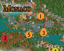
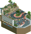
Monaco suffers a little bit from being late to market. We've seen multiple takes on the exact same “monaco with a red intamin rocket” scene several times now, and this was never going to be the most detail-rich Monaco. Thanks almost entirely to the gokarts, I would say it's the most engaging Monaco. The Kart circuit would have won me over entirely if it were a little more faithful to the actual Monaco circuit – it's not that far off – but everything that makes the Monaco GP great is here. High speed, tight corners on a narrow city-street course with a lot of elevation change, and it's all visible from the “helicopter shot” we get as park viewers. The red and white trim and the “>>>>>” path banners as corner signs are so simple, but so effective. Unfortunately the architecture around Monaco isn't the most spectacular, with the terraced balcony towers being the kind of thing LL struggles a little with. It works, but that's about as much praise as I can give it. If there was a little more ambitious codex use there's some great ways to add brick and marble textures, different window types, some less simplistic balconies. As a backdrop for the karts, coaster, and overall harbor scene though, it'll do the job, and the fact that this take on Monaco really nails the verticality of the hillside and embedded harbor wins me over. The Intamin is almost an afterthought. It's positioned away from the main harbor/buildings, and has a layout you can say two things about: “yep, that's an Intamin” and “looks like somebody didn't take their own map-edge advice.” Still, it does a good job of presenting main path views and flybys, has a lovely little plaza, decent queue interaction, and isn't a bad ride concept. The stand-up track is a good solution to keep things simple instead of trying to do a million merges. The full Monaco package, as envisioned by the community at large, is probably still one or two revisions away from perfection in my eyes.
Other Areas
Everything about the park planning seems to be aimed at looking pretty. There's a real intentional composition to just about everything, with a lot of creative restraint in place to step back and say "this is the big thing you're supposed to look at for this area" and then not crowd it out with detail or competing structures. I admire that capability, because I struggle to build enough breathing room into my own stuff even after trying to step back and assess. This is a style of park, and a parkmaker, where it's absolutely the right thing to do to say one big showpiece is enough for this corner of the map and then devote the rest of the area to framing it well. It delivers on the old-school style in that sense very well.
There's a rhythm about the path and buildings in particular that sets this up, the kind of thing that's built into the structural quirks of LL. If you compare the scale and frequency of buildings and how they relate to the path across all areas there's a clear framework to build off of - generic buildings are this size, usually just enough 1x2 and 2x3 units to include two different walls/roofs. Featured buildings get to be bigger/taller, or the whole system shifts to suit the area. Narrower, taller buildings for avalon. Sparser, flatter buildings for india. It's clever and probably instinctual, and it makes everything feel connected in a way that's harder to match in 2. It also makes everything feel a little same-y, which is probably what drives me to see this as kind of stuck in the old-school format without presenting a whole lot of new, exciting ideas... but that was probably never the point, and this is such a pleasant experience that I'm not sure I mind too much.
Oh right, so, this is a special request from my best bud Liam. This is a unique and never before seen feat done on the New Element website aka Steve’s New Blog. Liam wanted me to dictate a comment for him. However, technology is too smart. I don’t trust Siri to take my words in a humorous way that fits the Steve mentality (which, surprise, is utter nonsense). So, I turned on predictive text for my phone. Let’s see what happens. One second...
Hey while Steve is going to type that, I mean MAN, can you imagine being robotic. I mean think about it. Wow. What a time to be alive. I read an article the other day about a sex robot in Austria that makes you work for its affection. Can you believe it? I wonder if Version1 knows about it. I may have inadvertently found his soul mate. Austria is close to Germany right? Pfft Europe, right? Unreal. Anyway I can’t wait to see what Steve comes up with. Or I guess his robot phone is coming up with it. Whatever. Oh he’s coming back.
All right. It’s done. The first predictive review for an RCT park. I’m just breaking the mold everywhere. First predictive review, first to make a park in Classic, first to recognize our robotic members as if they were our own. Amazing. Anyway...
Giari Palms is a great way to make sure that you are in a great mood. I’m not sorry. The park is also the best park for the entrance. I love the way it works but it’s still a good game. What is the point of Giari Palms? I don’t think I can get a hold on my way to the park and I’m sorry. I’m not sure if it’s the same way or maybe not. Giari Palms has always been a big win for us. I’m sure I can get it to the point where it is probably a little bit more interesting. Oh wow. I love the idea. Giari Palms is a great day for you to come to the park. I’m sure I could see it.
I couldn’t have said it better myself, actually. It reads like a Trump speech. It’s perfect. I couldn’t think of a better way to sum my thoughts on this park that I have never even seen before. It’s fine though. I mean, do any of us actually look at these things? I don’t even own RCT. You guys ever play Candy Crush? Why isn’t this a Candy Crush site? We’re missing a HUGE market here guys. I’ll have a word with Rusty. He likes candy, I think. Or does he? You know I’ve never known him to eat anything really. Robots don’t eat anything I think...I wonder if Version1 knows about this.
Anyway.
im enjoying whatever steve is doing right now
I still haven't gotten around to respond, but let me say in advance of that post that I really appreciate the reviews, and I'm grateful for the accolade and the appreciation. It may be one of the weaker spotlights in recent times, but it's a spotlight. My second. Took me so long! I'm very happy with it.
So here's the real reason for this bump. A highlight reel for everyone who does not own LL.
https://www.youtube....h?v=x8lLIor-jCE