Park / Adventureland
-
 16-November 17
-
 Adventureland
- Views 7,369
- Downloads 903
- Fans 3
- Comments 25
-

-
 80.63%(required: 70%)
 Gold
Gold

Cocoa 85% yes Steve 85% no trav 85% no bigshootergill 80% no CoasterCreator9 80% no Kumba 80% no Liampie 80% no Louis! 80% no Coasterbill 75% no SSSammy 70% no 80.63% 10.00% -
 Description
A family operated park located in the American heartland.
-
3 fans
 Fans of this park
-
 Full-Size Map
-
 Download Park
903
-
 Objects
1
-
 Tags
Tags
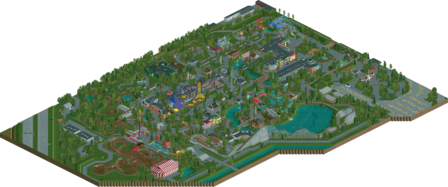
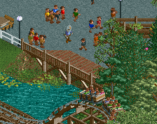
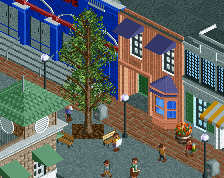
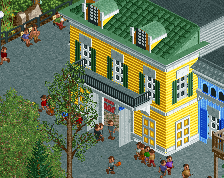
![park_3411 [H2H7 Finals] DisneyPunk](https://www.nedesigns.com/uploads/parks/3411/aerialt3046.png)
![park_3348 [H2H7 R3] The village and the park](https://www.nedesigns.com/uploads/parks/3348/aerialt2985.png)
Really clean aesthetic overall, with a both interesting and realistic ride lineup. There's moments of brilliance here. Absolutely your best archy outside of BGT. It's nice to see a development of your style when you're already so good. Only thing that keeps this only an 85 for me is size, scope, and ambition, but execution wise this is very close to perfect.
85%
yay!!! Let me look at this so I can review it.
Excellent stuff, G. I hope I get to give this park a full review sometime soon. For now I'll just say that I'm very happy to see a park of this size and quality that is not a chain park with big coasters. This park is closer to the European (or just Dutch/Belgian?) tradition of parkmaking. I think I'm going to end up voting 80% and no. Rather 85+no than 80+yes. This is your third full scale park and I think each one has been better from the last. I voted no on the first two, and I feel bad for voting no a third time after improving this much and making something so different. But I think a spotlight requires a certain amount of scope and grandeur that this park lacks. I haven't voted yet though, so my vote might change...
Alright This is a weird park to be honest. There is some good, some bad, and regrettably some awful. I'm gonna break this down into the different sections surrounding the coasters from best to worst.
Monster: This is obviously the star attraction at this park and it shows. It's in a centralized location, and is easily the most extreme ride at the park. The layout is as close to perfect as you can get. I do think that the track could have been differentiated closer to the mid course break run rather than at the final helix. A few more trims on the purple roofed section would have helped with making it less boxy.
The Outlaw: This is another great example of your coaster building abilities. It feels just like the real life coaster and is short and sweet as it should be. This section is also the best section of the park as far as composition. I think sawmill splash is an excellent choice in such a quirky park. I do think it could have one more helix because of how short it is.
Tornado: Again as stated before i think your coaster building is your strongest asset. There are a few things that you forgot though.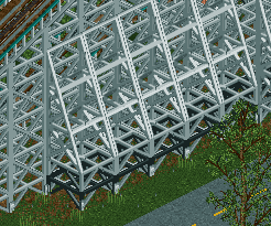
Excalibur: I think this ride might be a little to long but is still fine for what it is.
Der Flitzer: I hate that the coaster is so good because the rest of the area is just sooooooo boring. I guess it kind of makes sense because of how "low budget" this park is in comparison to something like cedar fair.
Cobra: It's again fine for what it is. nothing to really say here.
The Underground: This is where most of my problems lie with this park. it is an eyesore in an otherwise great park. The show building is just weirdly laied out the way it is. It might look like that in real life, but it just looks disgusting and probably should have been a simple show building.
Other Thoughts: There is way to much grey path. I wish there wasn't as much as there was. Moving on to the architecture. Of the architecture that is actually facades instead of warehouses it is very well done. It does feel like the same area throughout the entire park however. Overall i do like the park but I think it is a major step down from what you can and have done in the past. I know people say this all the time but i really want you to build something more creative. It doesn't even have to stray away from real parks. Maybe do an ioa or a Disney park. I know a few of your other projects so maybe we will see what I'm asking in the next project.
As far as score I would still give this a gold, but probably a low gold. 70%
Scoop, update your OpenRCT.
I either love this or I'm not a big fan of it at all, and I'm not sure which it is yet.
It feels like a weird mix between grit and clean. I think the level of polish is obviously to a high level overall, but I just found the whole park really bland as well, and not in the same way that I found Westwinds or Starpointe bland but could still appreciate the little details, this I was trying so hard to find those similar little details but it was just nothing new or exciting anywhere.
I do live the gritty feeling in parts though. The untextured circus tent, the big white building with little details, the big green dark ride thing. Those were great because they felt like something I'd see in my local park that hasn't had any love for 20 years. I'd have liked to have seen more like that.
I definitely think this is your best work honestly. I think what really sets this above is your wonderful use of empty green space; compared to WoF, and Westwinds to some extent, this didn't feel clogged, everything had breathing room which made it a far more enjoyable viewing experience.
I also appreciate how you stripped back things in the park; not everything is meticulously detailed, you left some things, eg. the circus tent, a lot more bare and open and to me, that really emphasises atmosphere because it becomes a lot charming.
I do think that your personal style begins to pull through here, by those intentional decisions of yours such as the quirky, unconventional colours of the architecture; some things are here are honestly aesthetically rather ugly, e.g The Underground, and some of the colour/foliage choices but I like that; I feel your realism best shines when you leave in the rather raw, ugly parts; it again brings out your personal style.
I know I'm sometimes rather unnecessarily critical to your work, just because realism is a style I struggle to find the appeal in, but I definitely find it here in this park. I enjoy the simplicity in this park; a lot of your design choices are rather quirky and I personally think you've nailed your style here.
Very very solid, g force. well done.
I cannot wait to open this.
I can't decide whether I like or don't like this. There are parts I love, parts that are technically done really well, and parts that really feel like a family park. I like the coaster layouts (Tornado was my personal favorite), and the archy is on point.
The part that I don't like is that I don't feel much when I'm looking at it. It's all good, but I just don't find anything that speaks to me. It just doesn't feel alive, and there are so many missed opportunities to make it feel alive. For example, cut back the circus tent and show us a circus going on inside. It seems like a busy day at the park, but all the pavilions are empty.
I don't want to sound overly critical, as it's a good park and top notch work. I just wish I knew which direction to lean on this, as right now I'm totally unsure.
EDIT: I was stuck between 75 and 80%, ended up going with 80%. I also had a chance to check out the real park online, and you certainly nailed the vibe and aesthetic. It was well executed for sure, and for that, my 80% upgrade was perfect.
amazing park. I love how well you've captured the feel of this sort of park. It just feels perfectly midwestern, and the way you've approached detailing and laying it out is really subtle and shows a lot of skill. In some sense, I feel its this sort of subtlety in atmosphere and vibe that leaves me feeling a little meh on worlds of fun, which in some ways is this sort of midwestern, too-ambitious park like adventureland- with a lot of trees and charm, but still cheap in many ways and feeling aged. I wish you'd captured that feeling with worlds of fun, instead of going heavier on the themeing and foliage. But, you did it here- so I shouldn't complain!
So yeah, this park does feel special to me in some way. It is just 'another realistic park', but it has a lot of feeling and careful research behind it. Not just a cookie cutter CF park, like starpointe, as much as thats still a great park. there are of course a lot of great bits- I love the yellow building with the green roof, the brown ones nearby, the weird cci dark ride coaster, etc. I love that the sort of weirdnesses of these parks crept in a bit. I do wish you had put corn fields and stuff on the other bank of the river instead of blacktiles, though- that would really round out the feel of these parks!
i didn't really enjoy this park too much. someone once said that a spotlight is like 4 or 5 design accolades stitched together, and for me there wasn't really a stand out right that i would cut out and give a design accolade.
i guess it comes down to the "its boring by design" thing, but that don't tickle my pickle no more. this park wasn't dangerous or risky.
i've given my score mostly out of respect for the time, effort and planning which must have gone into this park. there is a lot of polish and skill on display here, even if i'm not necessarily a fan of the result. i hope in future you can surprise us with some more daring projects
I'm so glad you finished this. I visited the real Adventureland in 2013 and while this is not a recreation, it really took me back to my visit 4 years ago. Creating the vibe from a real park in rct is difficult, so congrats on pulling it off so well.
The technical execution on this park is from such a high level. The main street is maybe the best example of this. It is bland and kinda ugly irl, you managed to get that feeling but still executed nicely which makes it nice to watch in-game.
I kinda get the park looks a bit dull and boring in general. But that's the real Adventureland too. I liked Outlaw and Monster, both seem very fun to ride. A bit of a shame you went for a dark color on Monster. I think a brighter color makes the coaster pop more out and gives a more vibrant feeling to its direct area.
I gave you 85% (not that it really matters that much since I'm not a panellist). I don't know if it's spotlight worthy, but for me, if I could see myself voting 'yes'. I had a fantastic USA trip in 2013 and had a very pleasant day at Adventureland. I'll probably never visit it again, so I'm glad I can open your park instead whenever I feel nostalgic.
So yeah, what's this then? Your least ambitious park in that it has the fewest big attractions out of your 3 full scale releases? I say its far from that. I think its your most genuine release yet and that in my eyes also makes it your best one. Its not hard to appreciate your rct style, and never has been as its always very clean.
I felt Westwinds got criticized too harshly for being inspired by Starpointe whereas as a sort of consolidation people applauded Worlds of Fun without being as critical as they were on Westwinds just because you added themes. To me your work's reception so far in the rct community has been weird as I feel that arguably the weakest of your 3 major releases won the big prize whereas the other two (probably) harshly missed out.
Westwinds was great! Worlds of Fun to me seemed like you went the realistic but themed route because you gave in to the comments on Westwinds. As a result it didnt seem like a park you enjoyed as much as your other two. This one on the other hand is full of life and exciting details. Its full of daring inventions that are unlike other rct projects and that were bold design decisions because its hard to pull off less is more in rct.
That entrance area for example is absolutely fantastic. The train ride, so good! The indoor coaster was beautifully executed, as was the brown mine coaster or whatever I should call it. Overall I saw more of your own inspiration in this than in any of your other releases. Everyone knows you have the skill. To me its mostly a question of whether you play it safe or whether you step out of your comfort zone by attempting unusual stuff. You did the latter here and it paid off. 85% from me. (I guess I would also vote 85% and no though if I was a panelist)
I really can’t wait to check this out. I hope I can get to it before the voting closes. Well done, dude!
I'm so conflicted, not in whether I like it, but on how good I actually think it is.
I love it, I love that it is gritty and I feel like you've actually presented us with something different, something that feels like your best work, but I don't think it is your best work. It's better than Westwinds for sure, but I don't think its as good as WoF.
This is a fantastic piece of RCT, and you've given me the gritty realism that I wanted, but I don't think it is as gritty as it should be, and this is what lets it down for me. It is too perfect, its trying to be ugly and basic, and it nails that, but then its too crisp and clean and sterile, I assume you weren't near the object limit, so I wish you had gone into it and 'roughed' it up, cracked paving, dirty paths, just made it feel a bit more ancient and lived in, as opposed to presenting us with an older, basic amusement park, that is incredibly well looked after and almost as if everything is brand new. It reminded me of Six Flags Santa Fe in that respect, where its quality work, its going for the ugliness of realism, but it isn't quite hitting the spot because it still feels so clean.
You won me over with your concept and idea, and the quality is decent, its just there isn't anything elevating it to the next level, the execution is lacking. You've made the ugly look beautiful, but I think that is where its problem lies, you've not made it ugly enough.
Solid work, nothing ground breaking RCT or realism wise, but lovely RCT, and lovely to see something different from you again, you've never given us the same thing.
I think I'm with a lot of the comments here; and Louis put what I was trying to put to words over the past few days rather nicely.
Everything about this park is nicely done; it really has the feel of Adventureland. Where it does fall short is what Louis identified; it's almost too beautiful. I agree that I would have loved to have seen some more grit in the park with cracked up pavement and less sterility.
I love the green space. I love the ride selection. Overall, really solid work and no doubt a very high scoring accolade. Very curious to see where this one ends up.
Congrats on the gold G Force! Well-deserved for sure!
the rare sssammy low vote! congrats on the gold my boy