Park / Sven's Adventureland
-
 24-November 17
- Views 3,611
- Downloads 826
- Fans 0
- Comments 13
-
 62.50%(required: 60%)
 Silver

Cocoa 70% Steve 70% Liampie 65% Sulakke 65% CoasterCreator9 60% Faas 60% Fisch 60% G Force 60% trav 60% Xeccah 60% 62.50% -
 Description
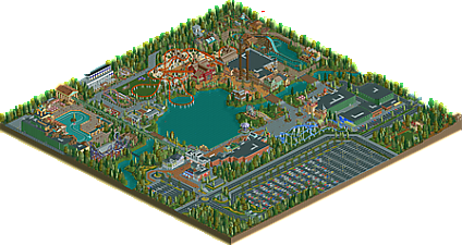
I had loads of fun building this park, halfway in I switched to Openrct2 (it might not open without Openrct2). This park really sparked my love for Rct2 again and I hope to be building again soon.
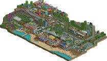
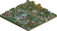
The park itself is divided in multiple themed Adventure area’s like the Fantasy Adventure or the Western Adventure. It features an mainstreet, but also some backstage areas. Hope you enjoy! -
 No fans of this park
-
 Full-Size Map
-
 Download Park
826
-
 Objects
1
-
 Tags
Tags
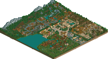
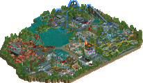
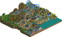
Another Adventureland!
Great little fun park to look at. It really gives an RCT Guide-ish feel but with more modern objects. The coasters in this park are like the park itself: little and cute.
Lightning Run is of course the eye catcher. Seems like a great coaster to ride. A bit of a shame you stopped playing with the undergound in a straight line. It would have been nicer if you pulled that trough the first drop and first corner. I also feel an underground with darker sand mixed with red clay and dirt would be more fitting to the wild west style.
My favorite zone is the Atlantis zone. I think you've got a great composition there. I think the paths needed some more love to make them more atmospherical.
Very nice little park. Glad to hear you've found your way to RCT back because I'd like to see more from you. For me, this is silver quality. 65%
There is indeed something charming of the older dutch style. Everything stripped to its more crucial elements with a clearer focus on atmosphere and composition. This park is missing identity. You have the facade of the typical dutch style, and most of the individual elements in the park would fit right in a good gold release, everything all together is disjointed. It all felt like a jigsaw puzzle that you broke the edges off to make fit, so there's holes everywhere in what would be an interesting whole. The composition itself reads as rather uninteresting and inorganic, with the same symptom being the forced nature the park is succumbed to. Highlights in this park are the splash boats, log flume, and the western area as a whole. So while the western area is the best stuff, even it lacks the path flow and deliberate composition that would make make me believe this deserves gold. Its good but flawed, and mediocre in nature which is indicative of a silver.
This is cool. Very quaint and homey. My favorite area by far is the Atlantis area. it has the best archy and feel in my opinion. I found the elevated railway a bit odd, but I think you made it work for your own purpose. There is a lot of very good architecture in this map, but it kind of falls flat when it comes to the themes. There are many areas in the park that just kind of fail to portray the theme in the same way as areas such as Atlantis and The Western Area. There is a lot of bleed from one area to another, such as the first drop of the Intamin Blitz and the Kiddie area (at least I think that's what it is.) Shotgun's said it best when he used the word disjointed and I agree about silver. 65% for me and I can't wait to see what you cook up next.
edit: I wasn't a fan of the inverted boomerang either, if there was some more context to the ride it might have been better, but it just doesn't make sense in an otherwise beautiful area.
This was a great little park and I had fun looking at it. The Atlantis-themed water coaster was nice, and I liked Lightning Run. The archy is also nice. I don't like some of the compositional elements, like the placement of Lightning Run, and how the pirate area is buried behind a huge building. It also would have been nice to see inside some of the buildings (like the Enchantress or the Atlantis ride).
Overall, I enjoyed looking at this park, and it's a high silver for me.
Seeing this park in the submission queue was such a nice surprise! I'll always have a soft spot for your work ever since Gelderwal, which remains one of my favourites. I think your last park was a bit too minimal, and the screens for this park implied it would be more of that. Instead I got to see more theming than you've shown in years, which is great. I thought Atlantis was really lovely, reminiscent of the old you. Better than that Pirates abomination you did in Gelderwal. Again, it's a bit barren and minimal at the monorail side of the area. Should've themed that too I think. I feel like I've seen the Garden Tour before, Wacky Worm is cool, and the Efteling-esque restaurant very charming too. I like the sea of flowers feel. Lightning Run has a nice layout, but I thought the theming looked very ugly and amateurish, as if you abandoned your computer for five minutes with your little nephew at the controls. Wild West area is otherwise looking great, especially around the S&S towers. They're nicely off the grid. Topspin is great. Nicely themed without taking the overdone Talocan route, this is exactly what I would expect from an okay mid-small sized theme park like Hellendoorn or Bellewaerde. Pirate area is very nice, again just the right amount of theming to make it believable. Minigolf looks great. The area around the Enchantress is pretty, but as I commented on the screen, too open and empty. Lastly, I've enjoyed exploring the park outskirts!
Overall I think this is a good Silver. Minimal in places, but usually not done in a way that it's bad. I just think your park would be much better if you went more all out with theming... It excites me that you say you're getting back into the game a bit more, because maybe that means you'll find the patience again to be more ambitious with your park and the theming. Give me more of Atlantis, and less of Lightning run!
Charming park. Very well done in areas like Atlantis and the little details like the mini golf course. I liked the tram line, that was fun. Lightning Run seemed a bit out of place; I wasn't too convinced by the theming around that ride in particular, and I agree with Liam and Fred about it.
Overall, a very pleasant park. Not without flaws that have been mostly laid out above, but certainly worth a look - 60%.
I actually found this surprisingly quite good, out of nowhere. it feels like a step up in detailing from the usual european parkmaking aesthetic, and there's some really lovely, unique structures here. some of the buildings are amazing, like the tan palace, the white teahouse, the intamin station, and the whole entrance is great too, especially the diner out front. its a bit small, but doesn't feel too cramped or unbelievable. nice work.
Everything is so tiny!
now it's time to keep the storm going.
Very good submission. Only downside for me is the huge parking lot and very large waterbody meaning effectively you have a smaller area to show your skills on. The detail is nice and there are some very strong areas that yo u have.
I thought this was very cute and I adored the little scale of it all.
I think my favourite area was the western one; it had a lovely atmosphere, good archy, especially the barn.
My gripes with this park were ultimately, I think some of your colour choices weren't paticularly the strongest; they all felt rather dry and soemtimes rather dull.
I also think the composition was rather lacking in some areas, paticularly the area around the log flume and the golf ride; it all felt rather forced in, cause it was so close to the map edge.
Overall, it's a lovely pleasant silver and I'm looking forward to more.
Very nice! Lightning Run was excellent, Great station, great support work, great layout (though maybe a tad slow in parts for it's coaster style). Overall though, A+ on that thing.
The rest of the park was good, but not as good. Kingdom flyer was nice but not amazing and the return run that's not conducive to spinning was an odd choice for a spinner. Atlantis and the elevated railway were nice but nothing else felt like it was up to the level of Lightning Run so it felt kind of awkward in that regard.
Great stuff though, there's a lot of skill here.
Great to see you back in RCT! And with a well-deserved silver.
Like others have said, it feels like an old-school RCT-Guide park but with a modern twist. And I love that idea. The strong points really are Atlantis and the zone around Enchantress. I'm also a big fan of how Treasure Cove turned out! It looks very atmospheric even though the zone itself doesn't really scream 'pirate'.
Lightning run really is this park weakest point. Not a fan of the colours or the placement. Also the theming around it is quite ugly. If you had played around more with different textures or some 1K rocks it might have looked better. Shame.
Another thing is the tiny scale... Normally this is okay if you're consistent with it but you're not. If I compare the brick building next to the entrance with the ones in the western area the difference is huge. You should take care of that in your next park.
Overall quite a nice little park and a great reintroduction in the game. Can't wait to see what's next!