Park / Callisto
-
 12-November 17
- Views 2,439
- Downloads 660
- Fans 1
- Comments 12
-
 56.88%(required: 65%)
 Design Submission

posix 65% bigshootergill 60% Fisch 60% nin 60% CoasterCreator9 55% Cocoa 55% G Force 55% Louis! 55% SSSammy 55% Coasterbill 50% 56.88% -
1 fan
 Fans of this park
-
 Full-Size Map
-
 Download Park
660
-
 Objects
1
-
 Tags
Tags
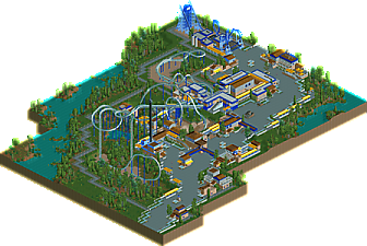

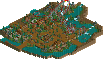
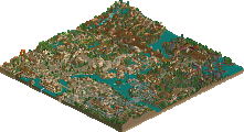
The first thing that pops in my mind is that if definitely feels a little too dichromatic. You could have definitely used the rides as some level of contrast. I don't think the composition is that stellar either. For something that relies on a solid composition to sell itself so much, it was really a letdown to see it not be as good as it should have been. The spots that are particularly troubling for me is that plaza near the drop tower and the overbuilt station. I think the main problem was the lack of atmosphere though. Your insistence on using cold colors and going fully minimal made everything feel so clinical.
I don't want to be too harsh as this is your project to get your feet back into the water, but it shows your rust. Once you knock that rust off you'll be at least as good as when you left.
I'd give it a 50%
This was nice and charming. A bit uninspired and bored perhaps as said, but nontheless very good to see. I'm glad people still respond to this style.
I like how the lift hill and the brake run squeeze through the loop
I really enjoyed this. As mentioned in my comment on your screen, it worked better as a whole versus a screen being that it's so sprawled out, and its because of that that may find it lackluster or boring.
It seemed more so like a chill build, in being that you simply built it to sustain an itch and kill time, and judging by the year count it seems like it didn't take too long to make. I wish there was just more to see, and if you were to ever complete a park at this macro scale it would be a sight to behold. This design was simply a screenshot of a larger park, and while this may have worked better than your earlier screenshot, and entire park would have made this even better.
I really enjoyed the coaster itself, and was a big fan of its station with the open roof covered in nothing but railing. It gave off a sort of SeaWorld vibe, and with that said, a Poke-led SeaWorld/marine park would be something very cool to see as it shares the same sort of atmosphere you seem to go after. The only thing I didn't find appealing was the supporting coaster. The colors were slightly obnoxious and the supports overdone, but again the station design was really nice with its closed-yet-open rail roofing, and the sign between the cobra.
As many know, I'm a sucker for these macro parks as they're more of an impression of a park than a detailed, exact replica. They both can be just as effective. In this case, given the scale I wish there was just more. Solid work though, Poke. I look forward to seeing more.
This had a very "classic RCT" feel to it, which I really liked. The archy was simple, but effective. I also liked the coaster layout, but it a bit too slow through some of the inversions for my taste. I would have liked to see peeps riding it, as well as wandering around the park. That may have broken up some of the tarmac pathing, which seemed a bit overwhelming.
Good work overall, I look forward to see what's next!
I liked this, but I don't think it's accolade worthy.
The layout is a bit strange, I probably don't hate the helix before the drop as much as I should but everything after the first inversion and before the mid-course is awkward to me. The second half is much stronger though.
Aside from the coaster there's not much else on the map that held much interest. The Boomerang was unnecessary and the buildings served no clear purpose. It wasn't bad by any stretch but there wasn't much there.
This is refreshingly oldschool. It had a classic NE vibe over the whole thing but still with some modern touches. The composition and colour scheme were pretty nice as well.
I do have to say I agree with Bill about the buildings. They were nice and all but just seemed to be there with no clear goal in mind. I also believe this might have benefitted from some peeps walking around.
Still, I'm sure you had great fun building this and I did enjoy looking at it. And that's what it's all about in the end, right?
felt like some old zodiac or pt2/3 prelim-era work by slob and others. maybe even earlier actually. I think its good, hard to vote on though. I agree that I'm not a huge fan of the overwhelming yellow and blue- just don't really vibe those two colors together like this. but more colors would definitely be overkill- just wouldn't have chosen this combo tbh. the archy is pleasant and I liked the interaction with the station and some nice landscapings. It doesn't really strike me as doing anything particularly exciting or compositionally amazing, like I would expect from a toned-back park detailing wise. if you're going to try and capitalize on the macro, nostalgic, composure - based aesthetic its got to still do that well! as it is, maybe not design. but still good nonetheless- obviously the criticism is because I know youre a legit good parkmaker and I want you to push yourself to be really intentional in your design!
Good to see a release again from you Poke. To me this looks like it was a quick little project, perhaps to get you back into the game. I liked the layout, other than the pace being a tad slow on the loop and the final inversions. Buildings were simplistic, a bit too much I would say, but I'm sure you realized that as you were building. If this was released 10 years ago you would have easily had a winning design. It was a nice little release, I gave it 60%.
As unconventional as this layout is, I actually like it a lot. I think that what was said above about color is right. I also would say that you could've thinned out the path a bit. There is too much dead space because there is so much path. The boomerang feels like an afterthought as well. Going back to the main coaster, the only problem I have with it is over near the interlocking corkscrew. It just takes too long to turn around and get through the second inversion.
Overall I think that there is a lot to be improved upon in this entry and there fore I would give it a 50%.
Thank you for all your feedback. Even if it didn't win, I'm still quite proud of this design.
The amount of breathing room everything has is certainly nice, but I found the architecture, ride design, and overall atmosphere couldn't keep my attention. This could be an interesting style to develop with an eye towards slob or artist to try and get that warm, approachable feeling.