Park / Falco di Ferro
-
 03-November 17
- Views 3,984
- Downloads 702
- Fans 2
- Comments 15
-
 63.13%(required: 65%)
 Design Submission

trav 75% Cocoa 70% SSSammy 70% bigshootergill 65% Louis! 65% posix 65% CoasterCreator9 60% G Force 55% Liampie 55% Stoksy 55% 63.13% -
 Description
Experimental aviation-themed B&M Invert built in Italy around a variety of different rides and themes.
-
2 fans
 Fans of this park
-
 Full-Size Map
-
 Download Park
702
-
 Objects
1
-
 Tags
Tags
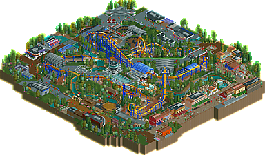
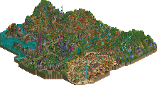
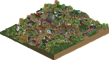
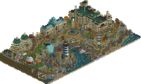
I absolutely LOVE the layout. Very smooth ride and speeds are just perfect. some people might hate on the "flat straight portions" but i like them. Overall a solid entry
Aesthetically this was very nice, atmospheric and colorful.
The coaster however was not. I feel you tried way to hard to place the elements where you did and as a result it felt very stretched out, pacing was pretty horrible as a result. Also, 9 cars per train...
Definitely a big improvement over your past work, nice job overall.
Really, really good work. There's careful, thoughtful architecture in places, creative uses of objects and textures, and interesting enough interaction between rides and paths to make this more exciting. The coaster could've used much better pacing, but the first half was good.
i think g hit the nail here. everything looks snazzy and colourful. however the coaster didn't use its space effectively and looked stretched out and clumsy.
you should be really proud of this work. continue the philosophy of great element interaction without it coming at the expense of flow and we'll be on to a winner. keep up the good work.
wow, this is some really good, clean and detailed ncso. its been a huge year for ncso! there were some really innovative things here- ride bases for paths, cool object use, the white pole lattice things near the coaster entrance, good use of windows, etc. really nailed a lot of things, and foliage was on point. the layout was a bit clumsy and strung out but not so bad. my main gripe is that you cut the map off along the edges of path in a weird way, so the whole design felt like this big ring. it also didnt allow the italian area to really develop atmosphere like it could have, IMO. not too major gripes, just a park composition thing I guess. great work overall.
From the quick look I had at this, the composition and planning are on point !
Really liked the atmosphere here. For me the roller coaster wasn't a problem, I even think that aesthetically it's a good thing it's stretched out like that. The overview looks awesome.
Now for me the problem was more the archy + the theme. Most of the buildings seems a bit too small, like it's missing 1 or 2 units. Also sometimes there was a bit too much trackitecture but nothing alarming in my opinion.
For the theme, it's a bit hard to guess, I didn't find obvious italian / aviation references. It reminds me more of american Cedar Fair theme parks or something like that.
Anyway I really liked it, some spots are very high quality work.
I agree with most things said.
Composition was great, architecture was great, creativity was great. Coaster was far too drawn out, should have been much more compact, but that's definitely something you can take into your next build.
Kind of refreshing to see the layout so stretched out. But I agree a bit too majestic and slow.
Applaud you for the NCSO, and the lifthill supports were my favourite, but otherwise I can't say this had a good aesthetic as others seem to think. I don't find there's good colour harmony or strong atmosphere thanks to very tasteful design. It's all clever and mostly clean, but just not beautiful enough for me.
Still a very good effort which I hope you find you've learned a lot from.
55%
Still a very promising submission. Win or no win, you're going places!
I agree with the above comments in most respects. You accomplished some great interaction with the rides here, and pieces of individual sections are very nice - but the overall submission is a little incohesive as Liam and posix have already noted.
In the end, as a Design submission, a lot is riding on the coaster itself. I thought the first half of the layout was fairly well paced, but the pacing was completely killed off after the MCBR with the rest of the layout being very slow and meandering.
This is a huge step in the right direction for you in my opinion, and I hope that you take all of these comments into consideration, as you're developing rapidly.
1.87 away. Inch by inch, we creep closer.
I should have built this coaster 10 or 15 feet (2-3 height units) higher initially, allowing the brake run to be higher. This would have given both halves more flow potential without sacrificing element placement.
As far as the long diagonal sections go, I'm not sure why I did that so many times, as I built the coaster first and the environment around it, so I must have thought it was somehow aesthetically pleasing. Ironically, going by Liam's screenshots, had I made the first one shorter, the second one would have automatically been shorter, so it was a design flaw that I can't currently explain (but will nonetheless eliminate in future coasters).
I appreciate all the feedback, and I've taken it into consideration regarding my current project, which should be out before the end of the year. It will have a few straight, flat sections, but only in higher-speed areas. Pacing will not be a problem with this one.
Very close there. I'm surprised I was the lone highest voter, I thought that the composition of this was pretty clearly design standard, just a shame about the layout I guess.
I liked this but it was definitely a bit elongated and I agree with the score. This was definitively borderline. I probably would have given it the 65% but admittedly I thought the layout was the weakest thing on the map (the rest was really nice) and that should never be the case with a design.
I admire this for the unique theme you used. Italian aviation?
There are some very creative touches in this. I love the use of pizza stalls for roofs and the fact you actually made gummy rocks work. And I actually like the trackitecture here... at least in some spots.
But while there are great spots in this (the control tower and station for instance, awesome!), the rest of it feels a bit messy. Trackitecture can be a great asset but like Liam said, it feels like you just tried to use it as many times as possible and that shouldn't be the goal. I'm not commenting about the coaster itself as I'm not an expert but I think the main points about it have been said already.
No design, although I understand why. Still, don't stop trying, you have potential.
This would have been a borderline score for me. The overall park was really fantastic work and you barely notice it's NCSO. The variety in color and texture really helped the architecture, but its all well-scaled and enjoyable to explore since each building has it's own flavor. I loved the station entrance as walls. Ride interaction was also a huge high point; the coaster meanders everywhere, but it's in the service of setting up cool over/underpass moments.
Unfortunately the coaster is the low point, and this is a design - where the layout is supposed to shine. It was ultimately just too slow and stretched out for me to be a big fan.
So - too bad it didn't make the design cut, but outstanding NCSO work and great park planning is enough to have me excited for your next project.