Park / Beechwood Theme Park
-
 08-November 17
- Views 1,492
- Downloads 441
- Fans 0
- Comments 4
-
 Description
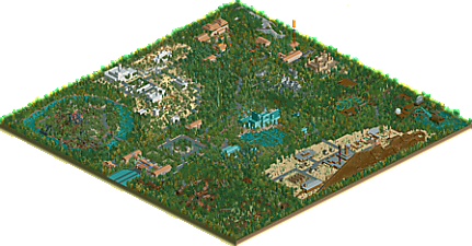
This is my second attempt at a scenery heavy sandbox so please feel free to leave any comments or tips for me,
Please enjoy :)
DomCav95 -
 No fans of this park
-
 Download Park
441
-
 Objects
1
-
 Tags
Tags
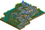
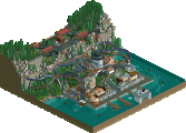
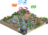
This reminds me a lot of parks I used to make. You have some fun ideas here!
Overall I would say that you're using trees to fill in empty spaces far too extensively. Check out some of the other parks on here and you'll notice that the foliage is less dense and less random. It makes it a little tough to see your hard work when it's mostly covered up with trees!
Not very sought overall and feels déjà vu but was nice to explore.
Foliage was too dense but the color composition was fine, I hope next time you will do something with more breathing and in a more realistic approach, scenario playing type of parks are limited in interest...
Otherwise this little launched coaster was nice.
It's a shame about the expansions. I wish I could open this.
cool stuff. the entrance was definitely the best bit- felt very well thought out and composed. I liked the big building as the entrance. i think there were some good spots of atmosphere and detailing throughout, although some felt a little more bare. I don't have a problem with a lot of trees, but it shouldn't block important things for the viewer to see, and they should still feel well-placed. for example, spamming bushes on the water doesn't quite grab the same swampy feel that placing denser bushes around the water edge would get, and being more careful with the foliage choice.