Park / Cibo Prefecture
-
 21-October 17
- Views 4,238
- Downloads 764
- Fans 4
- Comments 14
-
-
 69.38%(required: 60%)
 Silver

Kumba 75% Sulakke 75% trav 75% Coasterbill 70% CoasterCreator9 70% G Force 70% Cocoa 65% Louis! 65% pierrot 65% Stoksy 60% 69.38% -
4 fans
 Fans of this park
-
 Full-Size Map
-
 Download Park
764
-
 Objects
1
-
 Tags
Tags
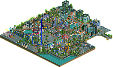
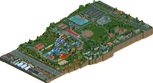
There was some really cool stuff here. Dive coaster placement and interaction was a highlight for me.
Some parts felt a bit rush or sloppy however, but you definitely have a great skill for making things look nice in game.
I really liked this! Lots of cool stuff, I especially liked the Ferris wheel, and the skate park was neat!
Cool stuff here, nice to see it's finally finished.
The final result is amazing, to be honest I didn't thought it was going to turn that great.
This is great! I owe you a full review but I'll wait for the full scale aerial to do that since I don't want to go totally from memory.
If this were on a larger scale I could see voting it Spotlight. It's not perfect, but it's pretty damn great. It reminds me of Kepler, but on a larger scale.
reminds me of BGNA by my beloved disneylhand
really solid park. full of a lot of life and details. I wish there were coasters just hanging around in cities in real life! I don't really understand what it is, but I like it anyway. plenty of cool stuff to look at and some of the buildings were really well done, especially the taller ones. I'm not quite sure why you blacktiled a weird chunk of the map at ground height though...
To write a few notes about this park.
At least 200 of the 536 in game years was ran in turbo or hyper speed to test peeps & crashing. At one point I almost completely scrapped this as being peepable due to openrct's ever changing AI. For 2 months it was a broken save I could only open for 5-10mins before crashing (mainly due to misuse of tile inspector).
So to be able to submit this as finished & working was a miracle.
Also, this was the first park I blacktiled so the concept was kind of foreign to me.
Congrats! Very well deserved accolade.
Congratulations! Had a quick look at this in game so sadly not a full blown review, but more of a quick thoughts:
-Very lively and colourful. I like that.
-Very clean in some parts. Maybe too clean. While most of the archy is really solid, some buildings are a bit too basic and would've benefitted from more details.
-Skate park.... So cool!
-Coasters were great, but I didn't understand the mouse. Was it part of the park or not?
-I did miss a clear concept. It's obviously a city, but then it has a parking lot and an entrance gate?
You clearly have a eye for detail and have a sight for composition, colour, and form. I can see you getting far. Keep building!
Just wanted to stop by quickly and say that I really like this map and your style. I might write a review someday when I have more time on my hands. Congrats on the silver. Big achievement. Keep it up.
- Soul is cool. The first half is too fast, the MCBR too sudden, and the second half too slow. But it looks great! I love the rainbow train colours.
- I have no clue what the wild mouse was doing there... Very random and not really interesting to look at. I prefer it over the cut corner though... What was up with that?
- Amazing skate park.
- Love the clean street scenes. Good amount and nice spread of traffic.
- The overall style was very clean, with large easy to read shapes. It felt like anime. Which is a good thing here!
- Surprisingly effective trackitecture in some of the big buildings. Impressive
- The ferris wheel is an egg, but it looks good
- Great architecture and atmosphere around the pond
- Diagonal transfer section. Excellent
- The B&M Diver's orange did not look very good
- Biggest con: what the hell is this map? A city with coaster? A park in the city? A city-park hybrid? I don't understand it. You're free to execture any weird concept you want, including unprecedented unrealistic hybrids, but I think you could've communicated it a little better.
The score seems accurate. I would've voted 70% I think. Great job, looking forward to your next park!
how is this worse than spacetopia
I don't know, since you still owe me a review.
Belated congrats on the silver roygbiv.
Because the majority of the panel voted it lower.
How was that a helpful or necessary comment, and what did it contribute to the community?