Park / nin's Six Flags over Texas
-
 21-October 17
-
 nin's Six Flags over Texas
- Views 8,423
- Downloads 1,067
- Fans 5
- Comments 18
-
 72.50%(required: 70%)
 Gold
Gold

Steve 85% trav 85% SSSammy 80% Coasterbill 70% CoasterCreator9 70% Faas 70% G Force 70% Sulakke 70% Liampie 65% Stoksy 65% 72.50% -
 Description
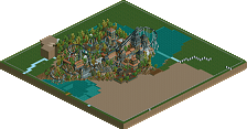
Did somebody say Texas?
-
5 fans
 Fans of this park
-
 Full-Size Map
-
 Download Park
1,067
-
 Objects
1
-
 Tags
Tags
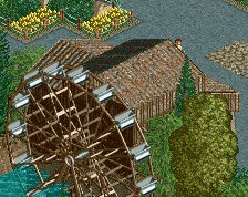
![park_2824 [PT4 R2] Drop of Doom](https://www.nedesigns.com/uploads/parks/2824/aerialt2482.png)
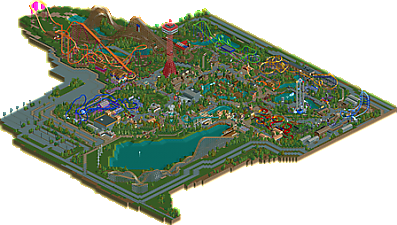
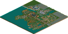
It’s quite interesting to see a six-flags park built with NCSO. I guess I think of six-flags parks as having a certain tackiness and cheap level of theming. The NCSO approach in this park works really well to counter this, as it adds a lot of warmth, heart and goofyness that you maybe wouldn’t get with modern CSO. I also think it’s so successful here because of your talent for composition and macro planning (though why the severe bottleneck before the park entrance??), and building in a way that looks organic and effortless.
Architecture was solid I thought. Very simplistic, under-detailed even, but the forms and composition were great and that’s more important.
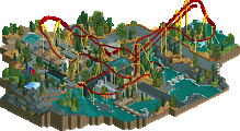
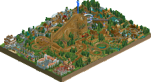
The coaster layouts were quite hit and miss. I thought Shockwave and Bizzaro flowed very poorly and had kind of ugly overall shapes. On the other hand I loved El Matador and Batman The Ride. Texas Giant was impressive in it’s scale and it was cool to see the multicoloured Flying turns which is so recognisable from the game’s six flags scenario.
Overall it’s a park thats full of charm and feels very true to RCT’s intended aesthetic. I think it’s lacking some of the quality and ambition of your other parks and it doesn’t really have any particular stand-out moments, but it’s fun and above all, finished.
Undetailed. but detailed at the same time. if you know what I mean..
This shows the macro level most people can't reach. and that's what makes nin's work so characteristic and charming. gotta have to watch more but almost towards to spotlight. amazing simple elegant.
did you delete the stuff I built?
I love how lively this park is! Well done
Thanks for the comments so far everyone. I’ll have a more thorough reply explaining the park later.
Thanks for that park nin, it looks awesome!
It also makes me remember that you still can have fun while building something serious.
I think this is absolutely brilliant. Very fun, atmospheric, full of charm and adorable awkwardness.
I don't get the deal about this being 'under-detailed'. To me, the clear focus was on fun and composition and at the end of the day, any more detail wouldn't have added anything to the overall picture.
My minor gripe was the fact that there were so many food/drink stalls left untouched and bare. they never look nice like that to me.
It's clear you're a big fan of this laidback, compositionally focused style of building and I hope in the future, you utilise it for more semi-realistic stuff, with some proper theming. In my opinion, that's where this style really shines. That's up to you tho. Maybe even some LL?
Anyway, overall, really enjoyable lovely park. The building process must have been just so fun for you, I imagine, where you don't have to focus so much on just zero clearancing and ridiculous micro obsession on every square.
Agreed about most of the stuff already said :
- Planning and composition = amazing
- The coasters were ok, not a fan of Bizarro
- Very interesting in terms of aesthetics
Really liked the old school feel of this release
Congratulations on Gold. And more importantly, congratulations on winning an accolade with a full size solo.
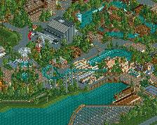
I think this park was Silver, but I can definitely see a lot of Gold qualities, so I can't say the score is undeserved. The park definitely had a lot of brilliant little ideas, and beautifully laid out larger areas. The area with the ponds, with the S&S towers and that awesome Mr Freeze (more the theming than the coaster that is awesome), is definitely my favourite. Upon closer inspection the corner La Vibora sits in is also very atmospheric and well done. The coasters were all good. I even liked Bizarro a lot, even though it was a bit short. Titan was notably smooth and the Texas Giant looked impressive from all angles.
What made me think this is a silver is how unfinished the park felt in a lot of places, especially around the edges. You're great at minimalism and these parts could work with another context, but here the context was a park with actually a quite high level of detail and buildings made of many stacked trims and tiny things. It did not mesh with the almost empty surroundings most of the coasters sat in. Minimalism or not, if the area looks less interesting than Forest Frontiers you've made a mistake. Same with the stalls everywhere, and the entrance gate. That's a scenario approach. You either did too little in those spots, or you did too much in other spots.
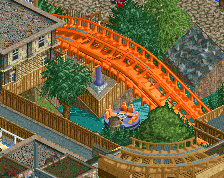
Anyhow... Great park dude. A lot to love here. The curved American flag, the big cogs under Titan's lifthill with the ladder trick, the way the parking is wrapped around Bizarro... Great work.
this to me was a solid spotlight, too bad I'm no longer a voting member... I gave this a 95 as I think it embodies everything this game is/has been to me, fun and lively atmosphere even in tuned down theme kinda way it oozed fun while building and I actually felt really thrilled viewing this
Well that sounded much harsher than I intended. it's an excellent park and I really enjoyed what I've seen so far. Good job on finishing things dude, you've always had the skill now it just polishing off your projects. Here's to more releases!
Thanks again to those leaving comments, it feels good having finished something big finally. While this isn't what I'd call the "premier" nin park, I'm glad it's finally out in the wild as I've had it forever. 7 years, in fact.
This should've been a read-me, but I jotted down a few "fun facts" about the park to give some decisions context.
- The park was started at a friends house in 2010 as a bit of a joke. He knew I played RCT and wanted me to build something. I didn't want to start anything major, so I threw some rides together thinking I wouldn't care for the rest. I liked what I built too much however and took the file home with me.
- Longhorn is the only ride left from that first day at my friends house.
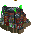
- Looney Tunes' Haunted Mansion was originally a planned micro, my first ever fully planned/drawn ride in RCT. It had a fully realized story, with various rooms and scenes. Perhaps one day I'll make it in some fashion, but for now this is all there is.
- Bizarro was the first full circuit coaster built (circa 2010), hence the awkward layout. I always liked the first drop into the immelmann into the cobra combo, so it stayed. Sadly it only looks good from one angle.
- Splashwater Falls, Bizarro, Longhorn, and Looney Tunes are the only rides to remain largely untouched since their original construction. Anything else dating back to 2010/11 has been altered in some way.
- Shockwave is the only coaster I really tried to capture the same feel as the original. It's layout is awkward because the real one is too.
- Both Oil Derrick and Mind Bender are prebuilt rides. Oil Derrick is from the scenario, Mind Bender is the Flying Dutchman Gold Mine from Six Flags Holland.
- There are only six lands, like the original Six Flags over Texas, though they do not represent the six flags flown over the state.
There are a few more, but those stuck out to me. The park layout was definitely important to me as some have noticed, but also keeping up with the original park boundaries from the scenario, hence the awkwardness of the park entrance. I got caught up with the nostalgia of the park and didn't want to change too much as it became "serious", so things like the coaster arch at the entry remained because to me, that marked when I started taking the park more seriously.
I'll also give a shoutout to Austin55 and Pacificoaster, who both helped with a few layouts (Austin provided Texas Giant, and Pac helped fix a few like Matador and Titan), as well as the countless others that have egged me on to finish this over the years. The majority are marked as security guards, but you also know who you are.
Feels good to finish something finally, but I'm more excited to release my more passionate projects as soon as I can.
i gods honestly think youre applying your new parkmaking philosophy to a fault. i remember the dense stuff you did in 2010 and certain areas were better than they are now. Like you got rid of some amazing stuff on this map for what? you had a worse product in the end because of that sadly
wow, this is amazing. shouldn't have taken so long to check it out!
your park composure is just fantastic. really incredible. the life, atmosphere, and vibrancy throughout is top notch. foliage and landscaping is especially wonderful, and you do a really good job using it to compliment the park's layout, and interactions with rides. overall, everything feels really thought out, which is such a big part of what makes good parks great. I think it had just the right mix of detailed NCSO but still focus on atmosphere/style/aesthetics. Good shit.
"Sadly it only looks good from one angle"
I have a solution for you...
Congrats on gold!
I really liked this. Highlights for me included the rapids area, the Superman Tower of Power area, the Splash Boat ride, Texas Giant and Titan.
The coaster nerd part of me appreciated the fact that in real life, Titan is basically Goliath with one minor modification (the extra helix). Here, Titan is basically Raging Bull with one minor modification... the switching of the midcourse location relative to the hill that (in real life) follows it but (in this case) comes before it.
There weren't a ton of negatives, but I guess if I had to critique anything it would be Bizarro's layout and Mr Freeze being a bit awkward. I'm also confused as to why Titan is the only coaster in the park with a transfer track.
Overall though, this was awesome. There's a ton of insane NCSO stuff coming out lately and this is up there with the best of it. Great work!
I think the Mekkit and Swag park did this same thing better.