Park / Halloween Throwback Park
-
 20-October 17
- Views 3,154
- Downloads 687
- Fans 0
- Comments 15
-

-
 54.38%(required: 50%)
 Bronze

Cocoa 65% bigshootergill 60% ][ntamin22 60% Coasterbill 55% CoasterCreator9 55% G Force 55% trav 55% Liampie 50% posix 45% Stoksy 45% 54.38% -
 Description
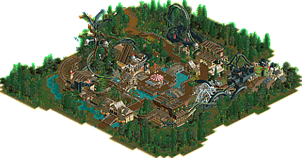
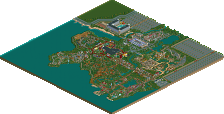
I found this old competition build. It's not much, but hey, figured I would release this, because I don't see myself having enough time to dedicate to an entirely new project in the near future.
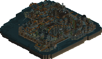
Also, warning: Glitches everywhere. I used some really thick foliage, especially on the tree. -
 No fans of this park
-
 Full-Size Map
-
 Download Park
687
-
 Objects
1
-
 Tags
Tags

Nice!
The carousel as a centerpiece is an odd choice, maybe a more intense flat ride would be more appropriate in that setting. But this is nonetheless a heck of a park!
This is trackitecture done right if I've ever seen it.
cool stuff. I really liked the placement of the carousel, and the swamp piece under the water is a great idea. good vibes throughout.
how long did it take to place those black wooden blocks?? is there a quick way to do it with tile inspector??
edit: i guess you could save them with a ride layout hey
I used the spam tool with openrct2. if you use see-through scenery, you can see where I forgot to turn on clearances, and placed multiple pieces in the same tile.
Love the atmosphere here. I'm not really a trackitecture person and I thought it was a bit too much in some places, but otherwise the composition and planning are the strong points of this release. You have your own style.
I love this. It's very small which makes it tough to score, but it has amazing trackitecture, a great overall vibe and a unique style which is refreshing on NE.
Indeed more fit as a design submission. Quite impressive, but also incredibly messy for me. Very tasteful foliage around the edges, inside very confusing composition. Seems like you started out full of ambition and then almost hated the project.
I believe what happened was that I started the project full of ambition, but failed to pace myself for the duration of the competition, and ended up doing a huge chunk of the work last minute. However, I wanted this to be authentic, so I didn't edit or change anything other than black-tiling the perimeter of the build.
I agree, this would have been better suited as a design, however, in my eyes, this is far below design level, so I would rather take the Bronze (presumably) and use any criticism to apply on my next project, than fail to get a design and lose motivation.
Failure happens, you can still take the criticism the same way.
I agree with everyone else about this having the feel of a Design submission and not quite suited to a park submission. Had it been a Design submission I think I may have voted 5% or so higher, though I'm honestly not certain. The NCSO skill displayed had some influence on my vote; you did a good job with the added foliage since the contest itself, and I'm curious to see what the overall voting spread is like.
Part of me wishes that you put a little more emphasis on the "Corruption" theme throughout the submission; like a little tiny backstory in the description or something. Calling it an old competition build that isn't much, but hey whatever - that's selling the park a bit short in my eyes. Obviously that doesn't really have anything to do with the work you did, but it's an impressive thing you made - don't give someone a reason to overlook it just because it's an older project!
Thanks for the feedback. I'm sure I could have done things better in both the park and the submission, but I wanted to present it as I built it last year. Instead of posting a throwback screen, I found an old project. Also, because I'm so tied down with school stuff, I figured that submitting this (rather hastily) would be a fun thing to do for Halloween.
I also think that you should submit your build, it was really well done!
Looks like we have ourselves a winner!!! I polished off the last vote, congrats on the bronze!
I was impressed how you packed in so much into this little space, so much going on. You managed to bring a fresh take on NCSO too, great use of trackitecture! I love your rugged style, keep it up!
Thank you BSG! Many of my older builds are very cramped, as they were server competition builds with very little allotted space. I am currently tying to transition out of that style into more realistic parkmaking, so it's going to be fun to see how I progress.
Congrats!