Park / Merlin's Odyssey
-
 29-July 17
- Views 2,256
- Downloads 627
- Fans 0
- Comments 8
-
 Description
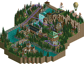
Originally built for a competition on RCTgo in late July this year in roughly 3 days. Nothing too serious, but gonna just upload this here for archiving purposes (and to have something to my name lol).
Link to original: https://rctgo.com/downloads/view/merlins-odyssey.17126
From what I can tell, it's not gonna run in vanilla RCT2; OpenRCT2 is required.
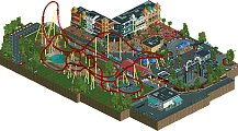
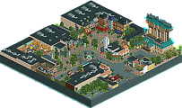
"A Junior Coaster perched in the heart of Sherbywood takes one through a legendary adventure, traversing the re-created grandiose journey of ancient local legend Merlin whose tales are known all too well by the people of Sherbywood.
The legend tells the tale of one young apprentice who embarked on a mission to retrieve an artefact direly needed by his village. Not knowing where it was, nor if it even existed, the fellow young man came back a decade later with the artefact in his possession. It's a tale older than Sherbywood itself, and we here at the Whispering Cliffs Amusement Park, in honour of this legend, hereby open our next family roller coaster: Merlin's Odyssey!
From an arduous journey up the Whispering Cliffs, one comes crashing down and through the mythical Cave of Myst. In the quest to obtain the Blinding Light of Destiny, one rushes through the lost and forbidden Mines of Malahar at great velocity, exiting their way for a return journey back to the village. However, in this voyage, one shall sneak past the Witch of Malice as her wicked shack stands between you and Melchior: guardian and mentor to our young hero Merlin.
Safe travels!" -
 No fans of this park
-
 Download Park
627
-
 Objects
21
-
 Tags
Tags
I didn't know argonath made a butterfly object
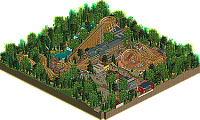
The first thing I wanted to do when I opened it was to zoom in. But I couldn't. I found the scale quite small, and the trees didn't help with that. I think you should've mixed in some of the in-game pine trees to add some variation to the foliage. The landscape itself could also have used a bit of variation. Some different textures under the trees, some jagged rocks on the river banks... It feels a bit to straight and artificial now.
I did like the archy though. I liked the combo of the stone, wood and green roofs. Also pretty fun to see a kiddie coaster as the focal point for once, you don't see that too often. I also liked the details. The usage of lesser known object is always interesting.
Fun and good little design, but room for improvement. I like it.
Wait, RCTgo still exists?
Yes, Louis, take it from me, perhaps one of the pillars of the site. It is indeed still active, and quite. A few names you see here on NE are also on RCTgo, such as Ziscor, Terry Inferno, SupraTheHedgehog and myself. (Others as well).
RCTgo is a light-hearted place if you want a short break from some of the heart-wrenching posts you might find here on NE.
Join, I dare you, Louis!
-----------
This design, I saw in competition and I thought it was great, and it still is great.
For a first entry design, this is rather well done, but there is always room for improvement, and I do think Jappy has mentioned the length of it.
I am far, in a way, proud to see you finally post a park, Ziscor! Which makes me excited for your future work as this, is, well, just a tinge from being really awesome. Keep it up!
this was a really lovely little thing. its size makes it somewhat hard to vote on, but I liked the archy, landscaping, and vibes. It felt lively and fun! good stuff. the layout was pretty solid for a kiddy coaster, something I've always struggled with tbh.
Thanks for the kind words so far!
In retrospect, I'm certain this isn't yet my current best. That's kinda why I knew submitting this for an accolade submission would have been silly. Being made on a whim in 3 days, I think there is a certain level of polish that is sorely lacking. In particular, the cliffs: simply chunks of LOTR objects. Perhaps doing it by hand with quarter tile landscape objects would have yielded a much more respectable result, though it would have set me back on time. The same can certainly be said of the trees, which needed a lot more variation indeed. As for the size, definitely! It's too small, and perhaps even extending the borders just a little to do some more archy here and there (my main area of strength, quite frankly), this as a whole could have had a lot more depth.
I'm very honoured to hear the layout is solid, Cocoa. I'm pretty terrible with layouts!
If there is anything else worth commenting about (though I suppose it is too small to have much to say anything about '^_^), I'd love to hear more! I enjoyed working with this theme, as it was my first time trying this sort of generic fantasy/medieval, and hopefully, I can utilize this elsewhere on a much more serious level in the future.
Thanks for the comments, and keep them coming!
This doesn't show up on the parks page for some reason. Might be why it's not getting many votes.
this is very sweet