Park / Hong Hu
-
 07-October 17
- Views 2,631
- Downloads 603
- Fans 0
- Comments 17
-
 58.13%(required: 65%)
 Design Submission

SSSammy 65% bigshootergill 60% Cocoa 60% Faas 60% Liampie 60% Louis! 60% CoasterCreator9 55% csw 55% Steve 55% trav 55% 58.13% -
 Description
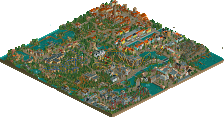
Experience the fury of the red tiger!
Due to my overall laziness, this project took almost a year (!) to finish, but here it is! Big thanks to G Force and nicman for testing and making a park map, respectively. -
 No fans of this park
-
 Full-Size Map
-
 Download Park
603
-
 Objects
1
-
 Tags
Tags
![park_4114 [H2H8 R3] Forum Caeleste](https://www.nedesigns.com/uploads/parks/4114/aerialt3853.png)
![park_3118 [MM2014 R1] Vertigo](https://www.nedesigns.com/uploads/parks/3118/aerialt2765.png)
I'll give a few constructive thoughts on this. I think overall it was good, and you're definitely getting better as a player.
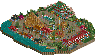
firstly, I think you maybe fall into the classic asian-theme trap of making everything yellow and red (especially rooves). I don't think its particularly realistic or fair to actual chinese architecture, and everything ends up coming off a bit cartoonish. The bits that were the best here, were also the bits I felt were copied a little too much from other releases, especially lijiang (that grey tower especially). the feel that 'this has been done before 100 times and done better' is one thats often hard to escape with these sort of generic chinese themes, I feel. which is unfortunate, because there is creativity here and its still a good park. but the feeling is still hard to shake. there's a lot of amazing, beautiful, chinese stuff that I feel we (as parkmakers) never really explore well, which is a shame. Lijiang is one of the few good examples, as well as BGA perhaps.
rambling aside, the color scheme as a whole possibly lets down the park the most- the dark greens don't really offset the overwhelming red rooves IMO (I think its telling that by far the best buildings are the ones with black rooves), and the colorful flowers just add to the confusion, rather than being a counterbalance to set the vibe more carefully. just something to think about for next time!
anyone I'm ranting too much. I think more carefully considering path and park layout, color scheme and the vibe you're trying to set, and the sources you use as inspiration for a theme will help you a lot. you clearly have a good grasp on infrastructure and detailing at any rate. I think you'd be a really solid addition to a H2H team- with some more experienced players to guide your building, you could definitely make some great shit.
This was a real weird one.
If I think of everything individually, everything is pretty good.
The architecture is decent, although a little basic and everything that Cocoa mentions about it above is also valid. The coaster is a nice layout, but is very basic and typical. If someone asked me to make the most typical GCI, I doubt I would come up with someone much different to what you've got here. The foliage is pretty nice as well, although there isn't too much of it around as it seems to just border everything else, which is fine but I would have maybe like to see the map expanded just for some more foliage thrown in.
However, the issue is when I look at everything together. It's a basic GCI literally bordered by path with some generic Chinese looking architecture dotted here and there. There's no thought put into the composition and I don't even understand why there is just a random GCI in the middle. The coaster has no room to breathe and offers no opportunities for interaction, which is a shame because with themes like this, that's what set them apart from your more realistic themes.
For your next build, you need to think on how you can improve your composition. Maybe plan out the whole area before you start building, and try and find any excuse or reason to have as much interaction between coaster and peeps as possible. Even more than that, try to stay away from just bordering the coaster with path on every side, which then has architecture bordering it on the other side of the path. If you had stuck to just the side where the station was, and then done something different with the back side, I feel this could have been better.
I'm really stuck on what to vote for this one. I think looking at the individual aspects, it's maybe borderline design, but when you put them together I think it's probably in the 55 - 60 region.
Let's play "where's the archy from" game! Let's see... I think I see some WoF by G Force, some Lijang...
Joking aside, the archy is decent. But like said before, it's done to death in the same way in other parks. The colour scheme wasn't that attractive and the amount of white didn't work IMO.
One thing I find strange that hasn't been mentioned before is the amount of path. I know I'm not the one to speak as my parks usually have an insane amount of path as well but here it was really noticeable. A few extra planters or details like signposts or even peeps might have helped with this.
The layout itself was very decent. Despite the lack of interaction it does fit that space nicely and I like the way it winds itself around the towers.
Overall, it's very decent and solid work. It's just not groundbreaking. I do look forward to you exploring and experimenting more in the future, you show great promise! H2H will do you good.
EDIT: just noticed Gamma the Panda....
The whole thing is too small and doesn't have enough content. I don't like how the wooden coasters has no space to breathe at all. Archy is good, but also generic.
55%
First thanks for being a handyman haha. The layout of the coaster has good flow. It's nicely compact, which sadly didn't allow it to have a lot of interaction. Just surrounding it with path maybe wasn't the best option, as said above the coaster could have had more space to breathe. And there is really a lot of path maybe could have had a little garden where that huge planter with the fountain is.
Architecture was good in my opinion, maybe a bit simple and generic but well done, especially the Great Tiger Theatre.
Overall the submission suffered a bit from poor planing, but it definitively was fun and a step forward for you.
Hmm. this is hard one. Nothing in there is especially original. that is a big problem. along with the problems others have pointed out. the layout is pretty standard and boring. the archy and colouring is soooooooo done at this point
however, i do think there is a lot of competency behind this, hence my 65 vote. i love how the drop tower is cradled in the turn. the buildings are believable and nice if repeated a lot.
i, however, dont know whether i would give this a design (despite my 65 vote). it is an important stepping point in your improvement and should be valued as such. we need more originality at this point in the games life.
Looking forward to your next project, Gamma! Well done on finishing this.
Congrats on finishing this. Most is said before. Archy isn't bad but it resembles too much with past Asian releases. I also think painting all the roofs black (with a brown one here and there) would have looked better, too much roof colors right now.
The coaster is cool, definitely would want to ride it. A shame it is enclosed by so much path. It needs more space to pop out. I didn't want to sound too negative, overall you've really grown as a player so I am looking forward to future work from you. I don't think this will win design, but you're getting there sooner than later.
Originality: Yes, I did copy from lots of stuff, and it was mostly due to lack of motivation in the early days of this project. My later buildings were actually more original (theater, tea house, hotel), but I can see why this harms park quality.
Colors: I struggled to find a good pallette for an Asian theme, but I'd probably do better if I redid this project today. I do agree that it's too red at places, and I should've planned that better.
Interaction: That's what you get when you do the layout before everything else. I kinda shot myself in the foot with this one.
Paths/Composition/Etc.: This is a big problem for me even now, although I was much worse at planning in the early stages of building this. I just plopped buildings down without any sense of space, and as a result, the path got bloated and overwhelming.
I may sound really negative here, but there are quite a bit of things that I'm proud of, such as some of the buildings and the layout. Anyway, thanks to everyone for commenting and for helping me finish this.
The theater and hotel are amazing. For me the big problem here is the composition of the whole thing. It could have been a lot more charming if the paths were not that wide and empty, but I know you were aware of that and it was too late to change it.
Something more personal, I'm not a fan of all those GCI wooden coasters we see here, and in this case the color of the wooden coaster is contrasting very badly with the rest of the area.
But yes the buildings are great !
I wanted more interaction with the coaster. I don't like how it's an ocean of path with a coaster in the middle.
Yep, you're right, I shouldn't have started the design with just the coaster. I figure that's what caused it.
Thanks Julow! I guess you could make an argument that GCI designs are done a lot, but trust me when I say that I tried many coaster types (even an Intamin looper) but the woodie ended up being the best layout. Also I don't really see how the colors are bad
One more vote boys.
Aerial added.