Park / Yokum Creek Park
-
 25-September 17
- Views 4,147
- Downloads 633
- Fans 0
- Comments 15
-
-
 60.00%(required: 60%)
 Silver

Cocoa 75% Steve 70% G Force 65% SSSammy 65% CoasterCreator9 60% Faas 60% Sulakke 60% trav 55% Coasterbill 45% posix 45% 60.00% -
 Description
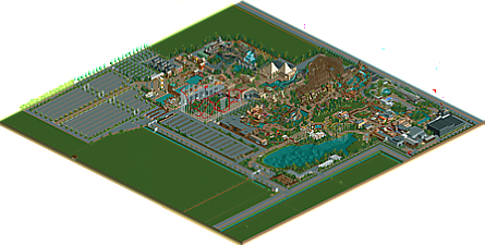
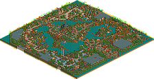
Finally found the time to finish my second all-ncso park. The scenario used for this one is Six Flags Over Texas, which can still be recognized by the nearly unchanged Texas Giant and the placing of the original entrance and parking lots. Please feel free to check out the main theme music of the Scandinavian entrance area:
https://www.youtube.com/watch?v=ZTZaHFPHma8&feature=youtu.be
Entrance A | 1976
Former entrance area. Sits unused since the opening of the larger new main Entrance B.
Old Europe | 1976
The bustling streets of this original heart of the park are based on various European building styles. Attractions vary from carousels, theaters, a classic 360° cinema and a haunted walkthrough to the many shops, restaurants and even an indoor children's playground.
Action Area | 1982
A colletion of swirling thrill-rides such as a classic Vekoma-looper, a racetrack and an indoor rollercoaster.
Castlerock | 1984
A small mythical town built at the foot of a medieval castle. Home to the Gulliver darkride and one of the two Viewliner-stations. Medieval festivals and games are organized on the playground-area.
Canyons of Texas | 1986
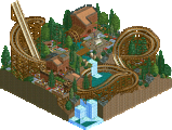
While the trains of the impressive Texas Giant are racing over the track, more action in this old frontier town can be found on the Silver Mountain mine train and the razing river of Red River Canyon.
Egypt | 1995
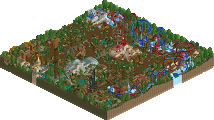
The first big expansion outside the park's original borders is an ancient Egypt-themed area, complete with pyramids and a spectacular hypercoaster, named after a legendary poisoned wind.
Grimvalley | 2002
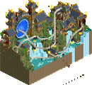
A spooky castle on top of a rocky hill serves as the starting point for an impressive flight on a compact B&M Inverted through the woods and past waterfalls.
Entrance B | 2008
This magnificent Scandinavian new entrance area is both inspired by the famous Danish Nyhavn and the old countryside towns. The main street is a bustling place with tramrides, shops, restaurants and information offices, while on the other side of the water a few rides such as the Sophia Amalia swinging ship can be enjoyed. -
 No fans of this park
-
 Download Park
633
-
 Objects
1
-
 Tags
Tags
Awesome job with this, I really enjoyed the archy, atmosphere and planning of the whole park. It all just felt so complete and fleshed out, like you put a lot of effort and heart into everything.
Only negative might be the coasters, some felt a bit random but that's pretty minor.
Loved the theme music too, fit the park perfectly. A 65% from me, hope to see much more from you in the future.
I really liked this! A great little NCSO park that shouldn't go unnoticed. Felt very old school time line park, but like G Force said, everything is plannes and it's clearly visible you had fun with it.
My only complaint are the park surroundings. I know meadows can be big and empty but damn.... That's really empty.
On the contrary, I found this park probably suffered from poor planning. I get the vibe that you had a lot of fun with this yet I found myself exploring the park and saying "where am I?" This could've been do to poor transitions between themes or something else entirely, but it was almost like there was too much to see in this.
I think this could've been resolved with more openness in the park. You have these huge fields on the outskirts and the inside of the park could've benefited greatly from some more breathing room. Everything is very close together which provides a certain aesthetic. It's pleasing in it's own way, but if you had planned it better to make the park itself larger to accommodate more open spaces I think this would've been a special piece.
This isn't to say the park is without it's merits. Most of the structures in the park were very well done and this whole map was a huge trip down memory lane. It had a charm that Blue Oak was missing in it's NCSO-ness. This thing was just, I don't know, very cute? Yet in the most nostalgic way.
I do agree that most of the coasters were forgettable but, I could give a shit about coasters really. They were okay.
One final bit, and this is perhaps a personal preference, but please name your shops. It adds so much to exploring a park. "What's this awesome restaurant called? Oh, Burger Bar 6."
I loved this. It had a lot of charm. I loved some of the creative things you did like using those lattices to frame your man made rock walls and cliffs. I second the meadows on the outside holding it back though. The texas giant and the red coaster seemed out of place, but I also loved the weather control indoor ride and the mine coaster on the island. I think this is a solid NCSO silver
this park had a tonne of old school charm. there were some parts about it i absolutely loved. the general atmosphere was great.
the places where it suffered have already been pointed out. it suffers from a lack of planning and a bad park layout. i do not mind the big open fields at all, they are pretty much the same as blacktiles and im glad you didnt waste any time on parts we dont need to worry about. the real problem lies in how cramped it is. more openness and room to breath would have done wonders.
the coaster layouts were weak as well. this will come with time. you plainly have an eye for composition and with a bit more drafting of rides (building and rebuilding to make sure youve done the best you can) you can achieve some great things.
thank you for sharing this lovely park with us and i hope to see much more from you in the future. keep up the good work.
wow I found a lot to like here, especially in the atmosphere. It didn't really fall into the pitfalls of classic ncso vibes that all feel the same, which is great on your part. the park was layed out in a new and original way, and it felt cramped but still alive and it all sort of worked really well. there were some awesome details and composure throughout- the rapids (and that queue) were a particular standout to me. but generally throughout the park you showed a really amazing knack for making the infrastructure beautiful- paths were layed out amazing, they interacted well with height changes/stairs and water and foliage etc. really surprisingly good stuff all around!
Well deserved Silver. Charming NCSO with some great areas (Egypt in particular!), though some of the coaster layouts were a bit on the weak side. I liked the use of green/garden space (most notable around the schwarzkopf).
Sorry to be the low vote. This had enjoyable bits, no question, but design wise felt very under-developed, in fact too basic and dated looking to warrant an NE accolade for me.
I stand by my score! well done.
this is one of those where i can understand both ends of the voting spectrum. it has some lovely moments but as I stated earlier it does need to develop further in your next project. great job on the silver, i hope to see much more from you in future!
I thought this was pretty good. Asides from what others have said, I did not like how you made a nice indoor coaster and didn't have the building cut away to see inside. Otherwise, nice job!
Sorry for the low vote. There were some things I really liked like the architecture near the swinging ship, the stormrider building and the building housing the royal theater and you definately have talent but a lot of things were a major step down in quality.
Texas Giant is probably the best layout in the park, but you used the game default layout (if opened in Vanilla it even has the Six Flags logo on it) and even default name. The Poison wind layout is awful, the other layouts could be better but they're fine. Jetflight is probably the best but there's really nothing to it.
Also, I really wasn't a fan of the big open grass fields. It felt unfinished to me.
There are nice things here and you clearly have talent. If everything was as good as the things I mentioned we'd be looking at a great release. Unfortunately a lot of it feels rushed and the layouts definitely need some improving. I'm looking forward to seeing more from you though.
I see some spots of greatness in your two parks, but overall its of silver quality. the aforementioned skill though makes me think you can easily get a gold with proper ambition. hit me up for ncso stuff and i can help you get good.
I enjoyed the more intimate feel of the park, but it was screaming to be a bigger, more spread out place than it was. The entrances felt grand and made me wish the park suited them better, and the space was there to allow for it.
Ride design was cool, though having duplicate attractions (multiple twist/scrambled eggs rides) seemed a little odd- I'm sure you could've found different supplements. No huge deal though.
Texas Giant was an odd choice to have here, only because such a big ride is a premade layout. Even just creating a coaster inspired by the original (or a better rec) would've done you well, though it doesn't really bother me that it is a game layout. Just odd that such a prominent ride wasn't custom built. Aesthetically it fit rather well.
The actual park details, the architecture, and the great backstage stuff kept me pretty interested. This makes me want to see more of your work because it has this great fun vibe to it. Just plan your parks a bit better, as it will do you wonders.