Park / Warbird Cove & Essex Naval Museum
-
 08-September 17
-
 Essex Naval Park / Warbird Cove Amusement Park
- Views 6,158
- Downloads 753
- Fans 3
- Comments 27
-

-
 70.00%(required: 70%)
 Gold
Gold

Steve 85% G Force 75% Liampie 75% Sulakke 75% bigshootergill 70% Faas 70% trav 70% posix 65% Coasterbill 60% SSSammy 60% 70.00% -
 Description
It's done!
This is my first release in many years, and one I am very proud of when compared to my prior work. Special thanks to all who supported me through this project, and very special thanks to ][ntamin for the excellent logo!
Warbird Cove/Essex Naval Museum essentially arose from me seeing boat day and thinking; I wonder if this could be done on a larger scale.
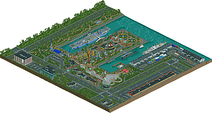
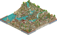
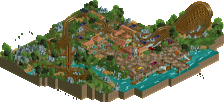
The final product features numerous ships including the USS Essex herself and the USS Olympia nuclear submarine, plus a decently sized amusement park themed to the aircraft of the United States Navy, with a couple of British names tossed in.
OpenRCT2 only. -
3 fans
 Fans of this park
-
 Full-Size Map
-
 Download Park
753
-
 Objects
1
-
 Tags
Tags
Great park
My problem with boats were always about medieval sailing ships that were in (what feels like) every H2H park, looked identical but hot tons of praise.
Oh it's out? Nice! Hope to find time to write a review this weekend. Congrats on finishing this.
Edit: I love the logo by the way.
Great work finishing this park CC9.
Lots of lovely moments in the park. i love garden-y it feels in some areas, it seems like a lovely place to go on a sunny day. all the rides look really good, no complaints there. the ships all look like they come from a place of passion as well. im glad you've managed to put them in a park.
the only problems i have with it are to do with how square the macro layout is. though it may seem like harbours are man made, they often are waterways that have been adapted for use, so they will have a more organic shape. the broad straight lines are a real missed opportunity in my eyes, as you could have capitalised and had some really cool man made shapes we don't see all too often. i would have stated by simply rounding off the corners of the causeway.
all in all, great park. keep up the great work and i look forward to seeing more from you
Lovely park! The boats look great and the themepark is nice and realistic. The Essex Park is colorfull, which I like. The placement of the foliage here is very good. Though, the SF Round Deco Rails around the trees remove the natural effect of a park.
Absolutely wonderful! This park is definitely a first with all the WWII history behind it. Knowing a bit about warbirds myself, I was quick to recognize some names (Hellcat, Avenger, Spitfire).
I'm stuck between a 65% and a 70% for this one.
The ships and shipyard are no doubt gold quality work, but the rest of the map is pretty hit and miss with that boundary.
The park it's self is a little confusing, It looks too...permanent I guess? The coaster layouts are nice, but I think this is one time where less grass and more concrete would definitely fit the theme better. The architecture in the park was too similar as well, once I'd seen one building, I had no reason to look at the others; there was nothing to draw me in.
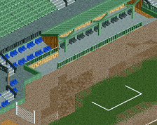
This continued around the outskirts as well. The structures were great, but there just weren't enough little details to find. There was the side of the harbour with the bomb and the tennis court and stuff, but other than that it felt like the outskirts were there just to fill space. When great parks like Riverlands do their outskirts, they have the structures there, but more important than that, it's filled with little details. Stuff to keep you looking for hours if you wanted to dig that deep, and unfortunately I don't think you achieved that here.
The closest thing to it was the petrol station, which was great! I loved the detailing on the pumps and the sign outside, but I wish that level of detail went across the board. So maybe having some rooms in the Marriott or the building next to it. Alfonzo's was cute, but was literally indistinguishable from the architecture inside the park.
I don't want to say much about the mall, because I think it's probably true to an American style roadside mall, but I think you could have done more. More details like posters on the pillars to add some colour, bigger better signs, etc.
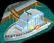
I did love the shipyard though, easily the best part of the map for me, along with the ships themselves. The little structures throughout were great too - the planes on the Aircraft Carrier, the truck, the defunct missile thing. I won't say which I preferred out of these ships or Grona Lund ships, but I think we definitely need a ship off for NE Awards 2k17.
Overall, it seems like you really wanted to build some boats and a shipyard, and then had to find a way to tie it into Rct. It's quality work throughout, but I can definitely tell which areas you cared for more than others.
Other than the architecture being a bit repetitive, you did a really nice job with this. The boats were actually interesting to me because they weren't just the same old ones we've seen over and over again.
I actually really like the foliage, even though it might not have made sense on the pier like that. It really felt pretty atmospheric and like some of the military museums/memorials I've been too. Sure a lot of it was pretty basic but I think it worked well like that.
Gets a 75% from me, but it right between 70 and 75. I think you could have gone either way.
+ Incredible ships
+ Great work on the rides. The eurofighter and starflyer showcase a lot of skill.
+ Lovely details all over the map, really helps to make it come alive, for example the momuments/memorial things around the map, the life boats on the white ship, gas station, popcorn machine...
+ The neon building under the woodie was interesting, the blue paths made it seem like there was blue light shining inside the building
+ Original concept, yet realistic and credible.
+ Excellent read-me, I enjoyed seeing all the old screens and things.
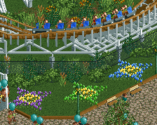
+ These flowers:
- Archy is very samey and uninspired.
- Octagonal motive on the map wears off quickly
- Outskirts were visibly rushed... Misisng interiors, cars not using all the roads, peeps being asbent... It's obvious you were over it. As you well know I think this park would've thrived in an urban setting but you did not achieve a real urban feel. Too many empty plots with rushed foliage
The park feels like a silver in places (architecture heavy areas, outskirts), but then I look at all the boats and all the other great stuff and in the end I cannot get myself to vote lower than 75%. This park shows a lot of skill in almost every aspect of the game (even in the archy department there is good stuff to distract from the octagonal mess) so a gold is definitely warranted. As of now you don't have a score yet but I'm sure it'll be above 70%. Congratulations! Excellent debut accolade.
I mostly agree with Liampie here on all the pros and cons.
Not a fan of the outskirts indeed, they feel rushed and the archy was a bit blocky/repetitive but the park and the rides are great (still not sold on the eurofighter colors lol).
Too bad the whole map was so square and linear because I think it could have been better otherwise.
70-75% for me, it looks like you're going to have a gold accolade and it's well deserved.
I guess I low voted on this one (along with SSSammy).
There are things I love, but it seems sort of all over the road. Things range in quality from almost Spotlight level (the boats) to bronze level (the Eurofighter) and there are so many huge, dull buildings like the shopping center and warehouses. But then there's stuff like Avenger that's adorable (though I don't love the first drop placement). It's tough to score I think. I really liked it as a whole, but there are some dramatic changes in quality.
Congrats though, there's great stuff here for sure. Those boats are amazing.
Thanks to everyone for the comments and criticism; I'm pleased to (finally) have an accolade under my belt!
I know that parts of this are far from perfect, and I agree with everything that has been said (especially about it being a bit all over the place from a quality standpoint). I was learning a lot about new styles and techniques as I worked on the park, and by the time I was nearing completion I was ready to apply that to something new. I hope to use the criticism and experience from this park to keep improving in the future!
I can also promise that the RCT ship bug hasn't left me yet.
70% is a mighty fine score!
Congratulations, CC9!
nice park! sorry I missed the vote, probably would have given it a 75. Lovely stuff throughout, with of course some incredible boats. clearly the highlight, and done tremendously. the scale also felt bigger here, which was a nice change and good for the tone of the park. I especially loved the SS Sunburst. the park itself was vibrant and colorful while still feeling realistic. I think maybe the one-story polygonal buildings get a bit tiresome/ hard to tell exactly what their purposes were. But also not so unrealistic and didn't drag it down very much at all. I liked the coasters, and the exterior areas were pretty great, although I wish you'd put in more proper interiors behind the glass windows.
overall, good stuff. look forward to more from you!
well done.
Huge congrats on the gold. Loved the park.
Congrats on the Gold, CC9. It's a big achievement!
I was really curious to see how the amusement park would fit in this kind of environment. I think you nailed it. Nothing seems out of place or unfitting.
When I first saw the overview I was concerned about the squareness. It didn't really appeal to me. But when zoomed in it felt completly different, not square-y at all.
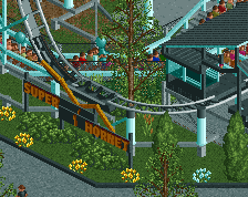
The park itself was very well made. The coasters were nice, and very fitting in this setting. I think you did a great job supporting Superhornet. I first thought it was the same layout that Louis! showed in one of his screens. But I was wrong.
What I liked about the park was the gardens with the flowers and fountains. I also enjoyed all the buildings with their interesting shapes. Pretty cool!
Obviously the main "attraction" on the map was the boats and the carrier - at least for me. The carrier is sick, man. It looks great. Very impressive. It must have taken you some time to finish. SS Sunburst was really cool too. Kudos for taking the time to build them. And by the way, the shadows were pretty neat.
I also liked the shipyard. It looked very authentic. A bit lifeless perhaps, but still good! I love how you did those tan/light brown boxes. Might have to steal that idea.
I guess some of the outskirts were a bit underwhelming at times. Escpecially the roads and the mall. But I liked that you added moving cars. They helped quite a bit.
All in all, this is a really good map! It was fun to explore! Hope to see more from you, and I definately hope to see more boats!