Park / Batman: The Ride
-
 05-September 17
- Views 4,782
- Downloads 848
- Fans 1
- Comments 17
-
 74.38%(required: 65%)
 Design

SSSammy 80% trav 80% bigshootergill 75% Coasterbill 75% Cocoa 75% G Force 75% posix 75% CoasterCreator9 70% inthemanual 70% Liampie 70% 74.38% -
 Description
(put on "disable all breakdowns" when opening; it's how the game stalls are peepable)
It's a Six Flags Gotham City area, what else do you need to know? -
1 fan
 Fans of this park
-
 Full-Size Map
-
 Download Park
848
-
 Objects
1
-
 Tags
Tags
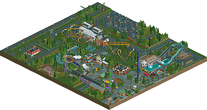
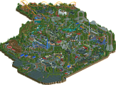
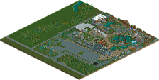
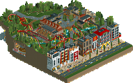
This will probably be the only "stale american realism" you see from me.
Parkname says Six Flags Over Louisiana?
Pretty nice. Loved the names for the cars. Don't think you really need them, but okay. Also you managed to make that Joker thing interesting. Nice, if perhaps a bit long, queue in front of it, and cool smoke stuff going on.
Some nice ideas like the white globe. Otherwise too recreationalist for me. Cleaner definitely than what you've so far shown. Coaster is indeed sitting too high.
SFOT's does sit about that high, as G Force said in discord chat, but It probably was a fault in terms of translating that into rct. Also I'm a retard who names parks over where he currently lives because he wants a park near me ;_;
No doubt Design quality, but there are a few things I'm not so sure on. Gonna take another look or two before I collect my thoughts.
Most obviously, the layout is well done. It does feel a bit high off the ground, but you've been told that a few times by now.
There's some great stuff here. Snowy's is awesome, the peepable shops and lockers are cool and the layout is really nice. Great work!
lovely work. felt realistic in a clean and detailed way, although I think its a funny park that has two inverts right next to each other. I think you did especially well with the foliage and open grass areas, well balanced (and of course, plenty of good realistic detailing all around). the surroundings also felt realistic and well executed. I quite liked how the park is a proper rectangle, it sort of made a nice frame for the whole chunk of park in a way that map cut-outs sometimes don't.
I always wonder why people want to recreate Batman, a type of coaster that's built so many times irl it gets boring. Nonetheless, a great job doing so but seeing this coaster lay-out doesn't excite me at all.
But the park is built really good and has a lot of cool details and stuff in it. I love the entrance gate to the Gotham City area, looks cool. The entrance to the Mr Freeze waterride is genius. Pretty neat you used simulators to recreate working lockers and game stalls.
I'd give ya 80%, with a more original coaster even more. It's a cool and beautiful piece of work but that coaster that takes it down imo.
This design is actually a joke. I picked the most boring, cookie cutter layout i possibly could to see if i could actually make something worthwhile from it. It was also a test to see how hard "actual realism" is to make.
everything was great apart from the fact it was boring old batman invert
I must agree with the other comments, but for what it was intended, being an american realism park, it's extremely good. I will repeat what I said on the screenshots you shared with us, but for me this is high quality work, that plaza with the umbrellas and its buildings around is just incredible, and has something other similar realism parks usually don't have : uniqueness. The path work is stunning. And the very important thing is that it's the perfect balance between clean and dirty.
Too bad the rides were not particularly exciting, mostly for Batman and Joker, because otherwise everything was here: creativity, atmosphere, perfect attention to details and colors, composition and planning on point...
Still a 75-80% entry, everything under that rating is in my opinion not fair ! u_u
Okay... So, I was really waffling between 70-75% for my vote. In the end, I went with 70%.
TL;DR - It's 100% design worthy and a very nice one at that, there are just some technical/planning/composition hiccups that held it back a bit in my eyes.
+ The layout itself; very representative of Batman. Upon a second look, it doesn't look too much higher than SFGAm's or other Batman clones, so it's not that big of a deal.
+ Mr. Freeze; I thought this was pretty cool; the snowman head and the station & theming was well done.
+ Shops and stuff; The little details among the shops, lockers, vending machines, etc were all very charming and fun to look at.
+ Misc. Theming/Joker; I liked the Gotham cityscape and Joker's theming quite a bit. I wasn't too keen on how little of the impulse would actually be visible from the queue with that big wall in front of it.
- Road infrastructure; This really didn't make a whole lot of sense to me. Given the concept that this is part of a larger park, I don't really understand why the parking lot and connecting road is where it is. The roads around the McDonald's don't make much sense either. The train track doesn't really do it for me either.
- Fences; Maybe this is a nitpick but it really looks like you rushed through a lot of the perimeter fences. Many of them abruptly end, ruining the point of a fence, or end in a gate that only has fence on one side, again ruining the point of a fence/gate. Mr. Freeze also has a pretty significant safety hazard next to the exit.
-Rushed(?) Technical Missteps; Batman's entrance hut clips through the roof, yet other ride entrance/exits have been made invisible, gaps in/too much of the mowed grass texture, Batwing's queue cover/building (this also struck me as a bit of an odd design choice), and what really seemed like a bit too much emphasis on the area rather than a greater and more refined approach toward the coaster itself.
If this is a joke, this is one of the funniest jokes I've ever seen. Joker's Jinx really stole the show for me, personally; probably one of the better impulses I've seen. Mr. Freeze and the game stalls were really nice, too, and of course you can never go wrong with a good Batman clone. Honestly, from the looks of things, you should try your hand at realism.
Joker's Jinx was the best ride on the map actually. Great details like the murals, the ha-has and the dripping paint bucket. Only the tunnel was a bit confusing to look at... You should try to make your work more readable. Another example of a thing that I couldn't figure out was where the Batman queue came out of the building at the back, before it goes up to the station.
All the supporting stuff (paths, buildings) was very nice and atmospheric. A bit glitchy where it shouldn't, but it's very well done. Love the McDonald's. Cars sinking on the highway was weird.
All in all, it's very good work, held back by relatively uninteresting rides and accumulating small issues. I voted 70%, but it was tempting to go with 75%. I'd say that the 74% you just got is well deserved! Congratulations!
With care and ambition you can easily crack 80% and get spotlight.
Liam always knows how to put it best.
Congratulations on the Design win!
You know most of my thoughts on this, or at least my thoughts on the problems with.
However, as far as the positives there are quite a few.
Architecture is obviously fantastic, probably some of the best we've seen in this style in a long time. It had a nice gritty feel to it which I enjoyed and definitely fit the six flags/gotham city nicely.
All the backstage was nicely done, other than the road layout in a few spots. I'm glad you spent time to flesh those areas out and didn't just spam small objects in them to make it feel a bit more finished.
Interiors to the games were all very fun, combined with the shops and carts made the park feel very alive and real.
Color and texture variation on the tarmac was extremely well done, as were the path type choices as a whole. I usually avoid doing this myself because I worry it will just look messy, but you did a great job.
Foliage/planters were also fantastically done and very well placed through the park. Added another layer of believably for sure, especially around the diagonal facade building. Though I think some of the tree planters in the path were a bit forced/unnecessary.
3D cinema entrance for the splash boats was a great addition, shame its a little glitchy. I think you maybe could have fixed that a little by changing the queue layout. But it was still a great feature that helped set this apart from most parks.
Great stuff Zach, a 75% from me though I think if you had used a different coaster and focused the map a bit more on the main coaster itself it could easily have pushed to 80%.
Congrats on the Design, Shotguns?
I can't say this style is my cup of tea, but regardless it's a fine piece of RCT. It's obvious that you're a talanted and skilled player.
I like that you aren't afraid of using bright colours. It really helps to make this style more enjoyable and atmospheric.
You also have a talent for architecture. The gift shop and the building with the dry cleaning were great. I love the fact there is a peep "queuing" for it.
The coasters were not very interesting, perhaps, but they were very well made. Good job on the supports.
I guess the most memorable ride for me was Mr Freeze. But I also love what you did with Batwing. Looks great.
Overall a solid Design. Good work. I'm definately looking forward to your next park.