Park / Tyrell Gardens
-
 22-July 17
- Views 3,408
- Downloads 494
- Fans 0
- Comments 21
-
 50.00%(required: 50%)
 Bronze

Louis! 65% csw 55% bigshootergill 50% CoasterCreator9 50% G Force 50% SSSammy 50% Sulakke 50% trav 50% Cocoa 45% Faas 45% 50.00% -
 Description
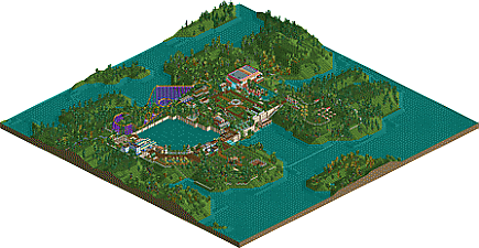
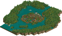
My winning entry in the July Reddit contest. The objectives for this contest were using a premade map
- Produce a recreation of a real life roller coaster
-Build a picnic area
- Build a childrens playground
- Build a boat ride
- Build a water ride
original release: https://www.reddit.com/r/rollercoastercontests/comments/6lxf34/submission_thread_july_contest/dkkxu85/ -
 No fans of this park
-
 Download Park
494
-
 Objects
1
-
 Tags
Tags
![park_3791 [NEDC4 5/15] - Arevik](https://www.nedesigns.com/uploads/parks/3791/aerialt3450.png)
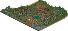
That portion of the park by the boat ride is brilliant parkmaking. So beautiful and picturesque! Overall a really quaint, quiet, peaceful place. I think you did that very well. I'm glad someone finally used that tunnel of love ride haha. I always wanted to but somehow never managed to put it into any of my parks. I like the big wall's design by the boat ride, but I'm not sure it's good for that central lake. Also with such a big waterfall I don't find it believeable that that lake will even exist for long. There should be a small stream leading into it from somewhere, not just that artificial waterfall section that goes into the lake by the park entrance.
Btw, lovely picnic tables!
Also this park is screaming for a carousel and a ferris wheel somewhere!!
So glad to see you really stepped up your game. I really like what you got here.
My personal favorite from your work. The Tunnel of love was amazing and the colors and foliage are great overall !
Problem I constated here and with your previous releases: surroundings. Improve them and it will really make your parks better.
Other problem, this garden is too lifeless, and putting some flowers here and here didn't help. Being the centerpiece of your park, it almost gives the feel the park was rushed at the end and you didn't take the time to fix some things.
Edit 30/08/17 : I didn't read the description and didn't realized it was for the reddit contest. Then I understand why the surroundings are like that. Still I hope you will make a non-contest park one day with cool surroundings.
This almost has a bit of an LL feel to it. My absolute favorite part of the park is the area around the boathouse. I love seeing multiple height levels in parks, and this was accomplished very well here. I do wish that the columns you made around the lake extended below the water. The coaster almost feels a bit out of place in such a wonderful garden, but I realize it was for a contest. Agree with Fisch; some more flat rides would have been fantastic!
i loved this when i judged it, hence why you won.
Fun little park. I don't know if it deserves bronze or not though, on the border between 45 and 50.
I'm confused by the obvious game of thrones references, but lack of any reference to that in the actual structure or design of the park
yeah pretty nice. My favorite bit was the concrete wall, and everything around there, especially that boat ride. that detail felt unique and really cool. the rest was sort of standard garden work with a bit of archy, but the way you did those walls really interested me
Sweet little park with a very sweet atmophere. Very nicely spaced out with a tranquil feel too it. I love it.
is there a link to the premade map? kinda important for my vote
https://www.reddit.c...t_july_contest/
@SSSammy there is a link to an overview image and the download for the premade map at this link
there's a lot to be proud of in this map iron rattler!
it certainly felt very garden-y. the garden aspects were all very pleasant. stuff like the tennis courts and the play area all look great. the picnic area also rocks. is the wild mouse/ barrel combo original? the tunnel of love looks cool as well. the little scene with the boats and the greenhouses would make a lovely screenshot.
the big weaknesses for me were:
-the park is an awkward horseshoe shape
- the coaster is pretty boring and clunky.
- the architecture suffers from being big boxes. try to diversify the shapes to add interest
all in all, this is a big improvement over your last submission. i just wish there was more content. keep up the good work,
I echo many of Sammy's criticisms here. Your stuff often feels like its locked to the grid a bit too much and is a bit awkward as a result.
Not really sure how you go about planning your park, but I'd try to take a more macro approach and implement more curves and irregularities in the layout. Maybe trying some different benches could help as well, just to break out of your style a bit.
Overall it was nice though, the picnic and park areas had quite a nice little atmosphere to them. A 50% from me.
Edit: that sounded more harsh than I meant. Work on your coaster layouts and architecture and you will improve quickly I think. Some really nice aspects were there, but it didn't really come together.
I thought this was very nice in areas, especially around the cliff kinda area.
However, I thought it was also very empty, hence the 50% from me. With some more content and a bit more refinement, this could have been pushing 60%.
@fisch I don't know how I never thought of a Ferris wheel. That would have been much better than an observation tower
@julow I actually liked leaving the surroundings in in this park. I felt it added to the aesthetic
@CC9 I agree about the coaster. I couldnt find one that fit in well.
@cocoa this park dame during my rewatch so I figured why not. I almost made a made Tyrell logo but got lazy
@Sammy I agree about the park shape. I think that's my biggest weakness currently is park layouts
@gforce I didn't really plan the layout much. It was almost a stream of a consciousness. I'm trying to switch off ncso benches though moving back towards LL and CEO
@Faas no worries. I didn't think it was harsh. I do think the layout was weak. I thought it was a good recreation but too fast
@trav thanks. I tried to find a balance between minimalist and too empty. Don't know if I succeeded
The 55 cancelled out the 45. That's a whole load of 50 votes there lol solid bronze win. Congrats, I loved the park.
Quaint and lovely park, although this suffered a lot from the premade, scenario-like terrain. Congrats on the accolade! You're already better than me
congrats on getting the lowest rated accolade in history! haha
Not as good as that time maverix got a mirror image of votes either side of 65 to land right on it