Park / Disney's Forgotten Kingdom
-
 22-August 03
- Views 14,011
- Downloads 4,543
- Fans 7
- Comments 41
-

-
 88.75%(required: none)
 Spotlight

Cocoa 95% no robbie92 95% no 5dave 90% no chorkiel 90% no csw 90% no Liampie 90% no alex 85% no Kumba 85% no ][ntamin22 85% no Poke 80% no 88.75% 0.00% -
7 fans
 Fans of this park
-
 Download Park
4,543
-
 Tags
Tags
Fatha' Offline
Its cool.
~Prince Ashitaka~
Fatha' Offline
Horseshoe Bay
Entrance Area was good, but it didn't capture that Disney feel that DDI did, so in my mind DDI has the better entrance of the two Disney parks. However I still like this area a lot, and the exit arch is a nice touch, makes it look realistic. Good start off, but it could have been better like DDI's was. Oh, and the name....Good God.
7/10
Ahgrabah
Sorry, but this isn't my cup of tea so to say. The adventure ride was splendid I think you did a good job, but more buildings around it could have done it some justice. That goes for the whole area. The place seems shopless, bare with nothing in it. You captured the feel well, but man where is the architecture? I mean, at least one building here or there...Anyway this area was dissapointing, and only thing that saves it is the adventure ride. The double carousel was nice as well.
5/10
Atlantis
This, this is the highlight of the park. Great, great, GREAT portrayal of Atlantis, almost as good as ALE's! This area has a charming Disney feel to it and has some nice rides. Nice touch with Jumping Jellyfish, the tentacles on top are marvelous. The building for the dark ride "Triton's Kingdom" is splendid, and the same goes for "Escape From Atlantis." Nice touch with the "Ursella's Lair" ride as well. One of my favorite areas ever, Top 10 maybe a Top 5.
10/10
Manjai Village
Another highlight of the park, this area is a great jungle-like section and gives an awesome tropical feel. "Temple of Sheer Kahn" is a jewel of a water ride, but the Indiana Jones ride is a bit dissapointing (Although the choose-your-own adventure idea was tight). Great area all together with lush foilage and nice architecture.
9/10
Treasure Island
Yeah its been done before, but i wont judge on that basis. The mountain looks pretty good, but I would brush it up a TAD bit with some foilage, just a tad. The mine train is dissapointing...what happened to the coaster building days of "Uluru Mountain?" Why throw some hidden non themed mine train when you can have the beauty that was presented by Uluru mountain? Maybe I am missing something. The area as a whole is nice, and the Pirates ride is stellar.
8/10
The Empire
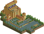
The last highlight of the park lies here, with the great area dedicated to Kuzco himself. Anyhow, the Church...Yes, its big, and yes it did take lots of effort I can tell, but...ehh. I dont know, I'm just not a fan of using coaster track for architecture when you've got the great land tool...but hey, its different so kudos. The Tower of Terror is marvelous, but I wish you couldnt see the car at the top sticking out of the building. Perhaps making it a wee bit taller would have eliminated this. However, the design of the ride is brilliant and far superior to Ports of Calls simple ToT. Great job on the rest of the area, one of the better ones in the park.
10/10
That stupid uninhabited island
Oh dear, please stop making these people! It makes no sense to make some island, where you have to get on a boat to go to, and see absolutely....nothing! Come one, make an adventure ride, do a coaster, do SOMETHING to keep me occupied. Don't waste land on some silly fort with nothing there. Its pointless, at least have an attraction that...moves. The horses don't cut it pall (But they are a nice hack). Please, Disney can afford ONE good coaster to put there instead of a isle. Sheesh.
2/10 - No, that wont go with the parks rating.
Yeah, I liked it a lot but like I said, if you would have fixed those flaws in my mind, I would have a new number one. With that said...
90/100.
...be nice to the uninhabited island, it has feelings!
You have a number to use the theme for well.
Best park ever, period. Number 1. RoB would be laid waste if this was RCT 2, luckily for me, it is not RCT 2, so RoB will continue... But damn.. makes me look at everything comlpetely differently. I love this park. I have only had several minutes to look over it and it it nothing but excellence. Fatha is right about the Agrabah area, but dont let that take away from your glory,if there was no worst, there would be no best. Very nice park. Number 1. My fav RCT 1 work ever..
Looking at a park like this makes me wonder if I should even compete...
Corkscrewed Offline
Anyway, I'm glad you like the logo, Nate. I'll give you two guesses as to what real logo this was blatantly inspired by.
And yeah, I had a feeling the Church was aimed at me. Nice job!
Anyways, #3 on my list.
Oh, the white things are supposed to be bones?
RMM Offline
lol j/k
The park was great. Your a great parkmaker. Top 5 or maybe 3.
The park was a refreshing RCT1 flashback for me. The boat sculpture was quite nice and all the architecture was as "Disney" as RCT1 will allow. I thought the Fire Mtn. thing had been done before (not sure where), but was a cute idea.
Sher Kahn and Indy were very groovy.
Anyway, congrats Nate. You deserved this as it was definitely a great Rct1 Disney Park.
Cheers.
And it's the best one, too. I'm gonna deal with the good stuff first (and there's lots of it) then i'm gonna criticise some shit because I feel I should.
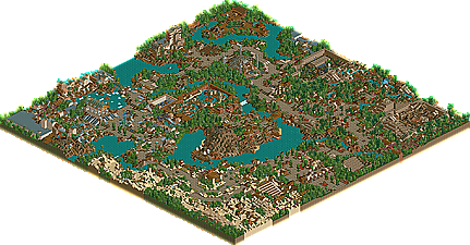
Anyway, first off, you are the park layout king. Just open up the map thumbnail in a Nate park and you can see the park working. There's a continuous path structure around the park, taking in all the areas. It was the same in DDI, but in DFK it's a lot less square and a lot less obvious, which I think is an improvement on Nate's part. There are few dead ends, the fast track layouts are the best i've seen (i'm in awe of people who do things like that...harakiri's another one who has perfect entrance/exit/queue layouts...it must require loads of organisation which I just don't have).
The entrance is pretty. I like the awnings and I like the colours. Those colours belong to Nate, really. DDI's entrance was a bit more impressive, but this one does the job nicely.
(By the way, excuse me constantly referring to DDI, but seeing as they are both Disney Parks I find it difficult not to...plus it helps me point out any progression I think there is...also excuse any mess-ups I make, cos i'm still getting used to the park and don't have rct loaded at the moment...i'm working off memory...i'll return to the park again though, several times as I do with most parks)
Agrabah. Well, I can't decide. There seem to be two types of arabian area at the moment. There's this type (similar to RR's and eTa's) and there's the vTd type (DD, Terrace Point, Hidden Realm). I like both as much as each other, but I think this is definitely the harder one. Firstly, there's less emphasis on architecture and more on desert. Now that's fine, but this time I think you've got it wrong because, really, that floorless adventure ride is boring. Very boring. There's the odd overhang and a few bones, but apart from that the sandy rocks just get overpowering and by the end of it I was left with a feeling of "meh". You could have added more 'features', like a mirage, or an oasis, or a nomad camp, or something. Anyway, apart from that I liked the area for its simplicity and effectiveness. Some of the best architecture here (carousels) but also some of the worst (useless mini buildings on the edge of the rocks).
Atlantis is my favourite area in the park. Triton's castle is great (it's like A:LE's, but updated and named...i had no idea what the one in A:LE was until now...) But, my favourite bit is the coaster. No-one does indoor madness like Nate. Ruiz Island, Hotel of Atlantis, Killuminati...and now this one. Great exterior (good mixture of flat roofing and normal architecture) and a very nice layout...i'm really liking rides with long slow bits leading up to the launch. This is really the big brother to the Haunted Atlantis Hotel, and the whol monorail/vertical hill/hidden large loop combination adds up to a ride that merits its excitement rating. The end is a bit bodged though...what happened to a brake run and transfer?? The little bumper boat thing is good, and the ghost train is really fun (i have a penchant for ghost trains
The Lost Island was a bit of a waste IMO. I'd have liked to have seen you redo the Mickey area in DDI. Would have been nice. The Empire Hotel was, of course, nifty (even though I don't get the thing with the tower of terror...maybe cos i don't know the real ride). The church is excellent - an extension of x's work in outrage and AS, which is good to see. Minaret's were a bit...confusing... I don't see how Iris rates this higher than Atlantis....IMO atlantis wins hands down...
Manjali Village was very nice. I nearly did a Jungle Book thing for the Blockbuster challenge but it sucked. This, however, doesn't. The buildings are pretty and the whole temple thing is done well. It's good to see the dark rides being less isolated - in DDI the things like Crazy Taxi etc were all far apart and you wasted space on the walls and the rocks. Here they're in close proximity and it works. I don't think there's any indoor theming approaching that of Taxi or IJ in DDI, but still it works...unfortunate that the two stations in the IJ ride aren't working when you open the park...some people might not realise it's a double station ride...The River Ride/Water Coaster is very nice, especially the drop with the foam at the bottom (a la A:LE) and the water s-bend.
The central treasure type island was nice if a little cliched. The mine train wasn't a patch on Uluru. But i guess it's very different, with the switchbacks and shorter trains etc. More of a family ride. The river ride is my favourite bit with the best indoor theming in the park - real fun ride, that one.
Some overall things I liked too were the area entrances, the grassy bits and the pathside theming.
Some things I think you could have improved were the spelling, the shops (names and number), the area entrances (lol, some were missing) and perhaps the lack of a main attraction (i think the park is lacking something that would serve the same purpose as Creature in SWA...the atlantis coaster isn't enough).
I really like this park a lot. However, I still think it's missing something that The Westcoast and Altamont had and that is, perhaps, real character. I know it's a Disney park and you need to be true to the system, but there's something in your old parks that make them more fun and more....alive.
I can't explain it, but maybe you know what I mean. It'd be great to see a park of the calibre of DFK with that Nate sparkle attached.
Well done on spotlight #4!
and you said you don't really know what Tower Of Terror is!! Oh my. here, it is worth your time: Here
Oh well, my criticisms are based on RCT not real life, so you shouldn't take them too badly...
And your link isn't working