Park / The Shadow
-
 10-September 17
-
 The Shadow
- Views 3,269
- Downloads 767
- Fans 2
- Comments 13
-
 75.00%(required: 65%)
 Design

Coasterbill 80% CoasterCreator9 80% Steve 80% bigshootergill 75% posix 75% Sulakke 75% trav 75% Cocoa 70% G Force 70% Faas 65% 75.00% -
 Description
What ever you do, Don't. Go In. The Mine.
*Read the read-me before opening either file. Open "The Shadow - Maverix" First. -
2 fans
 Fans of this park
-
 Full-Size Map
-
 Download Park
767
-
 Objects
1
-
 Tags
Tags
![park_2399 [H2H6] R3 - The Replacements - Worlds Of Fun](https://www.nedesigns.com/uploads/parks/2399/aerialt2136.png)
![park_3220 [MM2014 R3] Angel Concert Hall](https://www.nedesigns.com/uploads/parks/3220/aerialt2830.png)
![park_3338 [H2H7 R2] World's Fair](https://www.nedesigns.com/uploads/parks/3338/aerialt3037.png)
A mine is really much more fitting for this ride type and theme than a shed.
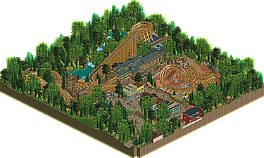
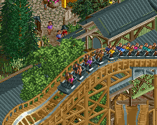
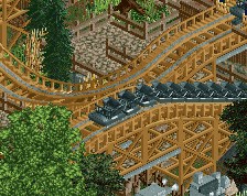
Layout was very solid. Aesthetically well done and found myself eager to follow the trains and see where they would pop out next through the trees/mine. Very cool ride.
Surroundings were good, foliage was done well enough and I really liked the mine stuff and the waterfall was well placed. Station is architecturally very good; just enough detail but still quite readable. Facades in the little town below were also good -- they got the job done at least.
Overall there's really not a lot to complain about. Nothing amazing but certainly solid. I do wish I could've seen what was in the mine a bit clearer, but otherwise you get like a 75-80 from me. Keep it up, dude!
Feels good to finally have something released!
Thanks for the comments so far guys
Steve really nailed it for me. Loved the layout and interaction, especially around the queue. Very solid release!
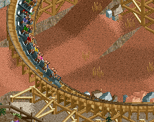
Excellent work man. Great compact layout with great attention to details, lovely queue and sight lines, good story that's credible for real parks without being too inside the box, better foliage than any of your work before, and a good atmosphere (that queue!). Two things I wasn't impressed by was the archy in general (remains your weakness) and the red sand area which looked out of place and not as detailed as the rest of the map. I also question your use of wooden pole fences for custom supports. I get it for ncso maps and other primitive benches, but if you have access to all custom scenery this is far from the most suitable choice for custom woodie supports.
75%.
Maybe it's because I have an affinity for western theming but this is wonderful.
The best thing about is is that I love the architecture. The station and surrounding buildings are all great and previously I always considered that to be your Achilles heel. Now it's a strength.
The layout itself is really nice, the queue is perfectly placed and overall this is just a beautiful piece of RCT that's practically bursting with atmosphere. Playing off of the mystic timbers shed concept is also a clever idea.
I love it! 80% from me.
great little design. loved the tight layout, felt right out of a herschend park. I'm not really sure I understand what was in the mine, but despite being quite little everything was really well down and atmospheric, with lovely foliage and vibes all around. great job.
Nice design. Just like all of your coaster layouts, this one is fantastic again. It hosts your best foliage up to date too and it added a lot of atmosphere. The architecture was solid. I agree with Liam on the red sand area, it felt kind of out of place. The second save game showing the inside of the mine was unnecessary, as there was not a lot inside the mine.
Congrats!
Thanks all!
Certainly proud of this project. Had a blast building it. Now onto hopefully bigger and better things!
is this the smallest design on record?
Nah, that's probably this one.
https://www.nedesign.../2054/tomahawk/