Park / Wildwood Kingdom
-
 25-August 17
- Views 2,579
- Downloads 617
- Fans 0
- Comments 10
-
 45.91%(required: 50%)
 Spotlight Submission

Cocoa 50% Jaguar 50% Poke 50% RWE 50% ][ntamin22 50% Coasterbill 45% CoasterCreator9 45% posix 45% SSSammy 45% trav 45% G Force 40% Liampie 40% Scoop 40% 45.91% -
 Description
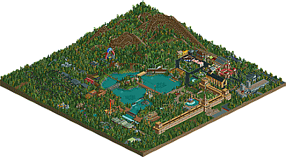
Back in 2013 there was a slightly lesser know reddit competition over the summer that possibly was overlooked by the other monthly contests. Me and my assigned partner, another redditor by the name of "xfcsa", worked on this park over the course of a couple months. He was very inexperienced compared to me... and I was at the time too honestly. Well I tried to make the park work well and still incorporate elements in the park he helped make. In the end, a lot of the final product designed by me, but I tried to keep the things he put in and just upgraded them. Though, most of the layouts were done by me. We did end up winning but I don't even know if he found out. He has been extremely inactive since then. Anyways, this if my (our) 3rd ever CSO park, Wildwood Kingdom!
-
 No fans of this park
-
 Download Park
617
-
 Objects
1
-
 Tags
Tags
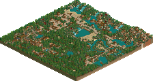
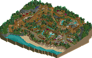
I enjoyed this. Some really cool ideas in an overall very woody park. Force of Nature was my favorite because of that double launch at the beginning. I wish you hadn't used that train type for the coaster though. The lake was nicely done, and had some pleasant, not so woody parts which was good. Overall I feel you were almost missing some more normal rides considering your crazy coaster line up.
I also enjoyed this. I agree with Fisch.
Otherwise, buildings are all a bit too squarry for me and personally I wasn't a fan of your selection of colors and textures overall. Just personal taste.
My favorite rides were the Enchanted Forest and Phantom !
Pretty cool park if a bit inconsistent. A lot of the path choices stood out to me. I loved the massiveness of phantom though
yeah, some good stuff here. I particularly enjoyed the layouts (except paladdin's), they interacted nicely and felt atmospheric. the huge woodie was especially good, and the kiddie coaster right next to it. the archy was a bit bare/unrefined I thought. the atmosphere was there in some places- a bit of a darker, medieval sort of vibe- but not really present enough to really give it a real impact. but overall, some good bits throughout.
This feels like one of those RCT2 parks that used to be started on the TPR forums but never got finished. Only this one did.
There were things I didn't like: too simple archy, strange colours... Some unrefined stuff in general.
But there were also quite a lot of things I did like. Whereas most top-of-the-bill NE parks plays things generally safe, these sort of parks tend to take more risks and be more creative with their park planning and ideas. The coaster over the carrousel or the island tram are things you just won't ever have to expect in modern park making. And I think that's a bit of a shame.
Overall a nice little park with neat ideas but one that suffers from an outdated way of doing architecture and strange colours.
this was nice. i don't think its quite there to make it accolade worthy. the ideas were that little bit too sporadic for me to invest wholly. take the massive walls which form the entrance to the park. theyre alright, except they kind of just stop, and i dont feel like you've sold the idea all the way. the architecture is really simplistic and doesn't really hold my attention. its too inconsistent as well.
the coasters needed one or two more drafts. i feel like people build a ride, then just say "its finished now." then move on. i think a lot of people would benefit from going back and asking yourself what you wanted from the ride and whether you achieved it to the best of your potential.
however, im excited to see what you bring in future. i like the level of creativity in the ideas. as you continue on your rct journey and improve as time goes on, if you properly commit to the ideas you have, you guys will make some interesting creations. can't wait to see what you do next. keep up the good work,
Lots of coaster fun but otherwise empty. Work on making things more beautiful and refined next time and you'll be hitting accolade level in my eyes.
I like this a lot.
The layouts were a bit awkward but fun and the architecture was blocky and basic but still sort of charming (especially over by Phantom).
Work on your layouts a little and try for a less blocky aesthetic with a bit more detail and you'll win an accolade for sure. Nice work!
Phantom was really pretty nice. I don't think the pre-lift or the second half quite nailed it but overall it was one of the most impressive Beast-alikes I've seen.
Let's get the last panelist votes in.
Simple but charming entrance.
The building "HALL" looked wonderful, the glasses well selected the colors.
The flags above the cups I loved.
The bridges were great, I loved the electric tram passing by the bridge.
Different chair lift, got creative the suports with the details.
I can say that it was a great job to set up a park.