Park / Gröna Lund
-
 07-August 17
-
 Gröna Lund
- Views 19,384
- Downloads 1,699
- Fans 28
- Comments 47
-

-
 93.13%(required: 80%)
 Spotlight

Louis! 100% yes Coasterbill 95% yes CoasterCreator9 95% yes Jaguar 95% yes Steve 95% yes trav 95% yes bigshootergill 90% yes Cocoa 90% yes G Force 90% no Kumba 90% yes 93.13% 90.00% -
 Description
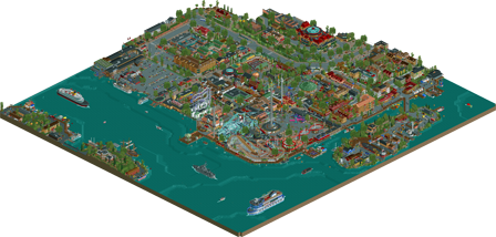
A Gröna Lund recreation
-
28 fans
 Fans of this park
-
 Full-Size Map
-
 Download Park
1,699
-
 Objects
572
-
 Tags
Tags
![park_3796 [NEDC4 4/15] - Wildfire](https://www.nedesigns.com/uploads/parks/3796/aerialt3454.png)
Ah, at last! Great to see that you managed to integrate that lighthouse ship I mentioned! Like I already said, this is definitely a clear step forward from Liseberg, both technically and aesthetically, and you've managed to capture the look and atmosphere of the park and its surroundings very well. Definitely worth the Spotlight!
I do agree with Shotguns though, I'd love to see you make a park of your own! And considering you've now done the only two proper amusement parks in Sweden, there isn't much choice really
it is.
it is everyone's greatest piece of rct ever.
there wasn't a question about it. i stated that it IS the greatest piece of rct ever, not MY greatest piece of rct ever.
Jesus, this whole thing was fantastic! I love finding little details in parks, so this was like going through a bag of Halloween candy for me. All of the rides looked great, too; my favorite might actually be Insane despite it not actually working. Overall, one hell of a park, and one that definitely deserves its rating!
Congratulations on spotlight Lagom! This is a mind blowing park and I intend to return to it a few more times to fully explore it and write a review.
Crazy stuff. Second spotlight for a parkmaker who's never actually been a vocal member of the community and who for I believe most of us appeared completely out of nowhere and took NE by storm. Liseberg and now this are already two pretty historical spotlights I'd say. Incredible work, so many details to look at.
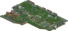
My criticism would be that it's really hard to read where the park starts and ends. I think just taking a different shade of grey for the roads as opposed to the pavement in the park would've helped a lot. It's all very dense around the park, and I totally believe you that it is like this in real life, but I wish you would've made it a lot easier to understand the whole park for the 99% of us that haven't been there yet.
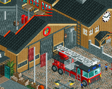
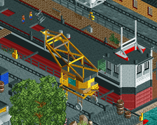
The boats are of course crazy, as are the real life details, the fire brigade, the shipyard/docks, etc.
I feel like you really enjoy turning rct into something like City Skylines in a way.
The park itself is awesome, too but I honestly feel that it's not the highlight of the map which is something that Liseberg managed to do better in my opinion. Jetline looks brilliant and kudos for making that cluster of coasters work out in rct in such a small space. The Zac Spin looks really cool as well!
Overall another really spectacular map, although I will say that the park almost gets lost in it a bit. The map overall though is a testament to your brilliant ability. It takes great vision to turn something from real life into such a colorful and fun rct scene.
This is spectacular, incredible, I don't have words to qualify your talent. I'm so glad to see that everything else in this park is at the same level of ingeniosity than the screens you shared during its construction.
For your next project, I must agree that I would love to see you try something else than recreations since I'm not usually a fan of ultra-realism parks, but that's just personal preference.
Congrats on Spotlight !
I cant seem to load this...I get a missing object plus had problems with my installation on GOG....any ideas
In a league with alex in producing endless masterpieces. You're unbelieavably talented in playing this game. I endlessly respect your dedication to producing these recreations with all their awkwardness and quirkiness; so just much talent in every aspect of the game displayed in this park.
it's just so breathtaking. Thank you so much Lagom.
As far as my thoughts, it's really spectacular. My main concern is that the park is relatively overshadowed by the surroundings, yet I can't fault it much since it's essentially a recreation. Also, I can't speak to how accurate this is in relation to its real life counterpart, but I'm guessing it's quite close.
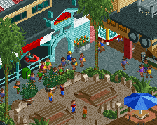
Otherwise, there's a lot to see and enjoy, here. The boats are an obvious favorite, and I really did love all of the details outside the city. The amusement park itself had a lot of great touches as well, and the coasters were well done and I really had a good time watching them make their rounds. Overall I probably looked at this park for over 30 minutes upon initial viewing; that's something I haven't done in a long, long time.
Congratulations on this staggering achievement, Lagom. I hope this isn't the last we see of you!
Pretty impressive and a kick in the teeth for all those recreational realism rct2 players. I can understand why people are so excited about this, but it's still not my cup of tea. It's too clinical, too meticulous, too much trying to be perfect, which creepily it achieves, I guess. But that still doesn't make me feel warm towards it.
Interesting posix. I feel the opposite. There's substantially less focus on micro precision and getting things absolutely perfect, and much more on the overall look and feel of the park and surroundings. The majority of structures miss out on the detailing and layering that have made Rob and Pack successful, and instead focus on how the area works as a whole, and that's brought its own phenomenal success.
In my opinion, this park is pretty far from technically perfect, but stylistically it's an ace.
Thank you all for taking the time to comment. It is always interesting to take part of your opinions. I am flattered that some of you liked it so much. I also understand the voices saying the park was too hard to read, and that the park was overshadowed by the surroundings. Very fair criticism.
The surroundings were never meant to overpower the park, but since they were so fun to build, it was hard for me to stop
I want to thank the admins and everyone involved for their hard work, and in releasing this park. I also want to thank everyone for all the uplifting comments and the constructive criticism I got along the way. As always, I will take your thoughts into consideration, as a tool to improve my work further.
Langos?
You did it again, my Swedish friend, you did it again.
What can I say that hasn't already been touched upon? Not much. Park is on point, surroundings are phenomenal, Faas is there... Everything I hoped for is here, and more. I've never been to the real life Gröna Lund, but this must be damn close to reality.
-Atmosphere is the most important thing for me in a park. You've got plenty of it.
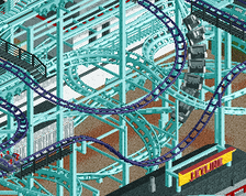
-I love the interaction of the coasters, I wish I was good enough to pull something like that off. It feels busy and messy but it all works!
-Can we all take a moment to appreciate the fact Lagom realistically recreated the catenary for the trams?
-Just add a plastic factory for detail, why the flying fuck not?
-Them boats. THEM BOAAAAAAAATS!!!!
There are however a few little niggles with it, not everyone is perfect it seems.
-Scale might be a tad too small sometimes. But this is a nitpick because you are consistent with it.
-Maybe it's just me but I find it hard to look at this park. I mean, it's sometimes unclear for me to separate park and surrounding and there's a lot to take in when you're viewing something. It's difficult to put my finger on but I hope you understand what I'm saying. It's tiresome on the eyes.
But hey, that's just my opinion. This is a Spotlight if I ever saw one and I look forward to what you're doing next. That design idea you showed has promise and I'm sure that will win an accolade as well. Keep on building!
This just looks amazing from the overview. I haven't checked it out yet since I'm on vacation rn, but I bet I'm gonna have fun looking around! Also, I only just found out this is a real park (facepalm)
it'll come as no surprise that i love this. im still annoyed i didn't get to vote on this as befit my rank as no1 lagom fan, but i'll do my best to hold it together.
i'll offer some nit picks for fear of fangirling too hard:
- some of the coasters were ugly in places. due to the nature of adaptation the woody and the suspended coaster look very clunky at times, with awkward transitions to make them work in rct. not much that can be done about this and i dunno if anyone else could have done it better in context
-eclipse could have functioned. we've seen it before in many parks, but i get its a lot of work to implement
-some of the architecture seems more considered on the outskirts of the map, where it is more simple (not necessarily a bad thing) towards the centre of the park.
i loved the crane going on the boat.
95/100. better luck next time.