Park / Mammoth
-
 29-July 17
- Views 4,806
- Downloads 771
- Fans 1
- Comments 27
-

-
 45.63%(required: 65%)
 Design Submission

posix 70% Coasterbill 60% Liampie 60% bigshootergill 50% CoasterCreator9 50% Cocoa 50% Jaguar 50% SSSammy 25% Faas 20% trav 20% 45.63% -
 Description
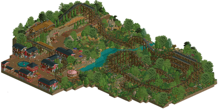
Located in a small national park in France, Mammoth was a spectacular attraction back when it opened in 1974. Indeed, the ride was built as a celebration after researchers discovered a full mammoth skeleton on the site.
Since then, the owners of the park cherished their only and beloved roller coaster and made a lot of retracks to keep the ride enjoyable.
Mammoth is the most famous attraction of the Basque country and had more than 1 million riders since its opening.
***********************************
Thanks to nicman for his help and to everybody for your feedback.
I was very pleased to see a lot of positive reactions about this project during its creation, I hope you will like it and that you will not be disappointed !
Julow -
1 fan
 Fans of this park
-
 Full-Size Map
-
 Download Park
771
-
 Objects
219
-
 Tags
Tags
![park_4122 [H2H8 R4] Park Guell](https://www.nedesigns.com/uploads/parks/4122/aerialt3861.png)
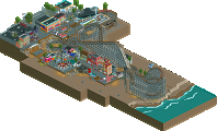
Julow, I like your work because it's one of the most unique styles on this site but as everyone else has said before, it's a shame to see this finished at only one angle and frankly very bizarre.
Heck even at the other angles it doesn't look that bad when you remove those massive black walls... some touching up could really have made this special but it's a shame as is.
Haha, this made me laugh. Sticking to your own beliefs. Placing all those black walls has probably taken just as much time as it would have taken to finish the other angles.
Anyways, I really love the area around the station and the first drop. The coaster entrance is fantastic. The rest didn't do much for me.
Hey everyone !
Thanks a lot for all the feedback (positive and negative ) and the different reactions, showing that much interest for what I do was heartwarming and it's great to see how diverse the community can be (as seen with the accolade votes for instance).
"There's literally no rule anywhere saying a park has to built with all angles considered."
I agree with you, but like every other community, there are some self-made diktats and I've been dumb to think this was going to be ok.
However, I'm still really proud of the final result, the more I build and the more I enjoy the game. I'm a bit saddened to see some people being that much disappointed, or even angry at me, without considering all the work, planning and the time it took me to build Mammoth.
And to answer the people who are making their own prognostics about the time it would have take to build the other angles: yes, it took me as much time to build the black walls than it would have maybe taken to "finish" it. It was a choice, since finishing the other angles would have impacted the aesthetics of my main and favorite angle.
For example, adding a tree somewhere would have hidden some elements that helps having good aesthetics in the main angle (for example, here, the rocks, the wooden supports) but aren't great in other angles. This tree would change the rendering of the main angle and then impact the whole project. Multiply this and then you finish with something very different of what you have here. And I want what I have here.
I hope some people understand it, I know some don't. To the people saying that all of this is bullshit, that I'm lying because I'm just lazy, I don't know what to tell, it's just disrespectful. But I'm taking it easy, it's not like I'm surprised.
Anyways, I'm actually working on a 4 angles project, changing my aesthetics a bit to something maybe more common but that will be in accordance with the diktats of the community.
Thanks for reading !
Julow
I kind of missed the release of this park. But it looks great! I can understand the people saying they were dissapointed because there was only one angle. I was also confused the first time I tried to switch the screen. But I think giving this a low score just because it has only one angle is very weird.
Personally I think what you did was very clever. I don't really have a problem with it although sometimes I must admit that I was temped to look at things from a different angle. I think it is rather weird that people here have a standard of having all angles present. It's like judging a fantasy park like Swoon based on it's realism, or like saying the mona lisa is shit because it isn't a sculpture.I think the one angle perspective is a choice that should be respected and I actually really like the idea of painting a picture from one angle rather than making a park work from all angles. Although for this park it was maybe not that necessary, I can see it being used to create really unique parks in the future.
Furthermore I also think the quality of the content itself is also really nice. The object choice is great, the foliage is great and the coaster is super nice and unique. I actually think this park is super nice and therefore I scored it an 85%.
6 years late but consider me a fan, there's nothing unfinished about this