Park / Mammoth
-
 29-July 17
- Views 4,209
- Downloads 640
- Fans 1
- Comments 27
-

-
 45.63%(required: 65%)
 Design Submission

posix 70% Coasterbill 60% Liampie 60% bigshootergill 50% CoasterCreator9 50% Cocoa 50% Jaguar 50% SSSammy 25% Faas 20% trav 20% 45.63% -
 Description
Located in a small national park in France, Mammoth was a spectacular attraction back when it opened in 1974. Indeed, the ride was built as a celebration after researchers discovered a full mammoth skeleton on the site.
Since then, the owners of the park cherished their only and beloved roller coaster and made a lot of retracks to keep the ride enjoyable.
Mammoth is the most famous attraction of the Basque country and had more than 1 million riders since its opening.
***********************************
Thanks to nicman for his help and to everybody for your feedback.
I was very pleased to see a lot of positive reactions about this project during its creation, I hope you will like it and that you will not be disappointed !
Julow -
1 fan
 Fans of this park
-
 Full-Size Map
-
 Download Park
640
-
 Objects
219
-
 Tags
Tags
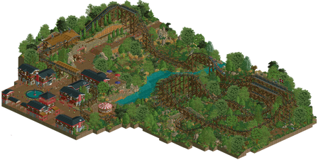
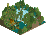
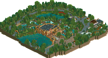
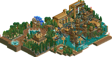
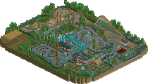
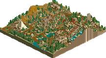
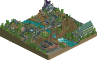
Wow, I have absolutely no clue how to score this.
At first I was blown away, while it's simplistic the aesthetic is incredibly unique, the ride is awesome and the support work alone makes it accolade worthy
... and then I turned the view.
Using the cutaway view it doesn't seem like it would be that hard to make this look at least sort of cool from the other angles too, so why cut corners like that?
I really don't know how to score it, at first I thought of giving this a 75 or even 80% (knowing I could easily be the high vote) just because of how unique it is but now I don't really know how to weigh how cool this angle is against the fact that it only works from one angle. I've really got to think about this.
I love it from one angle, but the way you restricted it is really disappointing. Creative placement of foliage or support design could have fixed any issues you were having with continuity.
Looks great from the one angle. Sadly, 1/4 finished also gets 1/4 the score -> 20%
Disappointing.
Yeah, I'm totally baffled with this. It would have taken another couple hours to finish off the foliage,probably the same amount of time to build all those dumb black walls that hide the design from 3 angles. I can't guarantee this would have won design, but it would have got a vote for sure and come close to an accolade. From what I can see from the one good side is probably a 65-70% vote from me. This reminds me of Tomb Raider a couple months ago, looked fantastic, but only from one angle. So weird, but so good.
Hopefully you can finish your next project properly, you ooze potential man!
i dont know what made you think that was a good idea, but it wasn't
I almost feel let down.
Totally deflated and disappointed.
This park is not only a masterpiece, but a deconstruction of the conventions and standards that new element holds others to as well as an aware nod to previous criticisms of his work. It is perhaps best viewed in any other angle than the one intended, as the blackness of the rct void speaks to anyone willing to listen. I truly appreciate this work, 90%.
I know your building speed, dude, it would have cost not even an hour to finish this for you. You said you hope that people won't be disappointed, but i can say that i clearly am...
it must have taken longer to obscure 3/4 of the views than it would have to finish this
Julow, you know it, RCT2 doesn't work like a drawing. To be good, it has to be worked on every angles, as the game was planned. So, why do you try to reinforce your mentality by making those black walls?!?
For the one angle I can see, this was just amazing! I just have no idea how to make it better; this was unique, beautiful, and it would definitively get a high score if all the angles were made. Shame that it's not the case.
You're the only person I saw do this in RCT2, and you could see that this is not working at all and it's not well received.
Sorry if I'm rude with that comment, but all that excitement I got with your screenshots became such a disappointment very fast, and that is getting a bit on my nerves.
I agree with the others that it's disappointing though. And a shame, because this thing and you in general have so much potential! I'm giving this 60% and that's quite a lot for what is pretty much a giant moving screenshot. The coaster is quite brilliant and I love the area around the lifthill.
Hahaha, this is pretty original. I don't think anyone has ever done this, to force people to look only from one angle. At first I thought it was quite refreshing. It's nice to force RCT to be a picture. But the longer I looked the more annoyed I got with it. Because I totally loved your design. Some of your aesthetic choices are so powerful. How we've not seen them in a very long time. You give a real soul to RCT2, something which is super rare. So I did try clearing the black wall hider scenery around but it didn't really work. I hope you might consider releasing a "free" version of this because I'd love to look more.
I love it, even for just one angle it uses new object combinations never seen before. Your style is so unique. Although I wont rate it because it does not have all angles, if it did, it would probably be 75%.
The one thing I do not like about this page, is that no one uploaded my park maps and instead uploaded this one which looks terrible and even has a giant pink blob. I probably wouldn't be commenting on this if it was the first time though.
EDIT: G_Force fixed it and uploaded mine.
Escher island was a good start to using isometrics in a new and creative way. I think theres potential to it but it doesnt make sense at all for this design, which is just a regular ride and doesnt use the inability to turn in a creative way...
I can never resist my urge to hit 'enter' a lot as I check out parks so I used cutaway view to see what I could here. I think its hilarious that its so close to being done. I could probably wrap it up well enough in 30 minutes...
I give the angle you finished about 65%. Great work, cool use of objects, although I was never really a fan of the coaster. I give the other angles 0%, so on average I give you 20% for this design, and that's really generously rounding it up.
Pretending to be special, but failed.
To not dismiss this as an arrogant approach. I hope it contains some aesthetic reasons. At least I didn't found anything.
There's literally no rule anywhere saying a park has to built with all angles considered.
It's great as it is. Very interesting aesthetics.