Park / Disney's Hollywoodland
-
 28-July 17
- Views 4,075
- Downloads 764
- Fans 2
- Comments 14
-
 71.25%(required: 70%)
 Gold
Gold

][ntamin22 80% Cocoa 75% G Force 75% trav 75% Coasterbill 70% CoasterCreator9 70% Dr_Dude 70% posix 70% pierrot 65% SSSammy 60% 71.25% -
 Description
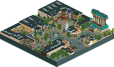
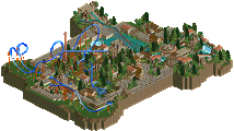
Created in Open RCT2 for the NE Olympics "Disaster Bench" challenge. Hit 90% by the deadline but lost steam. I remained true to the bench, however, in hopes to prove that no bench is truly a disaster if used well.
-
2 fans
 Fans of this park
-
 Full-Size Map
-
 Download Park
764
-
 Objects
1
-
 Tags
Tags
![park_3833 [Disaster Micro] Sharkfin Cove](https://www.nedesigns.com/uploads/parks/3833/aerialt3494.png)
![park_3607 [NEOlympics] Abu Al Sheikh Amusement Park](https://www.nedesigns.com/uploads/parks/3607/aerialt3220.png)
please play ncso.
this park is fantastic, and you would have beat our entry hands down. amazing details, archy, one of the best iterations of disney studios I've seen regardless of bench. the ratatouille architecture is perfect, really inspiring stuff. I'm with you that the bench was actually really fun and I learned a lot of new objects and textures from it!
Finally! Review coming later!
Best Disney park since DAW?
I can't open this because it contains WW/TT objects. It's the 'marbles' object.
Hey Faas, are you using Open? I don't use vanilla anymore so I cannot attest that the park works with it so that may be your issue.
I did, but just downloaded the objects from the database here and all was well.
Great park btw Disneylandian, really great use of the objects present and it certainly gives the park a different "feel" than most parks now.
True joy of limitation
I've been waiting for this for a long time. It looked very promising in the screens, and it didn't disappoint in that aspect. Everything looks fantastic and the Disaster Bench makes for an interesting aesthetic and makes people think creatively. I love for instance the pieces of film track above the entrance for Muppet Vision 3D and the shelves in Ratatouille.
There were some things I didn't like though. I think the tram stations could've been done better. Those look unfinished now. Also, the lack of a bigger ride kinda disappointed me. Ratatouille was nice but an indoor coaster or something would've completed this for me.
I'm torn between 70% and 75%.
I can't open it either using Open. I can't see which objects I'm missing though.
im surprised im the low vote here. i like everything thats there, but there really isnt that much. this is definitely something i'd vote gold if it had at least one quality ride to support it. for me it was just lacking interactive content. the flat ride in the rocks was great, tower of terror was great. gimme a rollycoaster or a water ride tho
Thank you all for your both positive and constructive feedback as I've been wrapping up this small project.
To everyone who really notices the absence of a rollercoaster or other tracked thrill ride, I do agree. There was many different park layouts that involved Buena Vista Street, ToT, Great Movie Ride, and Ratatouille. The other half of the park went through many iterations including Toy Story Land with the slinky the dog coaster, an indoor spinning wild mouse coaster themed to Roger Rabbit, and an indoor spaghetti style coaster.
Ultimately the layouts took so much room on the map that it felt very unbalanced with one side of the park involving so much facade frontage with a single large ride taking up the opposite hemisphere of the park, either outdoor (slinky) or indoor.
The final layout is one that I feel is very true to a studios style park with such limited space restrictions, which I feel was the true crux of the build, not the bench at all. Also very happy to finally snag my FIRST solo accolade in my 14(ish) years on NE.