Park / Ashford Amusement Grove and Squirrel Sanctuary
-
 27-July 17
- Views 3,468
- Downloads 640
- Fans 2
- Comments 12
-
 54.38%(required: 50%)
 Bronze

Coasterbill 60% Dr_Dude 60% G Force 60% ][ntamin22 60% bigshootergill 55% posix 55% alex 50% Jaguar 50% Cocoa 45% pierrot 35% 54.38% -
 Description
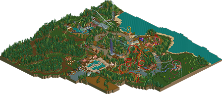
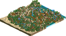
another quick no-hack extravaganzuhr. an exercise in macro composition. give me the bronze and fuck off
-
2 fans
 Fans of this park
-
 Download Park
640
-
 Tags
Tags
![park_3119 [MM2014 R1] El Paso Springs](https://www.nedesigns.com/uploads/parks/3119/aerialt2737.png)
Heartwarming.
you really are pushing the minimalism. I liked some of it, like the layouts and the general vibe had a friendly, classic rct vibe. it does feel a bit lifeless and maybe unfinished though. I'm not sure you really hit the macro composition nail on the head, the overall park layout and placement doesn't really seem anything particularly special to me; there's a sort of 'feel' of good park composition when you zoom out that doesn't really happen here IMO. I think I like your work more when you put a little more effort into the detailing and foliage and stuff.
"give me the bronze and fuck off"
Give that man what he wants.
Ok so I’m kinda on the fence about this one. I think you’ve got great compositional skills and a very ‘natural’ way of building, and I like that your focus is always on the macro picture. You also manage to capture a very classic RCT (scenario-play-esq) feel through many of your decisions - visible ride huts, use of theming objects, and with unusual layouts like the wild mouse. ..Onnnn the other hand I find that you mix colours and textures too randomly. I get why you do it - to create variety, because LL can be quite limited texturally. But I think sometimes there are too many conflicting elements on the buildings and it becomes messy. Maybe you are worried of things looking repetitive but I think people forget there is a lot of aesthetic power in consistency in colours and textures.
I should talk about rides too I guess.. The schwartzkopf was perfect and I also loved the wild mouse. The splash boats was poorly oriented meaning the drop wasn’t visible from any path. Flamingo, sure, why not.. but why was it in a campsite?? Invert was charming in that it met NE’s realistic approach to coaster design yet would’t look out of place as an existing ride from a scenario. Maybe not the transfer track.
I always love your foliage and the way you use open spaces. Best example of this is around the first half of the Shooting Star. Great use of small elevation changes throughout too - loved the little dips in the path and train bridges/tunnels.
So overall thoughts - I get that the approach here is very relaxed and probably you make a building and are like ‘eh that works’. But I think I’d like to see just a touch more intent and logic in some of the design decisions. Overall picture is great, I think it’s when it comes down to the individual elements.
Fab squirrel bridges.
I liked the simplicity of this park. The only time it really bugged me was the area around Flamingo which seemed very oddly placed. I really liked Shooting Star and the waterfront areas of the park. The wooded area on the left of the park was nice as well. If I was on the panel I probably would give this a 50 or a 55 so you seem to have met your goal.
thanks for the kind words and feedback. its not gonna be everyone's cup of tea but hopefully future projects will be more up those peoples alley
I really enjoyed this Sammy, your style is just wonderful and so relaxed. The Invert and terrain were really the highlight for me here, loved the interaction between the two and the added layer the terrain gave the rides and coasters. The foliage was great again, as it always is for you. However maybe a bit light around the shuttle coaster, it almost felt unfinished when I first looked at it. Maybe just a bit more of a border between the open grass and ride would have helped a bit here. Desperately hope we can see more from you soon, your LL stuff is always a highlight for me.
I'm glad OpenRCT allowed me to have a look at this in-game. I enjoyed this a lot, Sam. I think this park was very calm and pleasant, but still with a lot excitment. I think the Schwarchkopf is brilliant. Such a nice layout. The interaction with the water ride is so nice. I also like how the railway interacts with most of the coasters. Would definately ride it over and over just to see all the coasters up close. Another plus is the colours. You really know how to use them right.
The foliage is kind of heavy in places, but since there is still openess it works.
Pretty much agree with G Force on the shuttle coaster. A fence or some type of border would do wonders.
Great job on this, and I'm looking forward to see more from you!
lol i'm funny
I loved this! Your minimalistic approach is refreshing.
Sorry, I voted on this and just now realized I never commented. How shitty of me. lol
thanks man, im still really pleased with this. its not any contender for any awards but it loved building it and i love all the LL things i built in this time