Park / Venom
-
 20-July 17
- Views 3,823
- Downloads 734
- Fans 4
- Comments 19
-
 73.13%(required: 65%)
 Design

Kumba 85% SSSammy 85% posix 80% trav 80% CoasterCreator9 70% G Force 70% Jaguar 70% Coasterbill 65% pierrot 65% Sulakke 60% 73.13% -
 Description
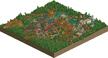
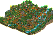
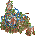
A Nemesis inspired B&M invert set in an Amazon rainforest themed area.
[OpenRCT only] -
4 fans
 Fans of this park
-
 Full-Size Map
-
 Download Park
734
-
 Objects
1
-
 Tags
Tags
![park_2389 [H2H6] revoLLutionists - The Lost Samurai](https://www.nedesigns.com/uploads/parks/2389/aerialt2131.png)
Such a lovely atmosphere. Very classic feeling... of both RCT2 and LL. The layout is really good and I can easily see the inspiration from Nemesis on it, but where's the themeing? Nemesis has great themeing done by set designer. You are too creative not to have made an effort at that. idk if it's the more classic style of this and Discovery, but I really want to see the Alex that made Luna Park back with ideas and creative details all over. You did have some, the giant lilys and I noticed the signs used as doors. I guess this was just a quick monthly contest entry tho, can't say that I never held back a little on those. Overall, a really good themed area.
Edit: Totally forgot about the Junkyard! My bad. I want the Luna-Junkyard Alex to show up more than the Discovery-Venom Alex, or for more of that style to be injected into the rest of your work.
I really like this park! The coaster looks good and the park has a great atmosphere. Well done!
Loved this. Lots of fun to explore and check out everything. Some really quite unique interactions of restaurants with rides and the terrain. Also loved the layout. Nice and speedy, perfect ratings.
We need more creative NCSO like this.
alex, this is amazing. i will definitely be returning to this again and again. answer me one question, how did you get the doors to stay open? i thought they only opened when cars went through? i could probably figure it out myself but i'll give you the chance to show off. ive never seen it before.
Set it so that you have a wild mouse car going into the door and staying there (Downward launch mode or something), then clone the door while it's open.
thought id give a review of this.
this is an outstanding proof that composition fundamentals are 10000000x more effective than putting lots of items everywhere with cso
+ the basic composition (or what you could plan out within the first 10 mins of opening the game with the land colouring tool) is fantastic. no doubt you kept changing as time went on as everyones ideas develop over time, i wouldnt want to imply for anyone reading this for advice that one must make a plan and stick to it like your life depends on it.
+ the relationship between elements vertically is fantastic. all these points could be formed into one point, as they are all sides of the same, many sided coin. this is really simple in concept, but few people properly utilise it. lets use the rollercoaster seen as its the focal point. the ride starts up high less so relative to the ground, more so relative to the rest of the ride. the ground is a character in the ride. the guests get a closer look at the coaster as the path goes uphill to see it. in the logic of the park, this is the entrance to the area, which makes this even better, the first thing guests see is the coaster starting high above them, and ending low below them. the main path of the park is above the key elements of the ride so that peeps can see it all. this has the added benefit of being great for framing things aesthetically. posix clued me in on that concept a long ass time ago and believe it or not that guy knows a thing or two about rct. another park/design which is excellent for this is el encierro by geewhzz and disneylhand, for those who want to do some additional research, along with carnivore by posix. weirdly, all of these are inverts. whoa
+ the peeps always see the punchline of rides before they get to the entrance. again, simple shit. the massive drop is right the fuck there in the log flume. the big spinning goo gahs are high up to make them seem imposing. the car ride has a car go over your head. how rad is that. that car ride is fucking sick, and its not often you get to say that about a car ride.
all this simple shit, compounded with the great architecture, great small scale composition and great little ideas mean that alex is up there with the best. simply because, whether conscious or unconscious, he knows how to fucking do the thing.
in other words, delete the game alex
I like this. Nice little design with a great color palate and cool atmosphere.
Venom itself was really nice. It flowed well, I like the nemesis inspired layout and the interaction with the flume was a nice touch.
Ancient River was pretty cool too, I didn't love the ending (and it enters the station way too fast) but the first half is great. Safari Jeeps was cool too.
My only complaint is really about Gladiator which doesn't really add anything to the map. It's not bad, it's just not needed either.
73%?!
I mean, yeah it's kinda an easy design, but the atmosphere was so good. These low votes are getting ridicules.
The surroundings were nice and all but the coaster wasn't anything special. After all it's a design and that should be the primary focus.
The coaster was literally Nemesis, consistently voted as one of the best coasters in the world. How is that nothing special?
To me it's a solid layout but nothing more. This style of coaster had been done better multiple times in the recent past. The theming was just okay and the terrain was about what you'd expect.
It's a good submission but far from anything special in an RCT sense.
I actually think the score is perfect for the coaster itself, which is unthemed, unsupported and unoriginal. Just I felt the overall quality was near the 80s range. idk, maybe 73% is kinda accurate.
Thanks for all the comments so far guys.
I actually agree with G that the score feels accurate/slightly high.. I wouldn't expect it to be a high design by any means as it's quite straightforward and simple in a lot of ways.
I don't agree with you that this style of coaster has been done better multiple times in the past though - show me an example of a better Nemesis style layout? Mav did a good one in Knoxvegas but I can't think of any others. I'm actually really proud of it.
Score is right on the money in my opinion, even though I didn't get to vote. Kumba is right, the atmosphere is really enjoyable, you have a knack for nailing that sort of thing alex!
I believe we've reached a point on NE where a design needs to be larger and to be far more detailed to breech the 80% mark, but what alex has here is an NE classic size design submission with his trademark spin to it!... which is wonderful as per usual!
He used RCT2's (mostly) native object palette creatively which is a hundred times more meaningful to me than any silly detail level or realistic "correctness" that's been plaguing the site for years. I'm disappointed by this score.
I really enjoyed this. you pulled the LL aesthetic out really well, bringing good composition and atmosphere to the park. lovely use of colors and landscaping to set the mood, with some pretty architecture to go with it. also, great nemesis layout. overall really solid design, probably would have given it 75 or 80 I think
Thank you.
I think I need to explain my low vote. Looking back now, I think it should have been a little bit higher. Nevertheless, I was quite disappointed by this in game, after seeing the incredible screen. Alex shows a lot of class here, but as a design submission it was pretty weak compared to other designs, I thought. The coaster itself is underwhelming compared to its surroundings, while it should be the center piece of a design. For me, it was the less interesting part of the submission. The lack of custom supports is normally not such a big issue, but the lifthill and first drop looked really bare here. I wasn't completely sold by the layout either, although it is probably still one of the better Nemesis spin-offs. The coaster colors were great though and so were the surrounding rides. You really have an eye for overall composition and small details like the small playground.
Anyways, looking back now, I should have voted 65-70% instead of 60%. Congrats on winning the accolade.
Just so stunning alex, some of the most immersive rct i've seen in a while. I love everything you do.