Park / Port Aransas Pier
-
 15-July 17
- Views 2,501
- Downloads 588
- Fans 0
- Comments 18
-
 48.13%(required: 50%)
 Spotlight Submission

Kumba 65% CoasterCreator9 50% G Force 50% Jaguar 50% Liampie 50% pierrot 50% Coasterbill 45% Stoksy 45% Sulakke 45% SSSammy 40% 48.13% -
 Description
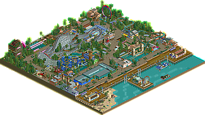
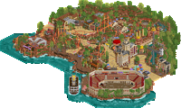
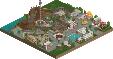
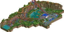
In the heart of Texas come spend a day at the beach with the South's newest, most exciting amusement park.
This park was originally supposed to be my entry for the Reddit June contest, however I failed to finish and submit in time. A big thanks to RCT2day for giving me some feedback down the stretch. -
 No fans of this park
-
 Full-Size Map
-
 Download Park
588
-
 Objects
1
-
 Tags
Tags
This is good ! Very nice composition of colors and rides.
From what I've seen, this is your best work in my opinion, everything is solid (except maybe that looper ride and its colors).
70%
I must be missing something with this unfortunately given the current score.
It was nice, but not really accolade worthy in my opinion. Many of the buildings were large and bland (including the large sheet metal food and games building that's not welcoming at all and the Roaring Racers tower), the colors are off and the layouts are sort of average.
Don't get me wrong, it's not bad and I think you're on the right track for sure but I don't see what other people seem to be seeing in this. I'm looking at it and trying to "get it" but I just can't do it. Sorry
Also, this is random but why is the Log Flume photo not on the drop? lol
@Julow, remember the scale goes from 0-100, do you really think this park deserves gold?
Understanding the way the panel votes and identifies higher quality parks will actually be a huge help to you Julow in your own work, it will help you to keep raising the bar on your building skills, continuously improving the quality of your screens and parks.
As for the park, I like how you tied in a few objects that are rarely used from ncso, like the sports objects. And you have some creative ideas and rides in here too. Personally I find ncso really tough to get extremely creative and push my skills to anything beyond bronze, but you have the potential to if you keep at it with some creative thinking and patience as you build, also learning from the work of some ncso masters.
I'd put this somewhere between 45-55... so 50 it is!
I may agree, I was maybe overwhelmed because I think it's his best work and I wanted to reward it. I know, this is not how things work, but since I find the rating system very repressive, I need to find a way to do it, lol. I can't just rate it severely (for me 50-65% is severe for something that someone spent a lot of time in), and post a comment about how good I found his work. I don't find it fair to be honest. Would be nice to have more buttons instead of just having a "fan" one. Maybe something like "good work" or "nice improvement" to show at least the person some respect when you rate 50-60% something someone spent a lot of time working on.
Still, I think everything does its work and aesthetics are quite pleasant and solid for something NCSO, if I had to rate it "correctly" it would be more like 55-60%.
I would advise you to rate correctly.
Even if correctly is not a norm, every point of view is subjective.
Iron Rattler, I liked the park, especially the chairlift and the wooden coaster. Some areas were lackluster, like the water slides and the square building on the entrance plaza.
Torn between 45 and 50%, but just enough for bronze I think so I give you 50%.
great work iron rattler, its no easy task to finish a park, even if it is on the smaller side like this one.
the pro points for me were the creativity and how it is very consistent throughout. ive never seen that idea for the super looper, i dont know if you invented it or its an old trick, but good job either way. its not perfect but it is a creative way to easily make it peepable. the inclusion of peeps as well helped bring a lot of life.
however, overall, this didn't quite come together for me. it felt like a lot of buildings were really plain, ie the big metal building. that location would be the perfect place for some more developed architecture, as it is very much a focal point as peeps enter the park.
on the other side of the coin, a lot of the other buildings are far too over complicated. this is a problem with a lot of peoples ncso work, in my opinion. i understand it completely, you are given a minimal palette of object, so natural you have to dip in to shop stalls for rooves, and more unconventional, overly specific objects get dusted off and stuck in there as well. the result is often a bit too messy for me. this is definitely something you will develop with time!
the last thing i want to give some constructive advice for your future projects is the park layout. the path structure feels very square, like everything is encased in little boxes. the fact that youre pressing up against the map edge on all sides definitely adds to this. your interesting ideas and ride designs are relegated to the edge, where they aren't given sufficient room to breathe. i even think that if this park was 10 tiles bigger in every direction and was more spread out accordingly, i could have easily given it 10% more, possibly more depending on how much better it was set out.
i've given this a 40% for these reasons. other people are marking this higher and i completely understand that side as well. its important for me, i think, to make the criticisms and give my advice to help you on your future projects. there is undeniable potential here. i eagerly await what you bring to the table next, and i hope my feedback is helpful on your journey. lastly, best of luck with the rest of the votes!
Voted 50%. The park shows a well thought out and executed concept, with creativity (the sandbox!) and a very good amount of content. Foliage left a lot to be desired though, the coaster layouts were flawed (mostly the wild mouse with those weird turns) and the park lacks some aesthetic cohesion as well, which is why I'm not giving this park 55%. You have great growth potential though, this park shows that once again.
The sandbox was awesome. Great idea.
Ouch have to say I am pretty disappointed with this score. But oh well, I am very pleased with the park itself so no real regrets. A big thanks to the panel and community for getting this through accolade voting so fast.
@Coasterbill - Yeah the water slide tower was probably the part of the park I was least pleased with. I couldn't find a way to make it look clean in game.
@BSG - Thanks. Trying to find creative NCSO techniques is the biggest challenge I feel.
@Faas. - Seems the arcade building was the biggest issue with this for several people. I guess i just focused too much on the beachfront open angle for this building.
@SSSammy - The superlooper has been done before most recently by BSG and Coasterbill so I can't take credit for that unfortunately. I sadly couldn't expand the map due to the the rules of the contests, so a lot of stuff did end up squashed on the edge of the map unfortunately.
@Liampie - I see what you mean about the wild mouse turns. I'll correct that for the next one I built.
@Sulakke - Thanks. That was one of the last things added to the park actually.
Don't get too disappointed IR, you've been improving a lot and I think you're next submissions will surely be accolade worthy.
This is probably the best non-accolade winning park submission in a long time, if that makes you feel any better. The main problem was probably the lack of a really memorable attraction or unique coaster. Personally I quite liked the coaster but I can see it being pretty standard in most peoples eyes and not enought to push this into accolade territory.
I voted 50% so I can't really disagree with the score (only 2% off), but I would've liked this to win. Doesn't matter. No accolade does not mean the park is worthless, something not everyone realises. Winning an accolade is a privilage and plenty of good creations fail to win. This is one of them. Be proud, and on to the next one!
I didn't mean to come off to negative. I still really enjoy this park and its the thing I have submitted that I am most proud of. I figured the coaster selection would hurt it, but I felt it was more important to stick to the vision of what kind of rides this park would have.
nice park. some good if a bit basic/classic ncso archy and a believable boardwalk. definitely my favorite bit though, is the woodie turnaround next to the station which goes over the covered queue. thats a brilliant small piece of design.
dont worry so much on finding ncso techniques and stuff and focus more on the bigger picture- i.e. the composition and placement of things. you need good fundamentals (aforementioned composition, color and atmosphere) before going into the nitty gritty of technicalities. just look at a lot of alex's rct2 work and see how far minimal details and great gamesense can take you.