Park / Legend of the Lake
-
 11-July 17
-
 Legend of the Lake
- Views 3,611
- Downloads 637
- Fans 0
- Comments 10
-
 56.88%(required: 65%)
 Design Submission

CoasterCreator9 65% bigshootergill 60% Coasterbill 60% Sulakke 60% alex 55% Cocoa 55% Faas 55% G Force 55% SSSammy 55% Stoksy 55% 56.88% -
 Description
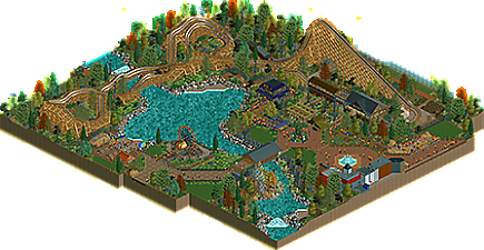
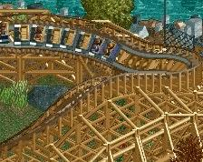
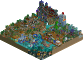
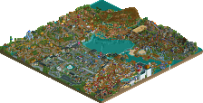
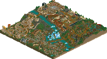
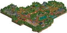
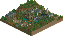
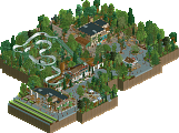
A rickety GCI built in a (fairly low-budget) park where it's October all year round. Wooden planks are painted green to appear mossy and extra, rickety-looking supports are added around the coaster to give the environment the illusion of being ramshackle when, in reality, this park is perfectly well-maintained. The mushrooms, however, are real.
This is my first full project using CSO. -
 No fans of this park
-
 Full-Size Map
-
 Download Park
637
-
 Objects
53
-
 Tags
Tags
The 1k ruins look good finally, it's original and it fits with the mystical aspect of the lake imo.
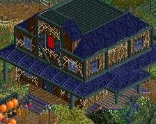
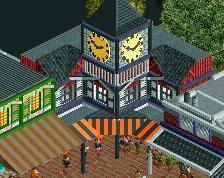
I would have liked to see the haunted house improved since it's one of the few attractions here and it could have deserved more attention. Love the theming on the ferris wheel. Path layout could be improved a bit too.
What's really incredible here are the land textures, I'm a big fan. You're very talented and always create solid atmospheres.
This is a very atmospheric entry. I really think it conveys the feelings and tone you wanted it to. I liked the rocks on the shoreline but I thought the density of them underwater was a bit much. I thought the architecture was weaker than the rest of the entry and seemed to have some issue with scale. I think this falls just short of design for me but is a great entry nonetheless.
I really liked this. You nailed that "end of the season"/autumn feel which I love in RCT. It has some great ideas which are well executed. I do agree with Iron Rattler though. The underwater stuff was a bit too much, and the archy was not that great. But I do belive you could easily improve on this. A larger scale could help alot already.
All in all a great little slice of park.
not bad overall. the vibe and feeling was really good, and the layout was overall good if a bit awkward in small spots. I think the landscaping could have been good but the multicolored 1k ruins take away from it a bit. the buildings felt a bit empty and squat but don't necessarily take away from the general atmosphere. I think its maybe not quite a design from me, but good nonetheless and looking forward to more from you for sure
I liked this. You nailed the spooky atmosphere, and that's not a thing a lot of people can do right. But I think the overall quality wasn't enough for a design accolade, especially looking at the architecture.
55%
there were some really good moments in this one, the coaster was nice if short and a bit awkward, but it does demonstrate that you have an eye for what looks good. all in all im excited to see what more you can show us in future!
I liked this. The coaster itself was nice (though the pacing was a tad slow) as was the area around it.
The areas away from the coaster probably could have used a bit more foliage though and the rocks were a bit distracting and forced.
Props for the unique aestetic though. Nice work but not QUITE design worthy IMO. 60% from me.
Great first cso park!
I wasn't such a fan of the coaster itself.. the L shaped out-and-back footprint was a bit boring and it felt a tad short. The tiny airtime bump at the bottom of the first drop looked a bit dangerous too.
Architecture was great imo, though as others have said could be improved by making it to a larger scale. Loved the autumnal/halloween palette and you did a great job with foliage for a first go. Rockwork was too much, especially underwater.
Decent stuff, showing great potential, but not a design release. 55%
Everything in this design was decent, but the overall picture missed that little bit of extra to be design worthy. I completely agree with all the points alex has pointed out. The rockwork underwater caused unnecessary glitches that are quite distracting. The coaster itself was decent, but nothing too special and it had some painful small bumps.
Anyways, great custom scenery debut. Hope to see more of your work soon!